All in One View
Content from Before we Start
Last updated on 2026-06-30 | Edit this page
Overview
Questions
- How to find your way around RStudio?
- How to interact with R?
- How to manage your environment?
- How to install packages?
Objectives
- Install latest version of R.
- Install latest version of RStudio.
- Navigate the RStudio GUI.
- Install additional packages using the packages tab.
- Install additional packages using R code.
What is R? What is RStudio?
The term “R” is used to refer to both the programming
language and the software that interprets the scripts written using
it.
RStudio is currently a very popular way to not only write your R scripts but also to interact with the R software. To function correctly, RStudio needs R and therefore both need to be installed on your computer.
To make it easier to interact with R, we will use RStudio. RStudio is the most popular IDE (Integrated Development Environment) for R. An IDE is a piece of software that provides tools to make programming easier.
You can also use the R Presentations feature to present your work in an HTML5 presentation mixing Markdown and R code. You can display these within R Studio or your browser. There are many options for customizing your presentation slides, including an option for showing La-TeX equations. This can help you collaborate with others and also has an application in teaching and classroom use.
Why learn R?
R does not involve lots of pointing and clicking, and that’s a good thing
The learning curve might be steeper than with other software but with R, the results of your analysis do not rely on remembering a succession of pointing and clicking, but instead on a series of written commands, and that’s a good thing! So, if you want to redo your analysis because you collected more data, you don’t have to remember which button you clicked in which order to obtain your results; you just have to run your script again.
Working with scripts makes the steps you used in your analysis clear, and the code you write can be inspected by someone else who can give you feedback and spot mistakes.
Working with scripts forces you to have a deeper understanding of what you are doing, and facilitates your learning and comprehension of the methods you use.
R code is great for reproducibility
Reproducibility is when someone else (including your future self) can obtain the same results from the same dataset when using the same analysis.
R integrates with other tools to generate manuscripts from your code. If you collect more data, or fix a mistake in your dataset, the figures and the statistical tests in your manuscript are updated automatically.
An increasing number of journals and funding agencies expect analyses to be reproducible, so knowing R will give you an edge with these requirements.
To further support reproducibility and transparency, there are also packages that help you with dependency management: keeping track of which packages we are loading and how they depend on the package version you are using. This helps you make sure existing workflows work consistently and continue doing what they did before.
Packages like renv let you “save” and “load” the state of your project library, also keeping track of the package version you use and the source it can be retrieved from.
R is interdisciplinary and extensible
With 10,000+ packages that can be installed to extend its capabilities, R provides a framework that allows you to combine statistical approaches from many scientific disciplines to best suit the analytical framework you need to analyze your data. For instance, R has packages for image analysis, GIS, time series, population genetics, and a lot more.
R works on data of all shapes and sizes
The skills you learn with R scale easily with the size of your dataset. Whether your dataset has hundreds or millions of lines, it won’t make much difference to you.
R is designed for data analysis. It comes with special data structures and data types that make handling of missing data and statistical factors convenient.
R can connect to spreadsheets, databases, and many other data formats, on your computer or on the web.
R produces high-quality graphics
The plotting functionalities in R are endless, and allow you to adjust any aspect of your graph to convey most effectively the message from your data.
R has a large and welcoming community
Thousands of people use R daily. Many of them are willing to help you through mailing lists and websites such as Stack Overflow, or on the RStudio community. Questions which are backed up with short, reproducible code snippets are more likely to attract knowledgeable responses.
Not only is R free, but it is also open-source and cross-platform
Anyone can inspect the source code to see how R works. Because of this transparency, there is less chance for mistakes, and if you (or someone else) find some, you can report and fix bugs.
Because R is open source and is supported by a large community of developers and users, there is a very large selection of third-party add-on packages which are freely available to extend R’s native capabilities.


:::::
RStudio extends what R can do, and makes it easier to write R code and interact with R. Left photo credit; Right photo credit.
Knowing your way around RStudio
Let’s start by learning about RStudio, which is an Integrated Development Environment (IDE) for working with R.
The RStudio IDE open-source product is free under the Affero General Public License (AGPL) v3. The RStudio IDE is also available with a commercial license and priority email support from RStudio, Inc.
We will use the RStudio IDE to write code, navigate the files on our computer, inspect the variables we create, and visualize the plots we generate. RStudio can also be used for other things (e.g., version control, developing packages, writing Shiny apps) that we will not cover during the workshop.
One of the advantages of using RStudio is that all the information you need to write code is available in a single window. Additionally, RStudio provides many shortcuts, auto completion, and highlighting for the major file types you use while developing in R. RStudio makes typing easier and less error-prone.
Getting set up
It is good practice to keep a set of related data, analyses, and text self-contained in a single folder called the working directory. All of the scripts within this folder can then use relative paths to files. Relative paths indicate where inside the project a file is located (as opposed to absolute paths, which point to where a file is on a specific computer). Working this way makes it a lot easier to move your project around on your computer and share it with others without having to directly modify file paths in the individual scripts.
RStudio provides a helpful set of tools to do this through its “Projects” interface, which not only creates a working directory for you but also remembers its location (allowing you to quickly navigate to it). The interface also (optionally) preserves custom settings and open files to make it easier to resume work after a break.
Create a new project
- Under the
Filemenu, click onNew project, chooseNew directory, thenNew project - Enter a name for this new folder (or “directory”) and choose a
convenient location for it. This will be your working
directory for the rest of the day (e.g.,
~/data-carpentry) - Click on
Create project - Create a new file where we will type our scripts. Go to File >
New File > R script. Click the save icon on your toolbar and save
your script as “
script.R”.
The simplest way to open an RStudio project once it has been created
is to navigate through your files to where the project was saved and
double click on the .Rproj (blue cube) file. This will open
RStudio and start your R session in the same directory
as the .Rproj file. All your data, plots and scripts will
now be relative to the project directory. RStudio projects have the
added benefit of allowing you to open multiple projects at the same time
each open to its own project directory. This allows you to keep multiple
projects open without them interfering with each other.
The RStudio Interface
Let’s take a quick tour of RStudio.
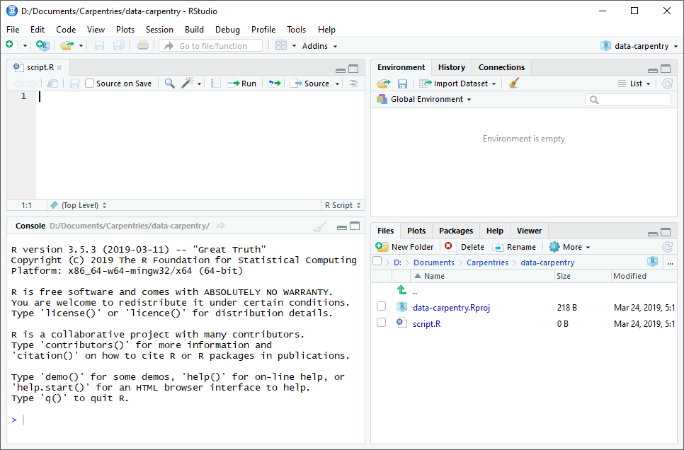
RStudio is divided into four “panes”. The placement of these panes and their content can be customized (see menu, Tools -> Global Options -> Pane Layout).
The Default Layout is:
- Top Left - Source: your scripts and documents
- Bottom Left - Console: what R would look and be like without RStudio
- Top Right - Environment/History: look here to see what you have done
- Bottom Right - Files and more: see the contents of the project/working directory here, like your Script.R file
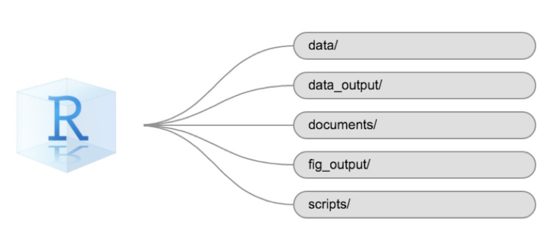
Organizing your working directory
Using a consistent folder structure across your projects will help keep things organized and make it easy to find/file things in the future. This can be especially helpful when you have multiple projects. In general, you might create directories (folders) for scripts, data, and documents. Here are some examples of suggested directories:
-
data/Use this folder to store your raw data and intermediate data sets. For the sake of transparency and provenance, you should always keep a copy of your raw data accessible and do as much of your data cleanup and pre-processing programmatically (i.e., with scripts, rather than manually) as possible. -
data_output/When you need to modify your raw data, it might be useful to store the modified versions of the data sets in a different folder. -
documents/Used for outlines, drafts, and other text. -
fig_output/This folder can store the graphics that are generated by your scripts. -
scripts/A place to keep your R scripts for different analyses or plotting.
You may want additional directories or sub directories depending on your project needs, but these should form the backbone of your working directory.
The working directory
The working directory is an important concept to understand. It is the place where R will look for and save files. When you write code for your project, your scripts should refer to files in relation to the root of your working directory and only to files within this structure.
Using RStudio projects makes this easy and ensures that your working
directory is set up properly. If you need to check it, you can use
getwd(). If for some reason your working directory is not
the same as the location of your RStudio project, it is likely that you
opened an R script or RMarkdown file not your
.Rproj file. You should close out of RStudio and open the
.Rproj file by double clicking on the blue cube! If you
ever need to modify your working directory in a script,
setwd('my/path') changes the working directory. This should
be used with caution since it makes analyses hard to share across
devices and with other users.
Downloading the data and getting set up
For this lesson we will use the following folders in our working
directory: data/ and
fig_output/. Let’s write them all in
lowercase to be consistent. We can create them using the RStudio
interface by clicking on the “New Folder” button in the file pane
(bottom right), or directly from R by typing at console:
R
dir.create("data")
dir.create("fig_output")
You can either download the data used for this lesson from GitHub or with R.
Check-In Dataset:
You can either copy the data from GitHub
and paste it into a file called checkin_data.csv in the
data/ directory or copy-paste the below code chunk into
your terminal:
R
download.file(
  "https://raw.githubusercontent.com/EngineeringForDemocracy/r-election-workers/main/episodes/data/checkin_data.csv",
  "data/checkin_data.csv", mode = "wb"
  )
Check-In Plotting Dataset:
You can either copy the data from this GitHub
and paste it into a file called checkin_sample_plotting.csv
in the data/ directory or copy-paste the below code chunk
into your terminal:
R
download.file(
  "https://raw.githubusercontent.com/EngineeringForDemocracy/r-election-workers/main/episodes/data/checkin_sample_plotting.csv",
  "data/checkin_sample_plotting.csv", mode = "wb"
  )
Messy Dataset:
You can either copy the data from this GitHub
link and paste it into a file called messy_data.csv in
the data/ directory or copy-paste the below code chunk into
your terminal:
R
download.file(
  "https://raw.githubusercontent.com/EngineeringForDemocracy/r-election-workers/main/episodes/data/messy_data.csv",
  "data/messy_data.csv", mode = "wb"
  )
Game of Thrones Dataset:
You can either copy the data from this GitHub
link and paste it into a file called voting_GoT.csv in
the data/ directory or copy-paste the below code chunk into
your terminal:
R
download.file(
  "https://raw.githubusercontent.com/EngineeringForDemocracy/r-election-workers/main/episodes/data/voting_GoT.csv",
  "data/voting_GoT.csv", mode = "wb"
  )
You can either copy the data from this GitHub
link and paste it into a file called
polygons_GoT.geojson in the data/ directory or
copy-paste the below code chunk into your terminal:
R
download.file(
  "https://raw.githubusercontent.com/EngineeringForDemocracy/r-election-workers/main/episodes/data/polygons_GoT.geojson",
  "data/polygons_GoT.geojson", mode = "wb"
  )
JSON Check-In Dataset:
You can either copy the data from this GitHub
link and paste it into a file called
checkin_snippet.json in the data/ directory or
copy-paste the below code chunk into your terminal:
R
download.file(
  "https://raw.githubusercontent.com/EngineeringForDemocracy/r-election-workers/main/episodes/data/checkin_snippet.json",
  "data/checkin_snippet.json", mode = "wb"
  )
Interacting with R
The basis of programming is that we write down instructions for the computer to follow, and then we tell the computer to follow those instructions. We write, or code, instructions in R because it is a common language that both the computer and we can understand. We call the instructions commands and we tell the computer to follow the instructions by executing (also called running) those commands.
There are two main ways of interacting with R: by using the console or by using script files (plain text files that contain your code). The console pane (in RStudio, the bottom left panel) is the place where commands written in the R language can be typed and executed immediately by the computer. It is also where the results will be shown for commands that have been executed. You can type commands directly into the console and press Enter to execute those commands, but they will be forgotten when you close the session.
Because we want our code and workflow to be reproducible, it is better to type the commands we want in the script editor and save the script. This way, there is a complete record of what we did, and anyone (including our future selves!) can easily replicate the results on their computer.
RStudio allows you to execute commands directly from the script editor by using the Ctrl + Enter shortcut (on Mac, Cmd + Return will work). The command on the current line in the script (indicated by the cursor) or all of the commands in selected text will be sent to the console and executed when you press Ctrl + Enter. If there is information in the console you do not need anymore, you can clear it with Ctrl + L. You can find other keyboard shortcuts in this RStudio cheatsheet about the RStudio IDE.
At some point in your analysis, you may want to check the content of a variable or the structure of an object without necessarily keeping a record of it in your script. You can type these commands and execute them directly in the console. RStudio provides the Ctrl + 1 and Ctrl + 2 shortcuts allow you to jump between the script and the console panes.
If R is ready to accept commands, the R console shows a
> prompt. If R receives a command (by typing,
copy-pasting, or sent from the script editor using Ctrl +
Enter), R will try to execute it and, when ready, will show
the results and come back with a new > prompt to wait
for new commands.
If R is still waiting for you to enter more text, the console will
show a + prompt. It means that you haven’t finished
entering a complete command. This is likely because you have not
‘closed’ a parenthesis or quotation, i.e. you don’t have the same number
of left-parentheses as right-parentheses or the same number of opening
and closing quotation marks. When this happens, and you thought you
finished typing your command, click inside the console window and press
Esc; this will cancel the incomplete command and return you
to the > prompt. You can then proofread the command(s)
you entered and correct the error.
Installing additional packages using the packages tab
In addition to the core R installation, there are in excess of 10,000 additional packages which can be used to extend the functionality of R. Many of these have been written by R users and have been made available in central repositories, like the one hosted at CRAN, for anyone to download and install into their own R environment. You should have already installed the packages ‘ggplot2’ and ’dplyr. If you have not, please do so now using these instructions.
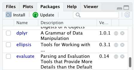
You can see if you have a package installed by looking in the
packages tab (on the lower-right by default). You can also
type the command installed.packages() into the console and
examine the output.
Additional packages can be installed from the ‘packages’ tab. On the packages tab, click the ‘Install’ icon and start typing the name of the package you want in the text box. As you type, packages matching your starting characters will be displayed in a drop-down list so that you can select them.
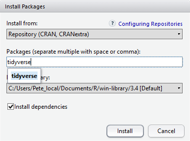
At the bottom of the Install Packages window is a check box to ‘Install’ dependencies. This is ticked by default, which is usually what you want. Packages can (and do) make use of functionality built into other packages, so for the functionality contained in the package you are installing to work properly, there may be other packages which have to be installed with them. The ‘Install dependencies’ option makes sure that this happens.
Exercise
Use both the Console and the Packages tab to confirm that you have the tidyverse installed.
Scroll through packages tab down to ‘tidyverse’. You can also type a few characters into the searchbox. The ‘tidyverse’ package is really a package of packages, including ‘ggplot2’ and ‘dplyr’, both of which require other packages to run correctly. All of these packages will be installed automatically. Depending on what packages have previously been installed in your R environment, the install of ‘tidyverse’ could be very quick or could take several minutes. As the install proceeds, messages relating to its progress will be written to the console. You will be able to see all of the packages which are actually being installed.
Because the install process accesses the CRAN repository, you will need an Internet connection to install packages.
It is also possible to install packages from other repositories, as well as Github or the local file system, but we won’t be looking at these options in this lesson.
Installing additional packages using R code
If you were watching the console window when you started the install of ‘tidyverse’, you may have noticed that the line
R
install.packages("tidyverse")
was written to the console before the start of the installation messages.
You could also have installed the
tidyverse packages by running this command
directly at the R terminal.
We will be using additional packages to manage paths, plots, json files, and shape files. We will discuss these in more detail in a later episode, but we will install them now in the console:
R
install.packages("here", "lattice", "sf", "jsonlite")
- Use RStudio to write and run R programs.
- Use
install.packages()to install packages (libraries).
Content from Introduction to R
Last updated on 2026-06-30 | Edit this page
Overview
Questions
- What data types are available in R?
- What is an object?
- How can objects of different data types be assigned to names?
- What arithmetic and logical operators can be used?
- How can subsets be extracted from vectors?
- How does R treat missing values?
- How can we deal with missing values in R?
- How can we work with dates and times in R?
Objectives
- Define the following terms as they relate to R: object, assign, call, function, arguments, options.
- Assign values to names in R.
- Learn how to name objects.
- Use comments to inform script.
- Solve simple arithmetic operations in R.
- Call functions and use arguments to change their default options.
- Inspect the content of vectors and manipulate their content.
- Subset values from vectors.
- Analyze vectors with missing data.
- Work with dates and times in R using proper data types.
Creating Objects in R
You can get output from R simply by typing math in the console:
R
3 + 5
OUTPUT
[1] 8R
12 / 7
OUTPUT
[1] 1.714286Everything that exists in R is an objects: from simple
numerical values, to strings, to more complex objects like vectors,
matrices, and lists. Even expressions and functions are objects in
R.
However, to do useful and interesting things, we need to name
objects. To do so, we need to give a name followed by the
assignment operator <-, and the object we want
to be named:
R
num_precincts <- 5
<- is the assignment operator. It assigns values
(objects) on the right to names (also called symbols) on the
left. So, after executing x <- 3, the value of
x is 3. The arrow can be read as 3
goes into x. For historical reasons, you
can also use = for assignments, but not in every context.
Because of the slight
differences in syntax, it is good practice to always use
<- for assignments. More generally we prefer the
<- syntax over = because it makes it clear
what direction the assignment is operating (left assignment), and it
increases the read-ability of the code.
In RStudio, typing Alt + - (push Alt
at the same time as the - key) will write <-
in a single keystroke in a PC, while typing Option +
- (push Option at the same time as the
- key) does the same in a Mac.
Objects can be given any name such as x,
current_temperature, or subject_id. You want
your object names to be explicit and not too long. They cannot start
with a number (2x is not valid, but x2 is). R
is case sensitive (e.g., age is different from
Age). There are some names that cannot be used because they
are the names of fundamental objects in R (e.g., if,
else, for, see R’s
reserved words for a complete list). In general, even if it’s
allowed, it’s best to not use them (e.g., c,
T, mean, data, df,
weights). If in doubt, check the help to see if the name is
already in use. It’s also best to avoid dots (.) within an
object name as in my.dataset. There are many objects in R
with dots in their names for historical reasons, but because dots have a
special meaning in R (for methods) and other programming languages, it’s
best to avoid them. The recommended writing style is called snake_case,
which implies using only lowercase letters and numbers and separating
each word with underscores (e.g., animals_weight, average_income). It is
also recommended to use nouns for object names, and verbs for function
names. It’s important to be consistent in the styling of your code
(where you put spaces, how you name objects, etc.). Using a consistent
coding style makes your code clearer to read for your future self and
yourcollaborators. In R, three popular style guides are Google’s, Jean Fan’s and the tidyverse’s. The tidyverse’s is
very comprehensive and may seem overwhelming at first. You can install
the lintr
package to automatically check for issues in the styling of your
code.
Objects vs. Variables
The naming of objects in R is somehow related to
variables in many other programming languages. In many
programming languages, a variable has three aspects: a name, a memory
location, and the current value stored in this location. R
abstracts from modifiable memory locations. In R we only
have objects which can be named. Depending on the context,
name (of an object) and variable can have
drastically different meanings. However, in this lesson, the two words
are used synonymously. For more information see: https://cran.r-project.org/doc/manuals/r-release/R-lang.html#Objects
When assigning an value to a name, R does not print anything. You can force R to print the value by using parentheses or by typing the object name:
R
num_precincts <- 5    # doesn't print anything
(num_precincts <- 5)  # putting parenthesis around the call prints the value of `area_hectares`
OUTPUT
[1] 5R
num_precincts # and so does typing the name of the object
OUTPUT
[1] 5Now that R has num_precincts in memory, we can do
arithmetic with it. For instance, we may want to calculate the number of
registered voters (assuming there are 1500 voters per precinct):
R
1500 * num_precincts
OUTPUT
[1] 7500We can also change an the value assigned to an name by assigning it a new one:
R
num_precincts <- 10
1500 * num_precincts
OUTPUT
[1] 15000This means that assigning a value to one name does not change the
values of other names. For example, let’s name the number of voters
num_voters:
R
num_voters <- 1500 * num_precincts
Next, let’s change (reassign) num_precincts to 50:
R
num_precincts <- 50
Exercise
What do you think is the current value of num_voters?
15000 or 75000?
The value of num_voters is still 15000. This is because
you have not re-run the line
num_voters <- 1500 * num_precincts since changing the
value of num_precincts.
Comments
All programming languages allow the programmer to include comments in their code. Including comments to your code has many advantages: it helps you explain your reasoning and it forces you to be tidy. A commented code is also a great tool not only to your collaborators, but to your future self. Comments are the key to a reproducible analysis.
To do this in R we use the # character. Anything to the
right of the # sign and up to the end of the line is
treated as a comment and is ignored by R. You can start lines with
comments or include them after any code on the line.
R
num_precincts <- 10      #number of precincts
num_voters <- 1500 * num_precincts  #calculate the total number of voters
num_voters        #print the total number of voters
OUTPUT
[1] 15000RStudio makes it easy to comment or uncomment a paragraph: after selecting the lines you want to comment, press at the same time on your keyboard Ctrl + Shift + C. If you only want to comment out one line, you can put the cursor at any location of that line (i.e. no need to select the whole line), then press Ctrl + Shift + C.
Exercise
Create two variables
ballot_costandballots_neededand assign them values.Create a third variable
total_costand give it a value based on the current values ofballot_costandballots_needed.Show that changing the values of either
ballot_costandballots_neededdoes not affect the value oftotal_cost.
R
#set the values of ballot_cost and ballots_needed
ballot_cost <- 0.0125
ballots_needed <- 2250

#give total_cost a value
total_cost <- ballot_cost * ballots_needed

#print current value of total_cost
total_cost
OUTPUT
[1] 28.125R
#change the values of ballot_cost and ballots_needed
ballot_cost <- 0.068
ballots_needed <- 3000

#display the value of total_cost isn't changed
total_cost
OUTPUT
[1] 28.125Functions and Their Arguments
Functions are “canned scripts” that automate more complicated sets of
commands including operations assignments, etc. Many functions are
predefined, or can be made available by importing R packages
(more on that later). A function usually gets one or more inputs called
arguments. Functions often (but not always) return a
value. A typical example would be the function
sqrt(). The input (the argument) must be a number, and the
return value (in fact, the output) is the square root of that number.
Executing a function (‘running it’) is called calling the
function. An example of a function call is:
R
b <- sqrt(a)
Here, the value of a is given to the sqrt()
function, the sqrt() function calculates the square root,
and returns the value which is then assigned to the name b.
This function is very simple, because it takes just one argument.
The return ‘value’ of a function need not be numerical (like that of
sqrt()), and it also does not need to be a single item: it
can be a set of things, or even a data set. We’ll see that when we read
data files into R.
Arguments can be anything, not only numbers or file names, but also other objects. Exactly what each argument means differs per function, and must be looked up in the documentation (see below). Some functions take arguments which may either be specified by the user, or, if left out, take on a default value: these are called options. Options are typically used to alter the way the function operates, such as whether it ignores ‘bad values’, or what symbol to use in a plot. However, if you want something specific, you can specify a value of your choice which will be used instead of the default.
Using the total_cost we calculated above, let’s try a function that
can take multiple arguments: round().
R
round(total_cost)
OUTPUT
[1] 28Here, we’ve called round() with just one argument,
total_cost, and it has returned the value 28.
That’s because the default is to round to the nearest whole number. If
we want more digits we can see how to do that by getting information
about the round function. We can use
args(round) or look at the help for this function using
?round.
R
args(round)
OUTPUT
function (x, digits = 0, ...)
NULL
R
?round
We see that if we want a different number of digits, we can type
digits=2 or however many we want.
R
round(total_cost, digits = 2)
OUTPUT
[1] 28.12If you provide the arguments in the exact same order as they are defined you don’t have to name them:
R
round(total_cost, 2)
OUTPUT
[1] 28.12And if you do name the arguments, you can switch their order:
R
round(digits = 2, x = total_cost)
OUTPUT
[1] 28.12It’s good practice to put the non-optional arguments (like the number you’re rounding) first in your function call, and to specify the names of all optional arguments. If you don’t, someone reading your code might have to look up the definition of a function with unfamiliar arguments to understand what you’re doing.
Exercise
As you may have noticed, in both cases of rounding, the total_cost rounded down. However, when calculating the total cost of something, you should always round UP to the nearest dollar or cent.
For this exercise, type in ?round at the console and
then look at the output in the Help panel. What other function similar
to round should be used instead? Apply this function to
round up to the nearest dollar.
Bonus: apply this function to round to the nearest cent.
The ceiling function rounds up to the nearest
integer!
R
ceiling(total_cost)
OUTPUT
[1] 29To use the function to round to the nearest cent, you can do the following:
R
ceiling(total_cost * 100) / 100
OUTPUT
[1] 28.13Vectors and Data Types
A vector is the most common and basic data type in R, and is pretty
much the workhorse of R. A vector is composed by a series of values,
which can be either numbers, characters, or other data types. We can
assign a series of values to a vector using the c()
function. For example, we can create a vector of job type strings, and
we can create another vector storing numbers of votes at different
precincts
R
votes_per_precinct <- c(1000, 4300, 2340, 7190)
votes_per_precinct
OUTPUT
[1] 1000 4300 2340 7190R
job_types <- c("check-in", "check-out", "supervisor")
job_types
OUTPUT
[1] "check-in" "check-out" "supervisor"The quotes around “check-in”, “check-out”, and “supervisor”are
essential here. Without the quotes, R will assume there are objects
called check-in, check-out, and
supervisor. Since these names don’t exist in R’s memory,
there will be an error message.
Additionally, you may notice there are no commas in-between the thousands. In R, you cannot add commas in numbers, as R will assume they are separate items in the list.
There are many functions that allow you to inspect the content of a
vector. length() tells you how many elements are in a
particular vector:
R
length(votes_per_precinct)
OUTPUT
[1] 4An important feature of a vector is that all of the elements are the
same type of data. The function typeof() indicates the type
of an object:
R
typeof(votes_per_precinct)
OUTPUT
[1] "double"The function str() provides an overview of the structure
of an object and its elements. It is a useful function when working with
large and complex objects:
R
str(votes_per_precinct)
OUTPUT
num [1:4] 1000 4300 2340 7190You can use the c() function to add other elements to
your vector:
R
devices_per_precinct <- c(5, 2)
devices_per_precinct <- c(devices_per_precinct, 9) # add to the end of the vector
devices_per_precinct <- c(6, devices_per_precinct) # add to the beginning of the vector
devices_per_precinct
OUTPUT
[1] 6 5 2 9In the first line, we take the original vector
devices_per_precinct, add the value 9 to the
end of it, and save the result back into
devices_per_precinct. Then we add the value 6
to the beginning, again saving the result back into
devices_per_precinct.
We can do this over and over again to grow a vector, or assemble a data set. As we program, this may be useful to add results that we are collecting or calculating.
An atomic vector is the simplest R data
type and is a linear vector of a single type. Above, we saw 2
of the 6 main atomic vector types that R uses:
"character" and "numeric" (or
"double"). These are the basic building blocks that all R
objects are built from. The other 4 atomic vector types
are:
-
"logical"forTRUEandFALSE(the boolean data type) -
"integer"for integer numbers (e.g.,2L, theLindicates to R that it’s an integer) -
"complex"to represent complex numbers with real and imaginary parts (e.g.,1 + 4i) and that’s all we’re going to say about them -
"raw"for bit-streams (we won’t be discussing this further)
Date Types
Dates are a common data type that require special attention. In R, dates can be represented in two ways:
- As character strings (e.g., “2018-11-06 07:02:36”, “11/06/2018 07:02:36”)
- As Date or POSIXct objects which are special data types for dates and times
When dates are stored as strings, they’re treated like any other text:
R
checkin_times_as_strings <- c("2018-11-06 07:02:36", "2018-11-06 07:04:09", "2018-11-06 07:05:45")
typeof(checkin_times_as_strings)
OUTPUT
[1] "character"However, storing dates as proper Date or POSIXct objects offers several advantages: - You can perform arithmetic with dates (calculate time differences) - You can extract components like month, year, or day - You can easily format dates for display - You can sort dates chronologically
To convert strings to Date or POSIXct objects, use the
as.POSIXct() function:
R
#convert strings to POSIXct objects
checkin_times <- as.POSIXct(checkin_times_as_strings, format = "%Y-%m-%d %H:%M:%S")
typeof(checkin_times)
OUTPUT
[1] "double"R
class(checkin_times)
OUTPUT
[1] "POSIXct" "POSIXt" The following “leap year” scenario highlights the importance of using proper date types. Consider the following example:
R
#BAD: using strings for date arithmetic
date_start <- "2020-02-28"
date_end <- "2020-03-01"

#attempt to calculate the difference by converting strings to numeric days
#here we use substr to extract the day portion in string format.
#it draws the characters at position 9 to 10 and converts them to numeric
difference_wrong <- as.numeric(substr(date_end, 9, 10)) - as.numeric(substr(date_start, 9, 10))
difference_wrong #incorrect!
OUTPUT
[1] -27In this example, we extract the day portion of the dates as strings and subtract them. While this works for simple cases, it fails to account for: - The transition between months (e.g., February to March). - Leap years (e.g., February 29 in 2020).
Now, compare this with proper date types:
R
#GOOD: using Date for leap year handling
date_start_correct <- as.Date(date_start)
date_end_correct <- as.Date(date_end)

difference_correct <- as.numeric(date_end_correct - date_start_correct)
difference_correct #correctly computes 2 days, accounting for February 29 in the leap year
OUTPUT
[1] 2Now, the number of days has been calculated properly!
It’s important to note that Date objects and POSIXct objects are not made equal and, while we used the two types interchangeably above, you should ensure you choose the one that fits your data needs. The key differences between Date objects and POSIXct objects can be seen below: - Date: - Represents dates without time. - Useful for operations where time is irrelevant (e.g., calculating the number of days between two dates). - Stored as the number of days since January 1, 1970. - `POSIXct: - Represents both date and time. - Useful for operations involving time (e.g., calculating the number of seconds or hours between two timestamps). - Stored as the number of seconds since January 1, 1970.
Using proper date types ensures that leap years and other calendar-specific rules are handled correctly, making computations accurate and reliable.
Coercion
An important characteristic of vectors is that they can only contain elements of the same data type. If you attempt to combine different types in a vector, R will automatically convert them to a single, common type - a process called “coercion”. This follows a hierarchy: character > numeric (double) > integer > logical.
R
# Coercion examples
num_logical <- c(1, TRUE) # TRUE converted to 1
typeof(num_logical)
OUTPUT
[1] "double"R
num_character <- c(1, "a") # 1 converted to "1"
typeof(num_character)
OUTPUT
[1] "character"R
logical_character <- c(TRUE, "a") # TRUE converted to "TRUE"
typeof(logical_character)
OUTPUT
[1] "character"R
tricky <- c(1, "2", TRUE) # Everything becomes character
typeof(tricky)
OUTPUT
[1] "character"R will always try to find a common data type that doesn’t lose information. Typically, this means converting toward the more flexible type (with character being the most flexible).
Note: Date/POSIXct will always be treated as “numeric” (days/seconds since January 1st, 1970) when being coerced within a vector!
Exercise
Predict the resulting data type for this vector:
c(1.1, 2L, TRUE, "a")-
Create a vector that contains:
- The number 5
- The logical value FALSE
- The string “data”
What is the resulting data type? Why?
The vector
c(1.1, 2L, TRUE, "a")will have type “character” because character is the most flexible data type.The vector would be:
R
mixed <- c(5, FALSE, "data")
typeof(mixed)
OUTPUT
[1] "character"It has type “character” because R coerces all elements to the most flexible data type that includes all values.
Vectors are one of the many data structures that R
uses. Other important ones are lists (list), matrices ,
data frames (data.frame), tibbles (tbl),
factors (factor) and arrays (array).
Subsetting vectors
Subsetting (sometimes referred to as extracting or indexing) involves accessing one or more values based on their numeric placement or “index” within a vector. If we want to subset one or several values from a vector, we must provide one index or several indices in square brackets. For instance:
R
job_types <- c("check-in", "check-out", "supervisor")
job_types[2]
OUTPUT
[1] "check-out"R
job_types[c(3, 2)]
OUTPUT
[1] "supervisor" "check-out" We can also repeat the indices to create an object with more elements than the original one:
R
more_jobs <- job_types[c(1, 2, 3, 2, 1, 3)]
more_jobs
OUTPUT
[1] "check-in"   "check-out"  "supervisor" "check-out"  "check-in"
[6] "supervisor"
Conditional subsetting
Another common way of subsetting is by using a logical vector.
TRUE will select the element with the same index, while
FALSE will not:
R
votes_per_precinct <- c(1000, 4300, 2340, 7190)
votes_per_precinct[c(TRUE, FALSE, TRUE, TRUE)]
OUTPUT
[1] 1000 2340 7190Typically, these logical vectors are not typed by hand, but are the output of other functions or logical tests. For instance, if you wanted to select only the values greater than 2500:
R
votes_per_precinct > 2500 # will return logicals with TRUE for the indices that meet the condition
OUTPUT
[1] FALSE TRUE FALSE TRUER
## so we can use this to select only the values greater than 2866
votes_per_precinct[votes_per_precinct > 2500]
OUTPUT
[1] 4300 7190You can combine multiple tests using & (both
conditions are true, AND) or | (at least one of the
conditions is true, OR):
R
votes_per_precinct[votes_per_precinct < 2000 | votes_per_precinct > 4000]
OUTPUT
[1] 1000 4300 7190R
votes_per_precinct[votes_per_precinct >= 2000 & votes_per_precinct <= 4000]
OUTPUT
[1] 2340Here, < stands for “less than”, > for
“greater than”, >= for “greater than or equal to”, and
== for “equal to”. The double equal sign == is
a test for numerical equality between the left and right-hand sides, and
should not be confused with the single = sign, which
performs variable assignment (similar to <-).
A common task is to search for certain strings in a vector. One could
use the “or” operator | to test for equality to multiple
values, but this can quickly become tedious.
R
job_types <- c("check-in", "check-out", "supervisor")
job_types[job_types == "check-in" | job_types == "check-out"] # returns both check-in and check-out
OUTPUT
[1] "check-in" "check-out"The function %in% allows you to test if any of the
elements of a search vector (on the left-hand side) are found in the
target vector (on the right-hand side):
R
job_types %in% c("check-in", "check-out")
OUTPUT
[1] TRUE TRUE FALSENote that the output is the same length as the search vector on the
left-hand side, because %in% checks whether each element of
the search vector is found somewhere in the target vector. Thus, you can
use %in% to select the elements in the search vector that
appear in your target vector:
R
job_types[job_types %in% c("check-in", "check-out")]
OUTPUT
[1] "check-in" "check-out"Missing Data
As R was designed to analyze data sets, it includes the concept of
missing data (which is uncommon in other programming languages). Missing
data are represented in vectors as NA.
When doing operations on numbers, most functions will return
NA if the data you are working with include missing values.
This feature makes it harder to overlook the cases where you are dealing
with missing data. You can add the argument na.rm = TRUE to
calculate the result while ignoring the missing values.
R
#create vector
checkin_lengths <- c(64, 74, NA, 287)

#calc with NA
mean(checkin_lengths)
OUTPUT
[1] NAR
max(checkin_lengths)
OUTPUT
[1] NAR
#calc without NA
mean(checkin_lengths, na.rm = TRUE)
OUTPUT
[1] 141.6667R
max(checkin_lengths, na.rm = TRUE)
OUTPUT
[1] 287If your data include missing values, you may want to become familiar
with the functions is.na(), na.omit(), and
complete.cases(). See below for examples:
R
## Extract those elements which are not missing values.
## The ! character is also called the NOT operator
checkin_lengths[!is.na(checkin_lengths)]
OUTPUT
[1] 64 74 287R
## Count the number of missing values.
## The output of is.na() is a logical vector (TRUE/FALSE equivalent to 1/0) so the sum() function here is effectively counting
sum(is.na(checkin_lengths))
OUTPUT
[1] 1R
## Returns the object with incomplete cases removed. The returned object is an atomic vector of type `"numeric"` (or `"double"`).
na.omit(checkin_lengths)
OUTPUT
[1]  64  74 287
attr(,"na.action")
[1] 3
attr(,"class")
[1] "omit"
R
## Extract those elements which are complete cases. The returned object is an atomic vector of type `"numeric"` (or `"double"`).
checkin_lengths[complete.cases(checkin_lengths)]
OUTPUT
[1] 64 74 287Recall that you can use the typeof() function to find
the type of your atomic vector.
Exercise
- Using this vector of check-in lengths, create a new vector with the NAs removed.
R
checkin_lengths <- c(54, 21, 74, 65, NA, 72, 21, 16, 46, 58, 43, 61, 39, 19, NA, 24)
Use the function
median()to calculate the median of thecheckin_lengthsvector.Use R to figure out how many check-ins took longer than 55 seconds.
R
#1.
checkin_lengths <- c(54, 21, 74, 65, NA, 72, 21, 16, 46, 58, 43, 61, 39, 19, NA, 24)
checkin_lengths_no_na <- checkin_lengths[!is.na(checkin_lengths)]
# or
checkin_lengths_no_na <- na.omit(checkin_lengths)

# 2.
median(checkin_lengths, na.rm = TRUE)
OUTPUT
[1] 44.5R
# 3.
checkin_lengths_above_55 <- checkin_lengths_no_na[checkin_lengths_no_na > 55]
length(checkin_lengths_above_55)
OUTPUT
[1] 5- Access individual values by location using
[]. - Access arbitrary sets of data using
[c(...)]. - Use logical operations and logical vectors to access subsets of data.
- Use proper date types (Date and POSIXct) instead of strings for date arithmetic.
Content from Starting with Data
Last updated on 2026-06-30 | Edit this page
Overview
Questions
- What is an R package?
- What is a data.frame?
- What is a tibble, and how is it different from a data frame?
- How can I read a complete csv file into R?
- How can I get basic summary information about my data set?
- How can I change the way R treats strings in my data set?
- Why would I want strings to be treated differently?
- How are dates represented in data sets and how can I change the format?
Objectives
- Understand what an R package is.
- Describe what a data frame is.
- Describe what a tibble is.
- Load external data from a .csv file into a tibble.
- Summarize the contents of a tibble.
- Subset values from a tibble.
- Describe the difference between a factor and a string.
- Convert between strings and factors.
- Reorder and rename factors.
- Change how character strings are handled in a tibble.
- Examine and change date formats within a data set.
What is an R package?
An R package is a collection of functions and (occasionally) data
sets that extend the functionality of R. Throughout these lessons, we
will primarily be using the tidyverse,
which is a collection of R packages designed to make data science
easier!
When installing and loading tidyverse,
the following are all of the packages that are installed/loaded as part
of the collection:
ggplot2dplyrtidyrreadrtibbleforcatslubridatestringrpurrr
You can learn more about the tidyverse
collection of packages by visiting the tidyverse website.
There are also packages available for a wide range of tasks including
downloading data from the NCBI database or performing statistical
analysis on your data set. Many packages such as these are housed on,
and downloadable from, the Comprehensive
R Archive Network
(CRAN) using install.packages. This function makes the
package accessible by your R installation with the command
library().
To easily access the documentation for a package within R or RStudio,
use help(package = "package_name").
Note
There are alternatives to the tidyverse packages for
data wrangling, including the package data.table.
See this comparison
for example to get a sense of the differences between using
base, tidyverse, and
data.table.
What are data frames?
Data frames are the de facto data structure for tabular data
in R, and what we use for data processing, statistics, and
plotting.
A data frame is the representation of data in the format of a table where the columns are vectors that all have the same length. Data frames are analogous to the more familiar spreadsheet in programs such as Excel, with one key difference. Because columns are vectors, each column must contain a single type of data (e.g., characters, integers, factors). For example, here is a figure depicting a data frame comprising a numeric, a character, and a logical vector.

Data frames can be created by hand, but most commonly they are
generated by the functions read_csv() or
read_table(); in other words, when importing spreadsheets
from your hard drive (or the web). We will now demonstrate how to import
tabular data using read_csv().
Introduction to the Check-In Dataset
The Check-In Dataset is an example data set that is based on the 2018 election. Each row in the data set represents one ballot case, and includes an ID, check-in length, arrival time, location, precinct, and machine.
The following is a visual representation of the data set’s columns:
| column_name | description |
|---|---|
| checkin_id | Provides a unique key/ID for each ballot instance. |
| checkin_length | How long it took the person submitting the ballot to check-in to the polling location. |
| checkin_time | The arrival time of the person submitting the ballot, includes both the date and time. |
| location | Anonymized ID for the location of the ballot box. |
| precinct | Anonymized ID for the precinct that the ballot box belongs to. |
| device | Anonymized ID for each ballot box. |
Importing Data
You are going to load the data in R’s memory using the function
read_csv(). This is from the
readr package, which (as you may remember)
is part of the tidyverse.
Before proceeding, however, this is a good opportunity to talk about
conflicts. Certain packages we load can end up introducing function
names that are already in use by pre-loaded R packages. For instance,
when we load the tidyverse package below, we will introduce two
conflicting functions: filter() and lag().
This happens because filter and lag are
already functions used by the stats package (which comes pre-loaded in
R). What will happen now is that if we, for example, call the
filter() function, R will use the
dplyr::filter() version and not the
stats::filter() one. This happens because, if conflicted,
by default R uses the function from the most recently loaded package.
Conflicted functions may cause you some trouble in the future, so it is
important that we are aware of them so that we can properly handle them,
if we want.
To do so, we just need the following functions from the conflicted package:
-
conflicted::conflict_scout(): Shows us any conflicted functions.
-
conflict_prefer("function", "package_prefered"): Allows us to choose the default function we want from now on.
It is also important to know that we can, at any time, just call the
function directly from the package we want, such as
stats::filter().
Even with the use of an RStudio project, it can be difficult to learn
how to specify paths to file locations. Enter the here
package! The here package creates paths relative to the top-level
directory (your RStudio project). These relative paths work
regardless of where the associated source file lives inside
your project, like analysis projects with data and reports in different
sub-directories. This is an important contrast to using
setwd(), which depends on the way you order your files on
your computer.

Before we can use the read_csv() and here()
functions, we need to load the tidyverse and here packages.
R
#loads in the tidyverse and here packages
library(tidyverse)
library(here)

#reads in data and assigns it to the 'data' variable using 'here'
data <- read_csv(here("data", "checkin_data.csv"))
In the above code, we notice the here() function takes
folder and file names as inputs (e.g., "data",
"checkin_data.csv"), each enclosed in quotations
("") and separated by a comma. The here() will
accept as many names as are necessary to navigate to a particular
file.
For example, let’s say you have both an RMarkdown file and a folder
called "info" that contains multiple CSV files (including
"data.csv") on your Desktop. If you want to access
"data.csv" within your RMarkdown file, you can use
here("info", "data.csv").
The here() function can accept the folder and file names
in an alternate format, using a slash (“/”) rather than commas to
separate the names. The two methods are equivalent, so that
here("data", "checkin_data.csv") and
here("data/checkin_data.csv") produce the same result. (The
forward slash is used on all operating systems; backslashes are never
used.)
If you were to type in the code above, it is likely that the
read.csv() function would appear in the automatically
populated list of functions. This function is different from the
read_csv() function, as it is included in the “base”
packages that come pre-installed with R. Overall,
read.csv() behaves similar to read_csv(), with
a few notable differences. First, read.csv() coerces column
names with spaces and/or special characters to different names
(e.g. interview date becomes
interview.date).
Second, read.csv() stores data as a
data.frame, where read_csv() stores data as a
different kind of data frame called a tibble. A tibble is
an extension of R data frames used by the
tidyverse. We prefer tibbles because they
have nice printing properties among other desirable qualities. You can
read more about tibbles in its
docs.
Additionally, the read_csv() statement in the code above
creates a tibble but doesn’t output any data because, as you might
recall, assignments (<-) don’t display anything. Note,
however, that read_csv may show informational text about
the data frame that is created.
If we want to check that our tibble has been loaded, we can see the
contents of the data by typing its name: data in the
console:
R
data
## Try also
## view(interviews)
## head(interviews)
OUTPUT
# A tibble: 352,112 × 6
   checkin_id     checkin_length checkin_time        location    precinct device
   <chr>                   <dbl> <dttm>              <chr>       <chr>    <chr>
 1 CHECKIN_000001             45 2018-11-06 07:02:36 LOCATION_0… PRECINC… DEVIC…
 2 CHECKIN_000002             29 2018-11-06 07:04:09 LOCATION_0… PRECINC… DEVIC…
 3 CHECKIN_000003             65 2018-11-06 07:05:13 LOCATION_0… PRECINC… DEVIC…
 4 CHECKIN_000004             28 2018-11-06 07:06:26 LOCATION_0… PRECINC… DEVIC…
 5 CHECKIN_000005             17 2018-11-06 07:08:08 LOCATION_0… PRECINC… DEVIC…
 6 CHECKIN_000006             56 2018-11-06 07:08:32 LOCATION_0… PRECINC… DEVIC…
 7 CHECKIN_000007             64 2018-11-06 07:09:36 LOCATION_0… PRECINC… DEVIC…
 8 CHECKIN_000008            262 2018-11-06 07:10:18 LOCATION_0… PRECINC… DEVIC…
 9 CHECKIN_000009            245 2018-11-06 07:12:57 LOCATION_0… PRECINC… DEVIC…
10 CHECKIN_000010            260 2018-11-06 07:13:41 LOCATION_0… PRECINC… DEVIC…
# ℹ 352,102 more rowsNote
read_csv() assumes that fields are delimited by commas
(since CSV stands for “Comma Separated Values”). However, in several
countries, the comma is used as a decimal separator and the semicolon
(;) is used as a field delimiter. If you want to read in this type of
files in R, you can use the read_csv2 function. It behaves
exactly like read_csv but uses different parameters for the
decimal and the field separators. If you are working with another
format, they can be both specified by the user. Check out the help for
read_csv() by typing ?read_csv to learn more.
There is also the read_tsv() for tab-separated data files,
and read_delim() allows you to specify more details about
the structure of your file.
When the data is read using read_csv(), it is stored in
an object of class tbl_df, tbl, and
data.frame. You can see the class of an object using:
R
class(data)
OUTPUT
[1] "spec_tbl_df" "tbl_df" "tbl" "data.frame" As a tibble, the type of data included in each column is
listed in an abbreviated fashion below the column names. For instance,
here checkin_id is a column of characters
(<chr>),precinct is a column of floating
point numbers (abbreviated <dbl> for the word
‘double’), and the checkin_time is a column in the “date
and time” format (<dttm> or
<S3: POSIXct>).
Inspecting Tibbles
When calling a tbl_df object (like data
here), there is already a lot of information about our tibble being
displayed, such as the number of rows, the number of columns, the names
of the columns, and, as we just saw, the class of data stored in each
column. However, there are functions to extract this information from
tibbles. Here is a non-exhaustive list of some of these functions. Let’s
try them out!
Size:
-
dim(data)- returns a vector with the number of rows as the first element, and the number of columns as the second element (the dimensions of the object) -
nrow(data)- returns the number of rows -
ncol(data)- returns the number of columns
Content:
-
head(data)- shows the first 6 rows -
tail(data)- shows the last 6 rows
Names:
-
names(data)- returns the column names (synonym ofcolnames()fordata.frameobjects)
Summary:
-
str(data)- structure of the object and information about the class, length and content of each column -
summary(data)- summary statistics for each column -
glimpse(data)- returns the number of columns and rows of the tibble, the names and class of each column, and previews as many values will fit on the screen. Unlike the other inspecting functions listed above,glimpse()is not a “base R” function so you need to have thedplyrortibblepackages loaded to be able to execute it.
Note: most of these functions are “generic.” They can be used on other types of objects besides data frames or tibbles.
Subsetting Tibbles
Our data tibble has rows and columns (it has 2
dimensions). In practice, we may not need the entire tibble; for
instance, we may only be interested in a subset of the observations (the
rows) or a particular set of variables (the columns). If we want to
access some specific data from it, we need to specify the “coordinates”
(i.e., indices) we want from it. Row numbers come first, followed by
column numbers.
Tip
Subsetting a tibble with [ always results
in a tibble. However, note this is not true in general for
data frames, so be careful! Different ways of specifying these
coordinates can lead to results with different classes. This is covered
in the Software Carpentry lesson R for
Reproducible Scientific Analysis.
R
#retrieves 1st element of the 1st column of the tibble
data[1, 1]
OUTPUT
# A tibble: 1 × 1
  checkin_id
  <chr>
1 CHECKIN_000001
R
#retrieves the 1st element in the 5th column of the tibble
data[1, 5]
OUTPUT
# A tibble: 1 × 1
  precinct
  <chr>
1 PRECINCT_001
R
#retrieves the 1st column of the tibble as a tibble
data[1]
OUTPUT
# A tibble: 352,112 × 1
   checkin_id
   <chr>
 1 CHECKIN_000001
 2 CHECKIN_000002
 3 CHECKIN_000003
 4 CHECKIN_000004
 5 CHECKIN_000005
 6 CHECKIN_000006
 7 CHECKIN_000007
 8 CHECKIN_000008
 9 CHECKIN_000009
10 CHECKIN_000010
# ℹ 352,102 more rows
R
#retrieves the 1st column of the tibble as a vector
#we're using head here, as without it, we would print 100,000 entries!
head(data[[1]])
OUTPUT
[1] "CHECKIN_000001" "CHECKIN_000002" "CHECKIN_000003" "CHECKIN_000004"
[5] "CHECKIN_000005" "CHECKIN_000006"
R
#retrieves the first three elements in the 3rd column of the tibble
data[1:3, 3]
OUTPUT
# A tibble: 3 × 1
  checkin_time
  <dttm>
1 2018-11-06 07:02:36
2 2018-11-06 07:04:09
3 2018-11-06 07:05:13
R
#retrieves the third row of the tibble
data[3, ]
OUTPUT
# A tibble: 1 × 6
  checkin_id     checkin_length checkin_time        location     precinct device
  <chr>                   <dbl> <dttm>              <chr>        <chr>    <chr>
1 CHECKIN_000003             65 2018-11-06 07:05:13 LOCATION_001 PRECINC… DEVIC…
R
#equivalent to head_data <- head(data)
head_data <- data[1:6, ]
: is a special function that creates numeric vectors of
integers in increasing or decreasing order, test 1:10 and
10:1 for instance.
You can also exclude certain indices of a tibble using the
“-” sign:
R
#retrieves the whole tibble (minus the first column)
data[, -1]
OUTPUT
# A tibble: 352,112 × 5
   checkin_length checkin_time        location     precinct     device
            <dbl> <dttm>              <chr>        <chr>        <chr>
 1             45 2018-11-06 07:02:36 LOCATION_001 PRECINCT_001 DEVICE_001
 2             29 2018-11-06 07:04:09 LOCATION_001 PRECINCT_001 DEVICE_001
 3             65 2018-11-06 07:05:13 LOCATION_001 PRECINCT_001 DEVICE_001
 4             28 2018-11-06 07:06:26 LOCATION_001 PRECINCT_001 DEVICE_001
 5             17 2018-11-06 07:08:08 LOCATION_001 PRECINCT_001 DEVICE_001
 6             56 2018-11-06 07:08:32 LOCATION_001 PRECINCT_001 DEVICE_002
 7             64 2018-11-06 07:09:36 LOCATION_001 PRECINCT_001 DEVICE_001
 8            262 2018-11-06 07:10:18 LOCATION_001 PRECINCT_001 DEVICE_001
 9            245 2018-11-06 07:12:57 LOCATION_001 PRECINCT_001 DEVICE_002
10            260 2018-11-06 07:13:41 LOCATION_001 PRECINCT_001 DEVICE_001
# ℹ 352,102 more rows
R
#equivalent to head(data)
data[-c(7:352112), ]
OUTPUT
# A tibble: 6 × 6
  checkin_id     checkin_length checkin_time        location     precinct device
  <chr>                   <dbl> <dttm>              <chr>        <chr>    <chr>
1 CHECKIN_000001             45 2018-11-06 07:02:36 LOCATION_001 PRECINC… DEVIC…
2 CHECKIN_000002             29 2018-11-06 07:04:09 LOCATION_001 PRECINC… DEVIC…
3 CHECKIN_000003             65 2018-11-06 07:05:13 LOCATION_001 PRECINC… DEVIC…
4 CHECKIN_000004             28 2018-11-06 07:06:26 LOCATION_001 PRECINC… DEVIC…
5 CHECKIN_000005             17 2018-11-06 07:08:08 LOCATION_001 PRECINC… DEVIC…
6 CHECKIN_000006 56 2018-11-06 07:08:32 LOCATION_001 PRECINC… DEVIC…tibbles can be subset by calling indices (as shown
previously), but also by calling their column names directly:
R
#returns a tibble
data["location"]

#returns a tibble
data[, "location"]

#returns a vector
data[["location"]]

#returns a vector
data$location
In RStudio, you can use the
auto-completion feature to get the full
and correct names of the columns.
Exercise
- Create a tibble (
data_100) containing only the data in row 100 of thedatadata set.
Now, continue using data for each of the following
activities:
- Notice how
nrow()gave you the number of rows in the tibble?
- Use that number to pull out just that last row in the tibble.
- Compare that with what you see as the last row using
tail()to make sure it’s meeting expectations. - Pull out that last row using
nrow()instead of the row number. - Create a new tibble (
data_last) from that last row.
Using the number of rows in the Check-In Dataset that you found in question 2, extract the rows that are in the middle of the data set. Store the content of these middle rows in an object named
data_middle. (hint: the middle two items of a set of 4 would be 2 + 3, or visually, [][X][X][])Combine
nrow()with the-notation above to reproduce the behavior ofhead(data), keeping just the first through 6th rows of the Check-In Dataset.
R
#part 1:
data_100 <- data[100, ]

#part 2:
#we save nrows so we can use it multiple times! makes the code cleaner :)
n_rows <- nrow(data)
data_last <- data[n_rows, ]

#part 3:
data_middle <- data[(n_rows/2):((n_rows/2) + 1), ]

#part 4:
data_head <- data[-(7:n_rows), ]
Factors
R has a special data class, called factors, to deal with categorical data that you may encounter when creating plots or doing statistical analyses. Factors are very useful and play a key role in making R particularly well suited to working with data.
Factors represent categorical data. They are stored as integers
associated with labels, and can be ordered (ordinal) or unordered
(nominal). Factors create a structured relation between the different
levels (values) of a categorical variable, such as days of the week or
responses to a question in a survey. This can make it easier to see how
one element relates to the other elements in a column. While factors
look (and often behave) like character vectors, they are actually
treated as integer vectors by R. So, you need to be very
careful when treating them as strings.
Once created, factors can only contain a pre-defined set of values, known as levels. By default, R always sorts levels in alphabetical order. For instance, if you have a factor with 2 levels:
R
ballot_type <- factor(c("in-person", "absentee", "in-person", "in-person", "absentee"))
R will assign 1 to the level "absentee" and
2 to the level "in-person" (because
a comes before i, even though the first
element in this vector is "in-person"). You can see this by
using the function levels() and you can find the number of
levels using nlevels():
R
levels(ballot_type)
OUTPUT
[1] "absentee" "in-person"R
nlevels(ballot_type)
OUTPUT
[1] 2Sometimes, the order of the factors does not matter. Other times you
might want to specify the order because it is meaningful (e.g., “low”,
“medium”, “high”). It may improve your visualization, or it may be
required by a particular type of analysis. Here, one way to reorder our
levels in the ballot_type vector would be:
R
ballot_type #current order
OUTPUT
[1] in-person absentee  in-person in-person absentee
Levels: absentee in-person
R
ballot_type <- factor(ballot_type,
                      levels = c("in-person", "absentee"))

ballot_type #re-ordered
OUTPUT
[1] in-person absentee  in-person in-person absentee
Levels: in-person absentee
In R’s memory, these factors are represented by integers (1, 2), but
are more informative than integers because factors are self describing:
"in-person", "absentee" is more descriptive
than 1, and 2. Which one is “absentee”? You
wouldn’t be able to tell just from the integer data. Factors, however,
have this information built in. It is particularly helpful when there
are many levels, and makes renaming levels easier. Let’s say we made a
mistake and need to recode “in-person” to “provisional”. We can do this
using the fct_recode() function from the
forcats package (included in the
tidyverse) – a package that provides some
extra tools to work with factors.
R
levels(ballot_type)
OUTPUT
[1] "in-person" "absentee" R
ballot_type <- fct_recode(ballot_type,
                          "provisional" = "in-person")

#alternatively, we could change the "in-person" level directly using the
#levels() function, but we have to remember that "in-person" is the first level
#levels(ballot_type)[1] <- "provisional"

levels(ballot_type)
OUTPUT
[1] "provisional" "absentee" R
ballot_type
OUTPUT
[1] provisional absentee    provisional provisional absentee
Levels: provisional absentee
So far, your factor is unordered, like a nominal variable. R does not
know the difference between a nominal and an ordinal variable. You make
your factor an ordered factor by using the ordered = TRUE
option inside your factor function. Note how the reported levels changed
from the unordered factor above to the ordered version below. Ordered
levels use the less than sign < to denote level
ranking.
R
ballot_type_ordered <- factor(ballot_type,
                              ordered = TRUE)

ballot_type_ordered #now ordered
OUTPUT
[1] provisional absentee    provisional provisional absentee
Levels: provisional < absentee
Converting Factors
If you need to convert a factor to a character vector, you use
as.character(x).
R
as.character(ballot_type)
OUTPUT
[1] "provisional" "absentee" "provisional" "provisional" "absentee" Converting factors where the levels appear as numbers (such as
concentration levels, or years) to a numeric vector is a little
trickier. The as.numeric() function returns the index
values of the factor, not its levels, so it will result in an entirely
new (and unwanted in this case) set of numbers. One method to avoid this
is to convert factors to characters, and then to numbers. Another method
is to use the levels() function. Compare:
R
year_fct <- factor(c(1990, 1983, 1977, 1998, 1990))

as.numeric(year_fct)                     #wrong! and with no warning either...
OUTPUT
[1] 3 2 1 4 3R
as.numeric(as.character(year_fct)) #technically works...
OUTPUT
[1] 1990 1983 1977 1998 1990R
as.numeric(levels(year_fct))[year_fct] #recommended methodology! :)
OUTPUT
[1] 1990 1983 1977 1998 1990Notice that in the recommended levels() approach, three
important steps occur:
- We obtain all the factor levels using
levels(year_fct) - We convert these levels to numeric values using
as.numeric(levels(year_fct)) - We then access these numeric values using the underlying integers of
the vector
year_fctinside the square brackets
Renaming Factors
When your data is stored as a factor, you can use the
plot() function to get a quick glance at the number of
observations represented by each factor level. Let’s create some new
data called ballotData, convert it into a factor, and use
it to look at the number of ballots that are in-person or absentee:
R
#create data
ballotData <- c("in-person", "in-person", "in-person", "in-person", "in-person", "in-person", "in-person", "absentee", "absentee", "absentee", "absentee", "absentee", NA, NA)

#convert it into a factor
ballotData <- as.factor(ballotData)

#prints out the data (as a vector)
ballotData
OUTPUT
 [1] in-person in-person in-person in-person in-person in-person in-person
 [8] absentee  absentee  absentee  absentee  absentee  <NA>      <NA>
Levels: absentee in-person
R
#bar plot of the number of cases per ballot type:
plot(ballotData)
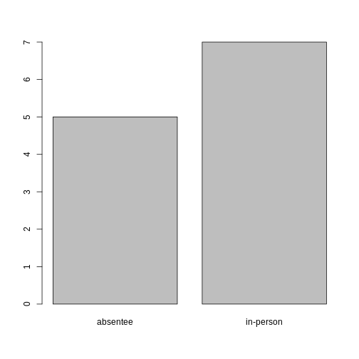
Looking at the plot compared to the output of the vector, we can see that in addition to “absentee”s and “in-person”s, there are some people for whom their ballot type was not noted. Consequently, these people do not appear on the plot! Let’s encode them differently so they can be counted and visualized in our plot.
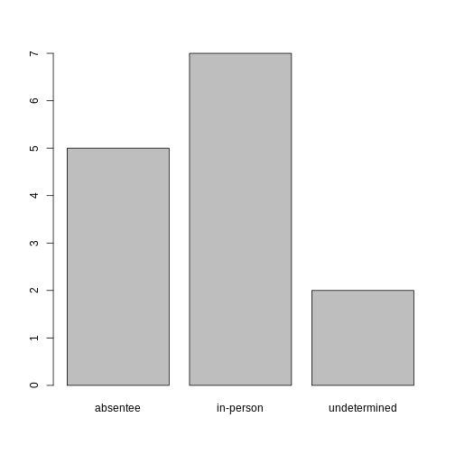
R
#recreates the data
ballotData <- c("in-person", "in-person", "in-person", "in-person", "in-person", "in-person", "in-person", "absentee", "absentee", "absentee", "absentee", "absentee", NA, NA)

#replace the missing data with "undetermined"
ballotData[is.na(ballotData)] <- "undetermined"

#convert it into a factor
ballotData <- as.factor(ballotData)

#prints out the data (as a vector)
ballotData
OUTPUT
 [1] in-person    in-person    in-person    in-person    in-person
 [6] in-person    in-person    absentee     absentee     absentee
[11] absentee     absentee     undetermined undetermined
Levels: absentee in-person undetermined
R
#bar plot of the number of cases per ballot type:
plot(ballotData)
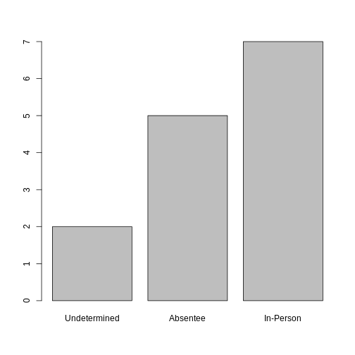
Exercise
- Rename the levels of the factor to be in title case: “Absentee”,“In-Person”, and “Undetermined”.
2, Now that we have renamed the factor level to “Undetermined”, can you recreate the bar plot such that “Undetermined” is first (before “Absentee”)?
R
#part 1:
ballotData <- fct_recode(ballotData,
                         "Absentee" = "absentee",
                         "In-Person" = "in-person",
                         "Undetermined" = "undetermined")

#part 2:
ballotData <- factor(ballotData,
                     levels = c("Undetermined", "Absentee", "In-Person"))
plot(ballotData)
Formatting Dates
Recall our coverage of dates in “Intro to R”. A best practice for
dealing with date data is to ensure that each component of your date is
available as a separate variable. In our data set, we have a column
checkin_time which contains information about the year,
month, day, hour, minute, and second that the person that submitted the
ballot arrived in the building. Let’s convert those dates into six
separate columns.
R
str(data)
We are going to use the package
lubridate, which is included in the
tidyverse installation and should be
loaded by default. However, if we deal with older versions of tidyverse
(2022 and earlier), we can manually load it by typing
library(lubridate).
If necessary, start by loading the required package:
R
library(lubridate)
The lubridate function ymd_hms() takes a vector
representing year, month, day, hour, minutes, and seconds and converts
it to a Date vector.
Let’s extract our checkin_time column and inspect the
structure:
R
times <- data$checkin_time
str(times)
OUTPUT
POSIXct[1:352112], format: "2018-11-06 07:02:36" "2018-11-06 07:04:09" "2018-11-06 07:05:13" ...When we imported the data in R, read_csv() recognized
that this column contained date information. We can now use the
day(), month(), year(),
hour(), minute(), and second()
functions to extract this information from the date, and create new
columns in our tibble to store it:
R
data$day <- day(times)
data$month <- month(times)
data$year <- year(times)
data$hour <- hour(times)
data$minute <- minute(times)
data$seconds <- second(times)

data
OUTPUT
# A tibble: 352,112 × 12
   checkin_id  checkin_length checkin_time        location precinct device   day
   <chr>                <dbl> <dttm>              <chr>    <chr>    <chr>  <int>
 1 CHECKIN_00…             45 2018-11-06 07:02:36 LOCATIO… PRECINC… DEVIC…     6
 2 CHECKIN_00…             29 2018-11-06 07:04:09 LOCATIO… PRECINC… DEVIC…     6
 3 CHECKIN_00…             65 2018-11-06 07:05:13 LOCATIO… PRECINC… DEVIC…     6
 4 CHECKIN_00…             28 2018-11-06 07:06:26 LOCATIO… PRECINC… DEVIC…     6
 5 CHECKIN_00…             17 2018-11-06 07:08:08 LOCATIO… PRECINC… DEVIC…     6
 6 CHECKIN_00…             56 2018-11-06 07:08:32 LOCATIO… PRECINC… DEVIC…     6
 7 CHECKIN_00…             64 2018-11-06 07:09:36 LOCATIO… PRECINC… DEVIC…     6
 8 CHECKIN_00…            262 2018-11-06 07:10:18 LOCATIO… PRECINC… DEVIC…     6
 9 CHECKIN_00…            245 2018-11-06 07:12:57 LOCATIO… PRECINC… DEVIC…     6
10 CHECKIN_00…            260 2018-11-06 07:13:41 LOCATIO… PRECINC… DEVIC…     6
# ℹ 352,102 more rows
# ℹ 5 more variables: month <dbl>, year <dbl>, hour <int>, minute <int>,
#   seconds <dbl>
Notice the six new columns at the end of our tibble.
In our example above, the checkin_time column was read
in correctly as a Date variable but generally that is not
the case. Date columns are often read in as character
variables and, similarly to how you can convert character variables to
dates using the as_date() function, columns can be
converted to the appropriate Date/POSIXctformat.
Let’s say we have a generic tibble of IDs and character dates, as configured:
R
data2 <- tibble(
  ID = c("001", "002", "003"),
  Date = c("01/05/2025", "04/23/2024", "12/25/1987")
)

data2
OUTPUT
# A tibble: 3 × 2
  ID    Date
  <chr> <chr>
1 001   01/05/2025
2 002   04/23/2024
3 003   12/25/1987
As you can see, the Date column is stored as characters.
We can easily convert this to a date type by doing one of the
following:
R
#option 1: base R (as.Date)
data2$Date1 <- as.Date(data2$Date, format = "%m/%d/%Y")

#option 2: lubridate (mdy)
data2$Date2 <- mdy(data2$Date)

data2
OUTPUT
# A tibble: 3 × 4
  ID    Date       Date1      Date2
  <chr> <chr>      <date>     <date>
1 001   01/05/2025 2025-01-05 2025-01-05
2 002   04/23/2024 2024-04-23 2024-04-23
3 003   12/25/1987 1987-12-25 1987-12-25
Date1 and Date2 store the exact same data!
Lubridate is preferred to base R, but either function can be used.
Outputting Data
Occasionally, after editing a data set within RStudio, you may want to output the updated data set to a CSV file. This would allow you to open the updated information in Excel, Google Sheets, or a different RMarkdown file!
To output a file to CSV, we will be using the
write_csv() function from the
readr package. Below, we will be
outputting our updated data with our new date and time columns as
"checkin_data_2.csv":
R
#takes the tibble and outputs it as a csv file
write_csv(data, "data/checkin_data_2.csv")
When choosing the name for the new file, ensure there are no files
with the same name. By default, write_csv() will overwrite
any files of the same name without a warning!
Additionally, you may have noticed we included the file path when specifying the name of the new CSV. When creating any sort of new file – whether that be an image, CSV, or otherwise – R will place the file in the current working directory! In other words, R will always place new files in the same folder as the RMarkdown you’re working in, unless specified otherwise.
Since we have a specific folder (called "data") to store
our csv files, we specify that we want the new CSV file to go in that
folder by adding "data/" before the file name!
If you want to output your new csv to a different file outside of the
working directory, you can use an entire file path (ex.
"C:/Users/name/Documents/checkin_data_2.csv") to specify
exactly where you want the file to be saved.
Note: similarly to reading in CSV files,
readr has a alternate version of
write_csv() called write_csv2() that uses
commas as decimal separators and semicolons as field delimiters.
- Use read_csv to read tabular data in R.
- Access rows and columns in a tibble in R.
- Use factors to represent categorical data in R.
- Use datetime to represent data in R.
- Output an updated data set to CSV in R.
Content from Data Wrangling with dplyr
Last updated on 2026-06-30 | Edit this page
Overview
Questions
- How can I select specific rows and columns from a tibble using dplyr?
- How does the pipe operator
(%\>%)help in combining multiple commands into a single workflow? - What is the advantage of using
mutate()for creating new variables, and how does it work? - How can I summarize my data by grouping observations and applying summary statistics with dplyr?
Objectives
- Understand the purpose of the
dplyrpackage. - Learn how to select specific columns from a tibble using
select. - Learn how to filter rows based on conditions using
filter(). - Use the pipe operator
(%\>%)to seamlessly chain multiple dplyr commands. - Create new columns in a tibble with
mutate(), deriving them from existing data. - Apply the split-apply-combine strategy using
group_by()andsummarize()to generate summary statistics.
dplyr is a powerful and intuitive
package in R designed to make data
manipulation both easy and efficient. It is part of the tidyverse
ecosystem, which emphasizes readable, consistent syntax for working with
data. We’re going to learn some of the most common
dplyr functions:
-
select(): subset columns -
filter(): subset rows on conditions -
mutate(): create new columns by using information from other columns -
group_by()andsummarize(): create summary statistics on grouped data -
arrange(): sort results -
count(): count discrete values
As covered in “Starting with Data”,
dplyr is also part of the tidyverse and
will be loaded in R’s memory when we call
library(tidyverse).
Note
The packages in the tidyverse, namely
dplyr, tidyr
and ggplot2 accept both the British
(e.g. summarise) and American (e.g. summarize)
spelling variants of different function and option names. For this
lesson, we utilize the American spellings of different functions;
however, feel free to use either whichever variant feels best for
you!
To begin working with dplyr, let’s
start by loading in the packages and data set:
R
#load packages
library(tidyverse)
library(here)

#read in data
data <- read_csv(here("data", "checkin_data.csv"))
Selecting Columns
The first function we will be covering is the
select() function! This function allows us
to select specific columns of our data set and accepts two primary types
of arguments: the original data set, and the column(s) to isolate.
In our case, for example, we are interested in seeing ONLY the
precinct id’s in our data set, so our arguments will be
data and precinct:
R
#selects JUST the precinct column
select(data, precinct)
OUTPUT
# A tibble: 352,112 × 1
   precinct
   <chr>
 1 PRECINCT_001
 2 PRECINCT_001
 3 PRECINCT_001
 4 PRECINCT_001
 5 PRECINCT_001
 6 PRECINCT_001
 7 PRECINCT_001
 8 PRECINCT_001
 9 PRECINCT_001
10 PRECINCT_001
# ℹ 352,102 more rows
Using the select function, you can also
select MULTIPLE columns. This can be particularly helpful with larger
data sets. Theoretically, this function can be performed using
subsetting instead of the select function,
but it’s best practice to use dplyr functions when possible:
R
#selects the precinct column AND the checkin_time column
select(data, precinct, checkin_time)
OUTPUT
# A tibble: 352,112 × 2
   precinct     checkin_time
   <chr>        <dttm>
 1 PRECINCT_001 2018-11-06 07:02:36
 2 PRECINCT_001 2018-11-06 07:04:09
 3 PRECINCT_001 2018-11-06 07:05:13
 4 PRECINCT_001 2018-11-06 07:06:26
 5 PRECINCT_001 2018-11-06 07:08:08
 6 PRECINCT_001 2018-11-06 07:08:32
 7 PRECINCT_001 2018-11-06 07:09:36
 8 PRECINCT_001 2018-11-06 07:10:18
 9 PRECINCT_001 2018-11-06 07:12:57
10 PRECINCT_001 2018-11-06 07:13:41
# ℹ 352,102 more rows
In some cases, you may want to select multiple, adjacent columns.
Instead of writing out each individual column name directly, they can be
selected with a :, as seen below:
R
#selects all columns from checkin_time to precinct
select(data, checkin_time:precinct)
You can see a visualized example of the
select() function on tidy
data tutor
Filtering Rows
Our next function we will be covering is the
filter() function! This function allows us
to choose rows based on specific criteria, and accepts two arguments:
the original data set, and the condition to select the rows based off
of. In this case, we ONLY want rows where the precinct is
“PRECINCT_001”:
R
#filters rows where the precinct is "PRECINCT_001"
filter(data, precinct == "PRECINCT_001")
OUTPUT
# A tibble: 648 × 6
   checkin_id     checkin_length checkin_time        location    precinct device
   <chr>                   <dbl> <dttm>              <chr>       <chr>    <chr>
 1 CHECKIN_000001             45 2018-11-06 07:02:36 LOCATION_0… PRECINC… DEVIC…
 2 CHECKIN_000002             29 2018-11-06 07:04:09 LOCATION_0… PRECINC… DEVIC…
 3 CHECKIN_000003             65 2018-11-06 07:05:13 LOCATION_0… PRECINC… DEVIC…
 4 CHECKIN_000004             28 2018-11-06 07:06:26 LOCATION_0… PRECINC… DEVIC…
 5 CHECKIN_000005             17 2018-11-06 07:08:08 LOCATION_0… PRECINC… DEVIC…
 6 CHECKIN_000006             56 2018-11-06 07:08:32 LOCATION_0… PRECINC… DEVIC…
 7 CHECKIN_000007             64 2018-11-06 07:09:36 LOCATION_0… PRECINC… DEVIC…
 8 CHECKIN_000008            262 2018-11-06 07:10:18 LOCATION_0… PRECINC… DEVIC…
 9 CHECKIN_000009            245 2018-11-06 07:12:57 LOCATION_0… PRECINC… DEVIC…
10 CHECKIN_000010            260 2018-11-06 07:13:41 LOCATION_0… PRECINC… DEVIC…
# ℹ 638 more rows
You can also use comparison operators within
filter() arguments! This includes
less-than (<), less-than or equal-to (<=), greater-than (>),
greater-than or equal-to (>=), or not-equal-to (!=).
For example, you could filter for all rows where the check-in length is less-than or equal-to 20 seconds:
R
#filters rows with the "less-than or equal-to"/"<=" operator
filter(data, checkin_length <= 20)
OUTPUT
# A tibble: 32,264 × 6
   checkin_id     checkin_length checkin_time        location    precinct device
   <chr>                   <dbl> <dttm>              <chr>       <chr>    <chr>
 1 CHECKIN_000005             17 2018-11-06 07:08:08 LOCATION_0… PRECINC… DEVIC…
 2 CHECKIN_000017             19 2018-11-06 07:20:40 LOCATION_0… PRECINC… DEVIC…
 3 CHECKIN_000059             19 2018-11-06 08:07:12 LOCATION_0… PRECINC… DEVIC…
 4 CHECKIN_000079             20 2018-11-06 08:25:41 LOCATION_0… PRECINC… DEVIC…
 5 CHECKIN_000092             18 2018-11-06 08:37:45 LOCATION_0… PRECINC… DEVIC…
 6 CHECKIN_000094             19 2018-11-06 08:39:38 LOCATION_0… PRECINC… DEVIC…
 7 CHECKIN_000119             17 2018-11-06 08:57:22 LOCATION_0… PRECINC… DEVIC…
 8 CHECKIN_000162             19 2018-11-06 09:30:57 LOCATION_0… PRECINC… DEVIC…
 9 CHECKIN_000163             20 2018-11-06 09:32:14 LOCATION_0… PRECINC… DEVIC…
10 CHECKIN_000190             18 2018-11-06 09:49:41 LOCATION_0… PRECINC… DEVIC…
# ℹ 32,254 more rows
Similarly to the select() function, the
filter() function also allows us to
specify multiple conditions. However, instead of splitting these by
commas, conditions are combined using ‘and’, ‘or’, or comparison
statements.
In an ‘and’ statement, an observation (row) must meet all
criteria to be included in the resulting tibble. To form ‘and’
statements within dplyr, we can pass our desired conditions as arguments
in the filter() function, separated by an
ampersand (&).
Below, let’s filter rows that include “PRECINCT_001” as the precinct and “DEVICE_002” as the device:
R
#filters rows with the "and"/"&" logical operator
filter(data, precinct == "PRECINCT_001" & device == "DEVICE_002")
OUTPUT
# A tibble: 265 × 6
   checkin_id     checkin_length checkin_time        location    precinct device
   <chr>                   <dbl> <dttm>              <chr>       <chr>    <chr>
 1 CHECKIN_000006             56 2018-11-06 07:08:32 LOCATION_0… PRECINC… DEVIC…
 2 CHECKIN_000009            245 2018-11-06 07:12:57 LOCATION_0… PRECINC… DEVIC…
 3 CHECKIN_000019             41 2018-11-06 07:23:05 LOCATION_0… PRECINC… DEVIC…
 4 CHECKIN_000026             22 2018-11-06 07:33:38 LOCATION_0… PRECINC… DEVIC…
 5 CHECKIN_000028             21 2018-11-06 07:35:44 LOCATION_0… PRECINC… DEVIC…
 6 CHECKIN_000031             33 2018-11-06 07:37:36 LOCATION_0… PRECINC… DEVIC…
 7 CHECKIN_000041             56 2018-11-06 07:49:06 LOCATION_0… PRECINC… DEVIC…
 8 CHECKIN_000044             23 2018-11-06 07:52:08 LOCATION_0… PRECINC… DEVIC…
 9 CHECKIN_000046             24 2018-11-06 07:54:06 LOCATION_0… PRECINC… DEVIC…
10 CHECKIN_000057             48 2018-11-06 08:05:54 LOCATION_0… PRECINC… DEVIC…
# ℹ 255 more rows
In an ‘or’ statement, an observation (row) must meet at least
one criteria to be included in the resulting tibble. To form ‘or’
statements within dplyr, we can pass our desired conditions as arguments
in the filter() function, separated by a
vertical bar (|).
Below, let’s filter rows that include “PRECINCT_001” or “PRECINCT_002” as the precinct:
R
#filters rows with the "or"/"|" logical operator
filter(data, precinct == "PRECINCT_001" | precinct == "PRECINCT_002")
OUTPUT
# A tibble: 905 × 6
   checkin_id     checkin_length checkin_time        location    precinct device
   <chr>                   <dbl> <dttm>              <chr>       <chr>    <chr>
 1 CHECKIN_000001             45 2018-11-06 07:02:36 LOCATION_0… PRECINC… DEVIC…
 2 CHECKIN_000002             29 2018-11-06 07:04:09 LOCATION_0… PRECINC… DEVIC…
 3 CHECKIN_000003             65 2018-11-06 07:05:13 LOCATION_0… PRECINC… DEVIC…
 4 CHECKIN_000004             28 2018-11-06 07:06:26 LOCATION_0… PRECINC… DEVIC…
 5 CHECKIN_000005             17 2018-11-06 07:08:08 LOCATION_0… PRECINC… DEVIC…
 6 CHECKIN_000006             56 2018-11-06 07:08:32 LOCATION_0… PRECINC… DEVIC…
 7 CHECKIN_000007             64 2018-11-06 07:09:36 LOCATION_0… PRECINC… DEVIC…
 8 CHECKIN_000008            262 2018-11-06 07:10:18 LOCATION_0… PRECINC… DEVIC…
 9 CHECKIN_000009            245 2018-11-06 07:12:57 LOCATION_0… PRECINC… DEVIC…
10 CHECKIN_000010            260 2018-11-06 07:13:41 LOCATION_0… PRECINC… DEVIC…
# ℹ 895 more rows
you can see a visualized examples of the
filter() function on tidy
data tutor
Using Pipes
In many cases, you will want to apply multiple functions at the same time! Within dplyr, there are three ways to do this.
- Intermediate Steps: Using this method, you apply the first function to your data and save the result as a new object. After saving, the second function is applied to your new object instead of the original data. While this method is easy to understand, it can create many extra, unnecessary objects in your R environment.
R
#step 1: apply filter function and save it to a new object (filtered_data)
filtered_data <- filter(data, precinct == "PRECINCT_005")

#step 2: apply select function on the filtered_data object
select(filtered_data, precinct, checkin_time)
OUTPUT
# A tibble: 762 × 2
   precinct     checkin_time
   <chr>        <dttm>
 1 PRECINCT_005 2018-11-06 11:39:28
 2 PRECINCT_005 2018-11-06 11:26:09
 3 PRECINCT_005 2018-11-06 18:25:45
 4 PRECINCT_005 2018-11-06 07:01:07
 5 PRECINCT_005 2018-11-06 07:01:22
 6 PRECINCT_005 2018-11-06 07:02:02
 7 PRECINCT_005 2018-11-06 07:02:02
 8 PRECINCT_005 2018-11-06 07:02:38
 9 PRECINCT_005 2018-11-06 07:02:50
10 PRECINCT_005 2018-11-06 07:03:23
# ℹ 752 more rows- Nested Functions: Instead of saving intermediate results, you can instead put your first function inside the second. This is called nesting, and, while it works, can become confusing if more than two functions are put together.
R
# Do it all in one go, nesting the functions
select(filter(data, precinct == "PRECINCT_005"), precinct, checkin_time)
OUTPUT
# A tibble: 762 × 2
   precinct     checkin_time
   <chr>        <dttm>
 1 PRECINCT_005 2018-11-06 11:39:28
 2 PRECINCT_005 2018-11-06 11:26:09
 3 PRECINCT_005 2018-11-06 18:25:45
 4 PRECINCT_005 2018-11-06 07:01:07
 5 PRECINCT_005 2018-11-06 07:01:22
 6 PRECINCT_005 2018-11-06 07:02:02
 7 PRECINCT_005 2018-11-06 07:02:02
 8 PRECINCT_005 2018-11-06 07:02:38
 9 PRECINCT_005 2018-11-06 07:02:50
10 PRECINCT_005 2018-11-06 07:03:23
# ℹ 752 more rows- Using Pipes:
Pipesallow you to connect your commands in a simple, step-by-step way. These let you take the output of one function and send it directly to the next, which is useful when you need to do many things to the same data set! When analyzing code with pipes, you can think of it as the word “then”.
R
#takes the data THEN applies the filter function THEN applies the select function
data %>%
  filter(precinct == "PRECINCT_005") %>%
  select(precinct, checkin_time)
OUTPUT
# A tibble: 762 × 2
   precinct     checkin_time
   <chr>        <dttm>
 1 PRECINCT_005 2018-11-06 11:39:28
 2 PRECINCT_005 2018-11-06 11:26:09
 3 PRECINCT_005 2018-11-06 18:25:45
 4 PRECINCT_005 2018-11-06 07:01:07
 5 PRECINCT_005 2018-11-06 07:01:22
 6 PRECINCT_005 2018-11-06 07:02:02
 7 PRECINCT_005 2018-11-06 07:02:02
 8 PRECINCT_005 2018-11-06 07:02:38
 9 PRECINCT_005 2018-11-06 07:02:50
10 PRECINCT_005 2018-11-06 07:03:23
# ℹ 752 more rows
In the above code, you may have noticed that the data
data set was not included as an argument in either of the functions.
Since pipes take the object on its left and pass it as the first
argument to the function on its right, we don’t need to explicitly
include the tibble as an argument to the filter() and
select() functions anymore.
In R, there are two main types of pipe operators: 1.
|>: called the native pipe —
included with base R. 2.
%>%: called the magrittr pipe
— installed automatically with dplyr. This
pipe is the most common, and what we will be using throughout this
lesson.
Both pipes behave the exact same way, so the choice of which one to use is a matter of taste.
Exercise
Using pipes, filter the data data set to include only
observations where the device is "DEVICE_738"
select only the columns precinct,
checkin_time, and device.
R
data %>%
  filter(device == "DEVICE_738") %>%
  select(precinct, checkin_time, device)
OUTPUT
# A tibble: 134 × 3
   precinct     checkin_time        device
   <chr>        <dttm>              <chr>
 1 PRECINCT_332 2018-11-06 07:02:26 DEVICE_738
 2 PRECINCT_332 2018-11-06 07:03:10 DEVICE_738
 3 PRECINCT_332 2018-11-06 07:03:56 DEVICE_738
 4 PRECINCT_332 2018-11-06 07:04:27 DEVICE_738
 5 PRECINCT_332 2018-11-06 07:05:01 DEVICE_738
 6 PRECINCT_332 2018-11-06 07:06:00 DEVICE_738
 7 PRECINCT_332 2018-11-06 07:06:36 DEVICE_738
 8 PRECINCT_332 2018-11-06 07:07:03 DEVICE_738
 9 PRECINCT_332 2018-11-06 07:07:45 DEVICE_738
10 PRECINCT_332 2018-11-06 07:08:24 DEVICE_738
# ℹ 124 more rows
Split-Apply-Combine Data Analysis
Many data analysis tasks follow a pattern known as split-apply-combine: 1. Split the data into groups. 2. Apply some analysis or calculation to each group. 3. Combine the results into a summary
The dplyr package makes this easy with
two main functions: - group_by() to define how you want to
split the data. - summarize() to apply one or more
calculations on each group and return a summary.
group_by()
The `group_by() function allows us to
treat parts of our data set as separate groups so other functions can
work within each group instead of on the entire data set. This function
accepts the one or more columns to group-by as arguments!
Below, we will be grouping the data by location, and filtering the rows to only include the check-in(s) with the longest check-in length for each location:
R
#groups the data by location and applies filter
data %>%
  group_by(location) %>%
  filter(checkin_length == max(checkin_length))
OUTPUT
# A tibble: 561 × 6
# Groups:   location [417]
   checkin_id     checkin_length checkin_time        location    precinct device
   <chr>                   <dbl> <dttm>              <chr>       <chr>    <chr>
 1 CHECKIN_000032            300 2018-11-06 07:37:43 LOCATION_0… PRECINC… DEVIC…
 2 CHECKIN_000106            300 2018-11-06 08:51:39 LOCATION_0… PRECINC… DEVIC…
 3 CHECKIN_000640            300 2018-11-06 19:47:13 LOCATION_0… PRECINC… DEVIC…
 4 CHECKIN_000839            300 2018-11-06 16:50:29 LOCATION_0… PRECINC… DEVIC…
 5 CHECKIN_001137            299 2018-11-06 10:03:21 LOCATION_0… PRECINC… DEVIC…
 6 CHECKIN_002362            298 2018-11-06 19:09:12 LOCATION_0… PRECINC… DEVIC…
 7 CHECKIN_002572            299 2018-11-06 10:46:01 LOCATION_0… PRECINC… DEVIC…
 8 CHECKIN_003919            300 2018-11-06 18:05:53 LOCATION_0… PRECINC… DEVIC…
 9 CHECKIN_004805            298 2018-11-06 17:57:33 LOCATION_0… PRECINC… DEVIC…
10 CHECKIN_005944            300 2018-11-06 16:17:04 LOCATION_0… PRECINC… DEVIC…
# ℹ 551 more rows
Additionally, when multiple columns are provided,
`group_by() goes from left-to-right,
grouping by the first column, then within each group by the second, and
so on!
Below, we will be doing the same calculation that we did above, but instead of grouping only by location, we will be grouping by location and device:
R
#groups the data by location and applies filter
data %>%
  group_by(location, device) %>%
  filter(checkin_length == max(checkin_length))
OUTPUT
# A tibble: 1,344 × 6
# Groups:   location, device [1,215]
   checkin_id     checkin_length checkin_time        location    precinct device
   <chr>                   <dbl> <dttm>              <chr>       <chr>    <chr>
 1 CHECKIN_000032            300 2018-11-06 07:37:43 LOCATION_0… PRECINC… DEVIC…
 2 CHECKIN_000106            300 2018-11-06 08:51:39 LOCATION_0… PRECINC… DEVIC…
 3 CHECKIN_000640            300 2018-11-06 19:47:13 LOCATION_0… PRECINC… DEVIC…
 4 CHECKIN_000774            295 2018-11-06 12:52:23 LOCATION_0… PRECINC… DEVIC…
 5 CHECKIN_000839            300 2018-11-06 16:50:29 LOCATION_0… PRECINC… DEVIC…
 6 CHECKIN_001015            296 2018-11-06 08:36:18 LOCATION_0… PRECINC… DEVIC…
 7 CHECKIN_001137            299 2018-11-06 10:03:21 LOCATION_0… PRECINC… DEVIC…
 8 CHECKIN_001792            290 2018-11-06 08:00:47 LOCATION_0… PRECINC… DEVIC…
 9 CHECKIN_002210             75 2018-11-06 16:11:09 LOCATION_0… PRECINC… DEVIC…
10 CHECKIN_002362            298 2018-11-06 19:09:12 LOCATION_0… PRECINC… DEVIC…
# ℹ 1,334 more rows
As you can see, there are additional rows, since we are looking at the longest check-in times for each device within each location, instead of just within each location!
After completing analysis, you may want to remove grouping! To do so,
you can use the ungroup() function:
R
data %>%
  group_by(location, device) %>%
  filter(checkin_length == max(checkin_length)) %>%
  ungroup()
OUTPUT
# A tibble: 1,344 × 6
   checkin_id     checkin_length checkin_time        location    precinct device
   <chr>                   <dbl> <dttm>              <chr>       <chr>    <chr>
 1 CHECKIN_000032            300 2018-11-06 07:37:43 LOCATION_0… PRECINC… DEVIC…
 2 CHECKIN_000106            300 2018-11-06 08:51:39 LOCATION_0… PRECINC… DEVIC…
 3 CHECKIN_000640            300 2018-11-06 19:47:13 LOCATION_0… PRECINC… DEVIC…
 4 CHECKIN_000774            295 2018-11-06 12:52:23 LOCATION_0… PRECINC… DEVIC…
 5 CHECKIN_000839            300 2018-11-06 16:50:29 LOCATION_0… PRECINC… DEVIC…
 6 CHECKIN_001015            296 2018-11-06 08:36:18 LOCATION_0… PRECINC… DEVIC…
 7 CHECKIN_001137            299 2018-11-06 10:03:21 LOCATION_0… PRECINC… DEVIC…
 8 CHECKIN_001792            290 2018-11-06 08:00:47 LOCATION_0… PRECINC… DEVIC…
 9 CHECKIN_002210             75 2018-11-06 16:11:09 LOCATION_0… PRECINC… DEVIC…
10 CHECKIN_002362            298 2018-11-06 19:09:12 LOCATION_0… PRECINC… DEVIC…
# ℹ 1,334 more rows
The final table will no longer be considered “grouped”, which can be helpful if you plan to do further operations that don’t rely on grouping.
summarize()
The
summarize()`** function is often used alongside **group_by()`,
as it allows us to reduce a group of rows to a single row per group.
This function accepts one or more expressions that compute summary
statistics as arguments!
Some common `summarize() summary
functions include: - mean(): calculates the average of a numeric column
- max()/min(): returns the maximum or minimum of a group - n(): counts
the number of rows in a group - n_distinct(): counts the number of
unique values in a column
Suppose we want to see how many total check-ins there were for each
precinct in our data set. We can do this by grouping the data by the
precinct column using
group_by()`** and then using the **summarize()`
function to count each row within each precinct group, as seen
below:
R
data %>%
  group_by(precinct) %>%
  summarize(total_checkins = n())
OUTPUT
# A tibble: 420 × 2
   precinct     total_checkins
   <chr>                 <int>
 1 PRECINCT_001            648
 2 PRECINCT_002            257
 3 PRECINCT_003            806
 4 PRECINCT_004            466
 5 PRECINCT_005            762
 6 PRECINCT_006            676
 7 PRECINCT_007           1347
 8 PRECINCT_008           1652
 9 PRECINCT_009            742
10 PRECINCT_010            882
# ℹ 410 more rows
We can also apply `summarize() on data
that has been grouped by multiple columns! Below, we will be grouping by
precinct and device, allowing us to see how many check-ins occurred for
each device within each precinct:
R
data %>%
  group_by(precinct, device) %>%
  summarize(total_checkins = n())
OUTPUT
`summarise()` has regrouped the output.
ℹ Summaries were computed grouped by precinct and device.
ℹ Output is grouped by precinct.
ℹ Use `summarise(.groups = "drop_last")` to silence this message.
ℹ Use `summarise(.by = c(precinct, device))` for per-operation grouping
  (`?dplyr::dplyr_by`) instead.
OUTPUT
# A tibble: 1,778 × 3
# Groups:   precinct [420]
   precinct     device     total_checkins
   <chr>        <chr>               <int>
 1 PRECINCT_001 DEVICE_001            381
 2 PRECINCT_001 DEVICE_002            265
 3 PRECINCT_001 DEVICE_671              1
 4 PRECINCT_001 DEVICE_844              1
 5 PRECINCT_002 DEVICE_003            125
 6 PRECINCT_002 DEVICE_004            131
 7 PRECINCT_002 DEVICE_536              1
 8 PRECINCT_003 DEVICE_005            449
 9 PRECINCT_003 DEVICE_006            357
10 PRECINCT_004 DEVICE_006              1
# ℹ 1,768 more rows
You’re not limited to a single summary statistic, either! For
example, you might want both the total number of check-ins and
the number of unique devices for each precinct. You can combine these in
one summarize() call:
R
data %>%
  group_by(precinct) %>%
  summarize(
    total_checkins = n(),
    unique_devices = n_distinct(device)
  )
OUTPUT
# A tibble: 420 × 3
   precinct     total_checkins unique_devices
   <chr>                 <int>          <int>
 1 PRECINCT_001            648              4
 2 PRECINCT_002            257              3
 3 PRECINCT_003            806              2
 4 PRECINCT_004            466              5
 5 PRECINCT_005            762              5
 6 PRECINCT_006            676              2
 7 PRECINCT_007           1347              5
 8 PRECINCT_008           1652              5
 9 PRECINCT_009            742              7
10 PRECINCT_010            882              6
# ℹ 410 more rows
Additionally, if you need to exclude certain rows before summarizing,
ensure you use filter() before grouping.
For example, to include only check-ins from a specific location, you can
do the following:
R
data %>%
  filter(location == "LOCATION_001") %>%
  group_by(precinct) %>%
  summarize(total_checkins = n())
OUTPUT
# A tibble: 1 × 2
  precinct     total_checkins
  <chr>                 <int>
1 PRECINCT_001            646
Additional examples of the group_by()
and summarize() functions can be found at
tidy
data tutor
arrange()
After summarizing, you may want to sort your results. To do so, you
can use the arrange() function to reorder
rows. For example, to list precincts from lowest to highest check-in
counts, you can do the following:
R
data %>%
  group_by(precinct) %>%
  summarize(total_checkins = n()) %>%
  arrange(total_checkins)
OUTPUT
# A tibble: 420 × 2
   precinct     total_checkins
   <chr>                 <int>
 1 PRECINCT_092              2
 2 PRECINCT_360             11
 3 PRECINCT_411             37
 4 PRECINCT_345             42
 5 PRECINCT_101             43
 6 PRECINCT_253             58
 7 PRECINCT_355             60
 8 PRECINCT_175             64
 9 PRECINCT_031             66
10 PRECINCT_403             68
# ℹ 410 more rows
Or, to instead arrange from highest to lowest, include desc() around
the arrange() attribute, as seen below: #
{r arrange-desc, purl=FALSE} data %>% group_by(precinct) %>% summarize(total_checkins = n()) %>% arrange(desc(total_checkins))
An additional example of the arrange()
function can be found at
tidy data tutor
count()
When working with data, we often want to know how many observations
we have for each factor or combination of factors. As you saw above, we
were able to complete this using the
group_by() function, followed by the
summarize() function.
However, since this is such a common task,
dplyr provides the
count() function to make this task much
quicker and easier to write and perform!
For example, if we want to count the number of check-ins for each
precinct, instead of grouping by precinct and summarizing using the
n() function, we can do the following:
R
data %>%
    count(precinct)
OUTPUT
# A tibble: 420 × 2
   precinct         n
   <chr>        <int>
 1 PRECINCT_001   648
 2 PRECINCT_002   257
 3 PRECINCT_003   806
 4 PRECINCT_004   466
 5 PRECINCT_005   762
 6 PRECINCT_006   676
 7 PRECINCT_007  1347
 8 PRECINCT_008  1652
 9 PRECINCT_009   742
10 PRECINCT_010   882
# ℹ 410 more rows
Additionally, if you’d like your results sorted, instead of using the
arrange() function, you can add “sort =
TRUE” as an argument to the count()
function, as seen below:
R
data %>%
    count(precinct, sort = TRUE)
OUTPUT
# A tibble: 420 × 2
   precinct         n
   <chr>        <int>
 1 PRECINCT_219  1968
 2 PRECINCT_016  1807
 3 PRECINCT_271  1798
 4 PRECINCT_317  1731
 5 PRECINCT_358  1717
 6 PRECINCT_239  1705
 7 PRECINCT_199  1700
 8 PRECINCT_323  1695
 9 PRECINCT_106  1680
10 PRECINCT_045  1671
# ℹ 410 more rowsExercise
Using what you’ve learned above, determine how many check-ins were recorded for each device. Which device had the highest number of check-ins?
R
data %>%
    count(device, sort = TRUE)
OUTPUT
# A tibble: 1,215 × 2
   device         n
   <chr>      <int>
 1 DEVICE_255   898
 2 DEVICE_190   894
 3 DEVICE_642   887
 4 DEVICE_178   850
 5 DEVICE_435   821
 6 DEVICE_960   817
 7 DEVICE_959   812
 8 DEVICE_436   796
 9 DEVICE_641   782
10 DEVICE_822   769
# ℹ 1,205 more rows
“DEVICE_255” has the highest number of check ins, with 898 recorded!
Exercise (continued)
For “PRECINCT_007”, find the device that recorded the least amount of check-ins.
Hint: ensure you filter your data before applying split-apply-combine!
R
data %>%
  filter(precinct == "PRECINCT_007") %>%
  group_by(device) %>%
  summarize(total_checkins = n()) %>%
  arrange(desc(total_checkins))
OUTPUT
# A tibble: 5 × 2
  device     total_checkins
  <chr>               <int>
1 DEVICE_919            462
2 DEVICE_917            448
3 DEVICE_918            426
4 DEVICE_920             10
5 DEVICE_009              1
“DEVICE_009” had the least amount of check-ins, recording only 1.
Mutating Data
Sometimes, you may want to create new columns based on values in existing columns. For example, if you have a column represented in seconds, and you might want to add a new column with the same information, but represented as minutes instead.
To complete this, we use the `mutate()
function. This function allows us to create new columns OR modify
existing columns by applying operations to each row of the data set!
For example, let’s say that we want to create a new column that, as
mentioned above, converts the checkin_length column (which
is in seconds) into minutes by dividing each value by 60. Below, we can
use the mutate function to add this column to our data:
R
data %>%
    mutate(checkin_length_min = checkin_length / 60)
OUTPUT
# A tibble: 352,112 × 7
   checkin_id     checkin_length checkin_time        location    precinct device
   <chr>                   <dbl> <dttm>              <chr>       <chr>    <chr>
 1 CHECKIN_000001             45 2018-11-06 07:02:36 LOCATION_0… PRECINC… DEVIC…
 2 CHECKIN_000002             29 2018-11-06 07:04:09 LOCATION_0… PRECINC… DEVIC…
 3 CHECKIN_000003             65 2018-11-06 07:05:13 LOCATION_0… PRECINC… DEVIC…
 4 CHECKIN_000004             28 2018-11-06 07:06:26 LOCATION_0… PRECINC… DEVIC…
 5 CHECKIN_000005             17 2018-11-06 07:08:08 LOCATION_0… PRECINC… DEVIC…
 6 CHECKIN_000006             56 2018-11-06 07:08:32 LOCATION_0… PRECINC… DEVIC…
 7 CHECKIN_000007             64 2018-11-06 07:09:36 LOCATION_0… PRECINC… DEVIC…
 8 CHECKIN_000008            262 2018-11-06 07:10:18 LOCATION_0… PRECINC… DEVIC…
 9 CHECKIN_000009            245 2018-11-06 07:12:57 LOCATION_0… PRECINC… DEVIC…
10 CHECKIN_000010            260 2018-11-06 07:13:41 LOCATION_0… PRECINC… DEVIC…
# ℹ 352,102 more rows
# ℹ 1 more variable: checkin_length_min <dbl>
Admittedly, this operation doesn’t tell us anything additional about our data, as it only converts part of our data into a different format. But, with a more complex operation we could, for example, add a column that says whether a check-in length is “abnormal” or not!
For the sake of the example, let’s say that any check-in length greater-than or equal-to 200 seconds is abnormal:
R
data %>%
  mutate(checkin_category = ifelse(checkin_length >= 200, "abnormal", "normal"))
OUTPUT
# A tibble: 352,112 × 7
   checkin_id     checkin_length checkin_time        location    precinct device
   <chr>                   <dbl> <dttm>              <chr>       <chr>    <chr>
 1 CHECKIN_000001             45 2018-11-06 07:02:36 LOCATION_0… PRECINC… DEVIC…
 2 CHECKIN_000002             29 2018-11-06 07:04:09 LOCATION_0… PRECINC… DEVIC…
 3 CHECKIN_000003             65 2018-11-06 07:05:13 LOCATION_0… PRECINC… DEVIC…
 4 CHECKIN_000004             28 2018-11-06 07:06:26 LOCATION_0… PRECINC… DEVIC…
 5 CHECKIN_000005             17 2018-11-06 07:08:08 LOCATION_0… PRECINC… DEVIC…
 6 CHECKIN_000006             56 2018-11-06 07:08:32 LOCATION_0… PRECINC… DEVIC…
 7 CHECKIN_000007             64 2018-11-06 07:09:36 LOCATION_0… PRECINC… DEVIC…
 8 CHECKIN_000008            262 2018-11-06 07:10:18 LOCATION_0… PRECINC… DEVIC…
 9 CHECKIN_000009            245 2018-11-06 07:12:57 LOCATION_0… PRECINC… DEVIC…
10 CHECKIN_000010            260 2018-11-06 07:13:41 LOCATION_0… PRECINC… DEVIC…
# ℹ 352,102 more rows
# ℹ 1 more variable: checkin_category <chr>
This code filters out duplicate entries, showing just one record for each unique precinct and the new column we just added.
Additional examples of the mutate()
function can be found at tidy
data tutor
Exercise
Using what you’ve learned throughout this lesson, create a tibble called “avg_checkins” that meets the following criteria: 1. Includes only precincts from “PRECINCT_001” to “PRECINCT_035”. 2. Removes the “PRECINCT_0” prefix from the precinct names and converts each precinct name to a numeric value. 3. Calculates the average check-in length for each precinct, ensuring this column is named “avg_checkin_length”. 4. Contains two columns: “precinct” and “avg_checkin_length”. 5. Sorts the tibble by precinct (1 to 35).
R
avg_checkins <- data %>%
  mutate(precinct = as.numeric(str_remove(precinct, "PRECINCT_0"))) %>%
  filter(precinct >= 1 & precinct <= 35) %>%
  group_by(precinct) %>%
  summarize(avg_checkin_length = mean(checkin_length)) %>%
  arrange(precinct)
WARNING
Warning: There was 1 warning in `mutate()`.
ℹ In argument: `precinct = as.numeric(str_remove(precinct, "PRECINCT_0"))`.
Caused by warning:
! NAs introduced by coercionExercise (continued)
Save your new “avg_checkins” into your data folder as “avg_checkins.csv”!
R
write_csv(avg_checkins, "data/avg_checkins.csv")
- Use the
dplyrpackage to manipulate tibbles. - Use
select()to choose variables from a tibble. - Use
filter()to choose data based on values. - Use
group_by()andsummarize()to work with subsets of data. - Use
mutate()to create new variables.
Content from Data Wrangling with tidyr
Last updated on 2026-06-30 | Edit this page
Overview
Questions
- How can I reformat a tibble to meet my needs?
Objectives
- Describe the concept of a wide and a long table format and for which purpose those formats are useful.
- Describe the roles of variable names and their associated values when a table is reshaped.
- Reshape a tibble from long to wide format and back with the
pivot_widerandpivot_longercommands from thetidyrpackage.
dplyr pairs nicely with
tidyr, a package that enables you to
swiftly convert between different data formats (long vs. wide) for
plotting and analysis. To learn more about
tidyr after the workshop, you may want to
check out this handy
data tidying with tidyr
cheatsheet.
To make sure everyone will use the same data sets for this lesson, we’ll be reading in the updated version of the Check-In Dataset (as created in “Starting With Data”), as well as the Messy Dataset (which we will cover at the end of this lesson).
Reading in Data
To start, we will load in the tidyverse
and here packages so we can read in our
CSV files.
R
library(tidyverse)
library(here)
Next, we will read in the Check-In Data:
R
data <- read_csv(here("data", "checkin_data_2.csv"))
Reshaping with pivot_wider() and pivot_longer()
There are essentially three rules that define a “tidy” data set:
- Each variable has its own column
- Each observation has its own row
- Each value must have its own cell
This graphic visually represents the three rules that define a “tidy” data set:
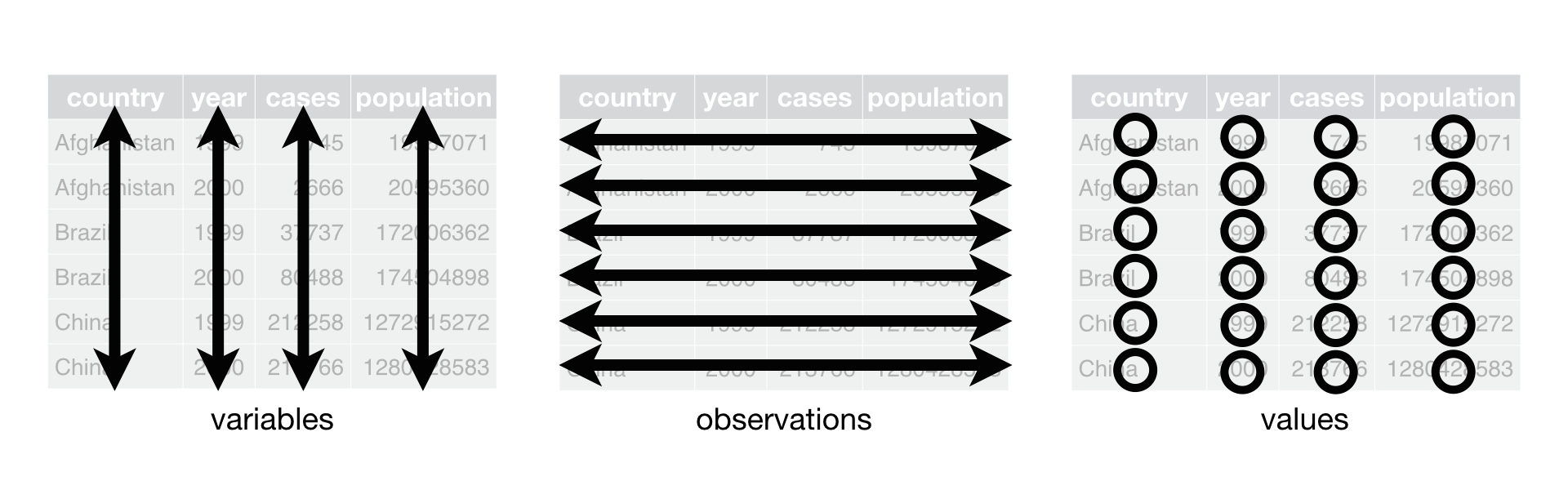 R for Data Science, Wickham H and Grolemund G (https://r4ds.had.co.nz/index.html)
© Wickham, Grolemund 2017 This image is licensed under
Attribution-NonCommercial-NoDerivs 3.0 United States (CC-BY-NC-ND 3.0
US)
R for Data Science, Wickham H and Grolemund G (https://r4ds.had.co.nz/index.html)
© Wickham, Grolemund 2017 This image is licensed under
Attribution-NonCommercial-NoDerivs 3.0 United States (CC-BY-NC-ND 3.0
US)
In this section we will explore how these rules are linked to the different data formats researchers are often interested in: “wide” and “long”. This tutorial will help you efficiently transform your data shape, regardless of its original format.
First, we will explore qualities of the data data and
how they relate to these different types of data formats.
Long and Wide Data Formats
In data, each row contains the values of variables
associated with each record collected (each ballot instance). As you may
recall from “Starting With Data”, it was stated that the
checkin_id was added to provide a “unique key/ID” for each
individual ballot.
Since checkin_id is unique to each instance, we can use
this variable as an identifier corresponding to each of the 352112
observations.
R
data %>%
  select(checkin_id) %>%
  distinct() %>%
  nrow()
OUTPUT
[1] 352112As seen in the code below, for each check-in time corresponding to
each device, no two checkin_ids are the same. Thus, this
format is what we call a “long” data format, where each observation
occupies only one row in the tibble.
R
data %>%
  filter(location == "LOCATION_001") %>%
  select(checkin_id, checkin_time, location) %>%
  sample_n(size = 10)
OUTPUT
# A tibble: 10 × 3
   checkin_id     checkin_time        location
   <chr>          <dttm>              <chr>
 1 CHECKIN_000067 2018-11-06 08:12:23 LOCATION_001
 2 CHECKIN_000075 2018-11-06 08:19:08 LOCATION_001
 3 CHECKIN_000266 2018-11-06 11:03:23 LOCATION_001
 4 CHECKIN_000536 2018-11-06 17:33:14 LOCATION_001
 5 CHECKIN_000159 2018-11-06 09:28:50 LOCATION_001
 6 CHECKIN_000274 2018-11-06 11:16:58 LOCATION_001
 7 CHECKIN_000320 2018-11-06 11:52:43 LOCATION_001
 8 CHECKIN_000167 2018-11-06 09:34:43 LOCATION_001
 9 CHECKIN_000388 2018-11-06 13:42:07 LOCATION_001
10 CHECKIN_000393 2018-11-06 13:49:08 LOCATION_001
If you were to look at the entire data data set, you
would notice that the layout/format of the data adheres to rules 1-3,
where:
- each column is a variable
- each row is an observation
- each value has its own cell
As mentioned above, this is called a “long” data format. Additionally, you may notice that each column represents a different variable. In the “longest” data format there would only be three columns, one for the id variable, one for the observed variable, and one for the observed value (of that variable). This data format is quite unsightly and difficult to work with, so you will rarely see it in use.
Alternatively, in a “wide” data format we see modifications to rule 1, where each column no longer represents a single variable. Instead, columns can represent different levels/values of a variable. For instance, in some data you encounter, the researchers may have chosen for every check-in hour to be a different column.
These may sound like dramatically different data layouts, but there are some tools that make transitions between these layouts much simpler than you might think! The GIF below shows how these two formats relate to each other, and gives you an idea of how we can use R to shift from one format to the other.
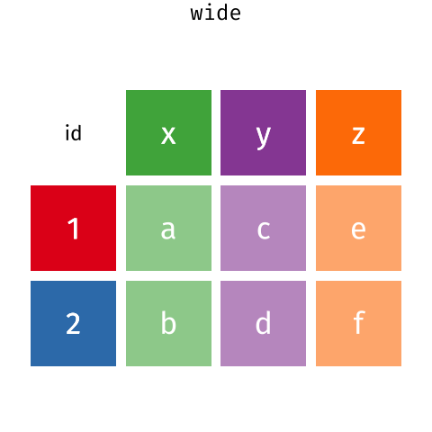
Long and wide tibble layouts mainly affect readability. You may find that visually you may prefer the “wide” format, since you can see more of the data on the screen. However, all of the R functions we have used thus far expect for your data to be in a “long” data format. This is because the long format is more machine readable and is closer to the formatting of databases.
Questions That Warrant Different Data Formats
In data, each row contains values associated with each
record (the unit). This may include values such as the ID of the ballot
box, the ballot box’s location, the precinct the ballot box belongs to,
or the arrival time of the person submitting the ballot. This format
allows for us to make comparisons across individual ballot
instances!
However, what if we wanted to look at how many check-ins occurred each hour in regards to each polling location?
To facilitate this comparison, we would need to create a new table
where each row (the unit) represents a polling location (associated with
the location column), each column (after the first)
represents an hour of the day (associated with the hour
column), and the values of each row containing the number of check-ins
recorded at that location during that hour.
Once we we’ve created this new table, we can explore the relationships within and between locations. The key point here is that we are still following a tidy data structure, but we have reshaped the data according to the observations of interest.
Alternatively, let’s say the check-in times were originally spread across multiple columns, and we were interested in visualizing, across multiple locations, how check-in activity has changed over the course of the day. This would require the check-in time to be included in a single column rather than spread across multiple columns. Thus, we would need to transform the column names into the values of a variable.
We can do both of these transformations with two
tidyr functions,
pivot_wider() and pivot_longer().
Pivoting Wider
pivot_wider() takes in three principal arguments:
- the data to be transformed
- the names_from column variable (whose values will become new column names).
- the values_from column variable (whose values will fill the new column variables).
Further arguments include values_fill which, if set,
fills in missing values with the value provided, and
names_sort, which, if set, sorts the columns in
alphanumerical order.
Let’s use pivot_wider() to transform data
to create new columns for each hour represented within the data.
To help with understanding, we will be walking through the transformation line-by-line.
First we create a new object (data_tc) based on the
data tibble:
Our next step will be to get the values for each cell, so we will be
using the count() function from the
dplyr package. This is completed in the
next line, grouping by location and hour:
Finally, we will be creating and populating the new, “wide” data using the counts and the column values! This can be seen below:
R
pivot_wider(
  names_from = hour,
  values_from = n,
  values_fill = 0
)
Now that we understand what’s going on, let’s combine all those chunks together and look at what our completed tibble looks like!
R
#create the object
data_tc <- data %>%
  #get the values
  count(location, hour) %>%
  #pivot the data
  pivot_wider(
  names_from = hour,
  values_from = n,
  values_fill = 0
)

head(data_tc)
OUTPUT
# A tibble: 6 × 16
  location       `7`   `8`   `9`  `10`  `11`  `12`  `13`  `14`  `15`  `16`  `17`
  <chr>        <int> <int> <int> <int> <int> <int> <int> <int> <int> <int> <int>
1 LOCATION_001    50    71    77    62    65    40    41    30    28    35    62
2 LOCATION_002    16    29    19    32    14    22    14    13    19    20    24
3 LOCATION_003    74    69    88   106    65    64    54    42    49    51    55
4 LOCATION_004    81    74    73    61    59    29    35    36    42    45    54
5 LOCATION_005    53    31    57    64    61    49    57    45    54    67    99
6 LOCATION_006   115    65    75    75    78    44    50    52    50    92    88
# ℹ 4 more variables: `18` <int>, `19` <int>, `6` <int>, `20` <int>
Oh no! It looks like the hours columns are out of order, with 6 sitting between 19 and 20. If we were to perform data analysis, this would not matter, but visually, this can be confusing or misleading, since we expect time to move from left to right in ascending order.
In order to fix this, we can add the aforementioned
names_sort argument to the function to specify that the
columns should be in order. This line has been added to the code block
below:
R
#create the object
data_tc <- data %>%
  #get the values
  count(location, hour) %>%
  #pivot the data
  pivot_wider(
  names_from = hour,
  values_from = n,
  values_fill = 0,
  names_sort = TRUE #sorts the columns from left to right
)

head(data_tc)
OUTPUT
# A tibble: 6 × 16
  location       `6`   `7`   `8`   `9`  `10`  `11`  `12`  `13`  `14`  `15`  `16`
  <chr>        <int> <int> <int> <int> <int> <int> <int> <int> <int> <int> <int>
1 LOCATION_001     0    50    71    77    62    65    40    41    30    28    35
2 LOCATION_002     0    16    29    19    32    14    22    14    13    19    20
3 LOCATION_003     0    74    69    88   106    65    64    54    42    49    51
4 LOCATION_004     0    81    74    73    61    59    29    35    36    42    45
5 LOCATION_005     0    53    31    57    64    61    49    57    45    54    67
6 LOCATION_006     1   115    65    75    75    78    44    50    52    50    92
# ℹ 4 more variables: `17` <int>, `18` <int>, `19` <int>, `20` <int>
As seen by the outputted tibble above, the hour columns now appear in ascending order, making the table far easier to interpret at a glance!
Now that we’ve used pivot_wider() to make our data
“wide”, let’s take a closer look at the resulting data_tc
tibble to gain a better understanding.
First, let’s check the dimensions:
R
dim(data_tc)
OUTPUT
[1] 417 16As we can see, there are 417 rows and 16 columns! Each row represents
a unique location within the data set. We can verify this by counting
the number of unique location values within data:
R
n_distinct(data$location)
OUTPUT
[1] 417This also returns 417, confirming that each row corresponds to a single, unique location within the data.
Next, let’s look at the 16 columns of the tibble:
R
colnames(data_tc)
OUTPUT
 [1] "location" "6"        "7"        "8"        "9"        "10"
 [7] "11"       "12"       "13"       "14"       "15"       "16"
[13] "17"       "18"       "19"       "20"
Notice there is no longer a column titled hour. This is
because the pivot_wider() function, by default, removes the
original column that the new column values were taken from. In this
case, the values from the original hour column have now
become columns with names that range from 6 to 20, representing the
hours from 6AM to 8PM, and thus the hour column has been
dropped.
This new format of the data allows us to do interesting things, like make a table showing the number of check-ins across all locations at a particular time, with the rows being ordered from highest to lowest in terms of count:
R
data_tc %>%
  select(location, `7`) %>%
  arrange(desc(`7`))
OUTPUT
# A tibble: 417 × 2
   location       `7`
   <chr>        <int>
 1 LOCATION_233   234
 2 LOCATION_364   215
 3 LOCATION_258   212
 4 LOCATION_366   197
 5 LOCATION_417   197
 6 LOCATION_306   194
 7 LOCATION_317   193
 8 LOCATION_166   189
 9 LOCATION_403   188
10 LOCATION_386   183
# ℹ 407 more rows
Or, we can calculate the total amount of check-ins for each location across all hours, and sort the data to determine which location had the least check-ins:
R
data_tc %>%
  mutate(total_checkins = rowSums(data_tc[-1])) %>%
  select(location, total_checkins) %>%
  arrange(total_checkins)
OUTPUT
# A tibble: 417 × 2
   location     total_checkins
   <chr>                 <dbl>
 1 LOCATION_048              2
 2 LOCATION_308             11
 3 LOCATION_393             38
 4 LOCATION_103             42
 5 LOCATION_280             42
 6 LOCATION_164             58
 7 LOCATION_298             60
 8 LOCATION_101             64
 9 LOCATION_014             66
10 LOCATION_138             68
# ℹ 407 more rowsExercise
We created data_tc by reshaping the data. Replicate this
process to create a tibble named data_total that shows the
total number of check-ins for each hour, across all locations.
The resulting tibble should have columns for each hour, sorted from
earliest to latest similarly to the data_tc tibble. There
should only be one row, representative of all locations, and an extra
summary column, called total_checkins, that calculates the
total number of check ins across the entire data data
set.
R
data_total <- data %>%
  count(hour) %>%
  pivot_wider(
    names_from = hour,
    values_from = n,
    values_fill = 0,
    names_sort = TRUE
    ) %>%
  mutate(total_checkins = rowSums(across(everything())))

data_total
OUTPUT
# A tibble: 1 × 16
    `6`   `7`   `8`   `9`  `10`  `11`  `12`  `13`  `14`  `15`  `16`  `17`  `18`
  <int> <int> <int> <int> <int> <int> <int> <int> <int> <int> <int> <int> <int>
1   265 34918 29613 34076 35186 30909 23119 21751 20178 23233 28925 31774 25924
# ℹ 3 more variables: `19` <int>, `20` <int>, total_checkins <dbl>
R
#alternative solution:
data_total_2 <- data %>%
  count(hour) %>%
  pivot_wider(
    names_from = hour,
    values_from = n,
    values_fill = 0,
    names_sort = TRUE
    )

data_total_2 <- data_total_2 %>%
  mutate(total_checkins = rowSums(data_total_2))

data_total_2
OUTPUT
# A tibble: 1 × 16
    `6`   `7`   `8`   `9`  `10`  `11`  `12`  `13`  `14`  `15`  `16`  `17`  `18`
  <int> <int> <int> <int> <int> <int> <int> <int> <int> <int> <int> <int> <int>
1   265 34918 29613 34076 35186 30909 23119 21751 20178 23233 28925 31774 25924
# ℹ 3 more variables: `19` <int>, `20` <int>, total_checkins <dbl>
Pivoting Longer
The opposing situation could occur if we had been provided with the
data_tc tibble, but instead of treating each hour as an
individual column, we instead wish to treat them as values of a variable
instead.
In this situation, we are gathering all of these columns and turning
them into a pair of new variables. One variable will include the column
names as values (checkin_hour), and the other will contain
the values in each cell previously associated with the column names
(checkin_count)!
pivot_longer() takes four principal arguments:
- the data to be transformed
- the names of the columns we use to fill the a new values variable (or to drop), referred to as cols.
- the names_to column variable we wish to create from the cols provided.
- the values_to column variable we wish to create and fill with values associated with the cols provided.
R
data_tc_long <- data_tc %>%
  pivot_longer(cols = `6`:`20`,
               names_to = "checkin_hour",
               values_to = "checkin_count")
Below, we will look at the two tibbles and compare their structures:
R
head(data_tc)
OUTPUT
# A tibble: 6 × 16
  location       `6`   `7`   `8`   `9`  `10`  `11`  `12`  `13`  `14`  `15`  `16`
  <chr>        <int> <int> <int> <int> <int> <int> <int> <int> <int> <int> <int>
1 LOCATION_001     0    50    71    77    62    65    40    41    30    28    35
2 LOCATION_002     0    16    29    19    32    14    22    14    13    19    20
3 LOCATION_003     0    74    69    88   106    65    64    54    42    49    51
4 LOCATION_004     0    81    74    73    61    59    29    35    36    42    45
5 LOCATION_005     0    53    31    57    64    61    49    57    45    54    67
6 LOCATION_006     1   115    65    75    75    78    44    50    52    50    92
# ℹ 4 more variables: `17` <int>, `18` <int>, `19` <int>, `20` <int>
R
head(data_tc_long)
OUTPUT
# A tibble: 6 × 3
  location     checkin_hour checkin_count
  <chr>        <chr>                <int>
1 LOCATION_001 6                        0
2 LOCATION_001 7                       50
3 LOCATION_001 8                       71
4 LOCATION_001 9                       77
5 LOCATION_001 10                      62
6 LOCATION_001 11                      65
As you can see, the hours and their corresponding counts for each location are now separated into individual rows! Each location appears multiple times – once for every hour – rather than appearing just once, as in a wide-table format.
Exercise
In the last exercise, you created the wide tibble,
data_total. In this exercise, your goal is to reverse this
transformation using pivot_longer().
Create a tibble called data_total_long that has two
columns: one for the hour, and one for the corresponding check-in count.
During your transformation, remove the total_checkins
column.
R
data_total_long <- data_total %>%
  select(-total_checkins) %>%
  pivot_longer(
    cols = everything(),
    names_to = "hour",
    values_to = "checkin_count"
  )

data_total_long
OUTPUT
# A tibble: 15 × 2
   hour  checkin_count
   <chr>         <int>
 1 6               265
 2 7             34918
 3 8             29613
 4 9             34076
 5 10            35186
 6 11            30909
 7 12            23119
 8 13            21751
 9 14            20178
10 15            23233
11 16            28925
12 17            31774
13 18            25924
14 19            12178
15 20               63
Other Useful tidyr Functions
Throughout this lesson, we used only a portion of the commands that
tidyr offers for data transformation.
Below, we will be briefly covering some other functions that may prove
useful throughout your future analyses (you can refer to the
tidyr cheat sheet linked at the beginning
of the lesson for more in-depth explanations):
-
separate_longer_delim()– splits one column into many rows, based on a delimiter.
R
tibble(location = "1", count = "1,2,3") %>%
  separate_longer_delim(count, delim = ",")
OUTPUT
# A tibble: 3 × 2
  location count
  <chr>    <chr>
1 1        1
2 1        2
3 1 3 -
separate_wider_delim()– splits one column into multiple columns, based on a delimiter.
R
tibble(date = "01/01/2025") %>%
  separate_wider_delim(date, delim = "/", names = c("month", "day", "year"))
OUTPUT
# A tibble: 1 × 3
  month day   year
  <chr> <chr> <chr>
1 01 01 2025 -
unite()– combines multiple columns into one.
R
tibble(city = "Providence", state = "RI") %>%
  unite("location", city, state, sep = ", ")
OUTPUT
# A tibble: 1 × 1
  location
  <chr>
1 Providence, RI-
replace_na()– fills in missing values (NA) with a value of choice. The replacement must be in a list.
R
tibble(count = c(1, NA, 3)) %>%
  replace_na(list(count = 2))
OUTPUT
# A tibble: 3 × 1
  count
  <dbl>
1     1
2     2
3 3-
drop_na()– removes rows that contain missing values (NA).
R
tibble(count = c(1, NA, 3)) %>%
  drop_na()
OUTPUT
# A tibble: 2 × 1
  count
  <dbl>
1     1
2 3-
fill()– fills in missing values (NA) with the value either above (.direction = “down”) or below (.direction = “up”) it.
R
#below
tibble(count = c(1, NA, 3)) %>%
  fill(count, .direction = "up")
OUTPUT
# A tibble: 3 × 1
  count
  <dbl>
1     1
2     3
3     3
R
#above
tibble(count = c(1, NA, 3)) %>%
  fill(count, .direction = "down")
OUTPUT
# A tibble: 3 × 1
  count
  <dbl>
1     1
2     1
3 3-
complete()– fills in all combinations of variables that could exist, but don’t within the inputted data.
R
tibble(location = c("A", "B", "B"), hour = c(3, 1, 2)) %>%
  complete(location, hour)
OUTPUT
# A tibble: 6 × 2
  location  hour
  <chr>    <dbl>
1 A            1
2 A            2
3 A            3
4 B            1
5 B            2
6 B            3
Applying What We Learned to Clean Data
Introduction to the Messy Dataset
The Messy Dataset is an example of a “messy” data set that tracks when people check-in to a voting location! In the context of the data set, labels (“provisional”, “assistance”, and “provisional and assistance”) are used to explain why check-in times may be longer than average. If a check-in does not have a label, assistance was not needed, and the check-in can be considered “normal”. Within this data set, missing data is encoded as “NULL”.
The following is a visual representation of the data set’s columns:
| column_name | description |
|---|---|
| CheckIn_Duration_Provisional | Includes check-ins that fall under the “Provisional” label. |
| CheckIn_Duration_Assistance | Includes check-ins that fall under the “Assistance” label. |
| CheckIn_Duration_Provisional_and_Assistance | Includes check-ins that fall under the “Provisional and Assistance” label. |
| CheckIn_Duration_ | Includes check-ins that did not fall under any label, or in other words, were normal. |
As mentioned above, missing information in data is encoded as “NULL”.
This requires us to specify na = "NULL" within the
read_csv() function, allowing R to automatically convert
all the “NULL” entries in the data set into NA.
Below, we will be reading in the Check-In Dataset using the additional line:
R
messy_data <- read_csv(here("data", "messy_data.csv"), na = "NULL")
Tidying the Data
Throughout this next section, we’re going to be tidying/cleaning the Check-In Data step-by-step to ensure understanding throughout!
We’ll start by looking at the data so we can understand what we’re working with:
R
messy_data
OUTPUT
# A tibble: 514 × 4
CheckIn_Duration_Provisional CheckIn_Duration_Assist…¹ CheckIn_Duration_Pro…²
<dbl> <dbl> <dbl>
1 NA NA NA
2 NA NA NA
3 NA NA NA
4 NA NA NA
5 NA NA NA
6 NA NA NA
7 NA NA NA
8 NA NA NA
9 NA NA NA
10 NA NA NA
# ℹ 504 more rows
# ℹ abbreviated names: ¹CheckIn_Duration_Assistance,
# ²CheckIn_Duration_Provisional_and_Assistance
# ℹ 1 more variable: CheckIn_Duration_ <dbl>At first glance, we can see this data set is wide, with each label tacked onto the end of the phrase “CheckIn_Duration_” and underscores replacing spaces. Additionally, there is no label after “CheckIn_Duration_”, which indicates this is likely representative of the normal check-ins!
However, looking at how many missing values there are, it may be a
better choice to turn the data into “long” data, instead of “wide” data,
with a duration column, and a label column.
Let’s apply this pivot to a new tibble, named clean_data,
below:
R
clean_data <- messy_data %>%
  pivot_longer(cols = everything(),
               names_to = "label",
               values_to = "duration")

head(clean_data)
OUTPUT
# A tibble: 6 × 2
  label                                       duration
  <chr>                                          <dbl>
1 CheckIn_Duration_Provisional                      NA
2 CheckIn_Duration_Assistance                       NA
3 CheckIn_Duration_Provisional_and_Assistance       NA
4 CheckIn_Duration_                                 80
5 CheckIn_Duration_Provisional                      NA
6 CheckIn_Duration_Assistance                       NA
Oh no! That’s a lot of NA values. Taking a closer look
at the original data, we can see the first value within the data set
consists of a duration of 80 underneath the
"CheckIn_Duration_" column. Looking at our in-progress,
“clean” data set, we can see the labels that do not apply to this
duration are listed as NA.
Since the labels that have a duration of NA do not
matter within our data set, we can drop them from the tibble
completely:
R
clean_data <- clean_data %>%
  drop_na()

head(clean_data)
OUTPUT
# A tibble: 6 × 2
  label             duration
  <chr>                <dbl>
1 CheckIn_Duration_       80
2 CheckIn_Duration_       55
3 CheckIn_Duration_       61
4 CheckIn_Duration_       58
5 CheckIn_Duration_       63
6 CheckIn_Duration_       64
Now we’re getting somewhere! Next, when we loaded in the data set, it was noted that underscores replaced spaces throughout the data. As seen below, the next step is to revert that change:
R
clean_data <- clean_data %>%
  #including "all" in the str replace call ensures both underscores are replaced
  mutate(label = str_replace_all(label, "_", " "))

head(clean_data)
OUTPUT
# A tibble: 6 × 2
  label               duration
  <chr>                  <dbl>
1 "CheckIn Duration "       80
2 "CheckIn Duration "       55
3 "CheckIn Duration "       61
4 "CheckIn Duration "       58
5 "CheckIn Duration "       63
6 "CheckIn Duration "       64
Our next step is removing the “CheckIn Duration” phrase from each label, which we will be completing below:
R
clean_data <- clean_data %>%
  mutate(label = str_remove(label, "CheckIn Duration "))

head(clean_data)
OUTPUT
# A tibble: 6 × 2
  label duration
  <chr>    <dbl>
1 ""          80
2 ""          55
3 ""          61
4 ""          58
5 ""          63
6 ""          64
After removing the “CheckIn Duration” prefix, we can see that some of our labels are now an empty strings. However, as you may recall from our initial analysis of the data, empty labels indicate that the check-in was normal! So, our next step will be replacing the empty labels with “Normal” labels:
R
clean_data <- clean_data %>%
  mutate(label = ifelse(label == "", "Normal", label))

head(clean_data)
OUTPUT
# A tibble: 6 × 2
  label  duration
  <chr>     <dbl>
1 Normal       80
2 Normal       55
3 Normal       61
4 Normal       58
5 Normal       63
6 Normal       64
Now, our data is clean! In practice, all of these functions can (and should!) be chained together using pipes (and comments), as seen in the code block below:
R
clean_data_final <- messy_data %>%
  #pivot longer by label
  pivot_longer(cols = everything(),
               names_to = "label",
               values_to = "duration") %>%
  #remove rows with missing values
  drop_na() %>%
  #replace underscores with spaces
  mutate(label = str_replace_all(label, "_", " ")) %>%
  #remove "CheckIn Duration " from each label
  mutate(label = str_remove(label, "CheckIn Duration ")) %>%
  #replace empty labels with "Normal"
  mutate(label = ifelse(label == "", "Normal", label))

head(clean_data_final)
OUTPUT
# A tibble: 6 × 2
  label  duration
  <chr>     <dbl>
1 Normal       80
2 Normal       55
3 Normal       61
4 Normal       58
5 Normal       63
6 Normal       64
Since our data has been cleaned, we can now export it as
clean_data.csv for use in future analysis. As you may
recall from “Starting with Data”, we will be using the
write_csv() function, specifying that we want our csv to go
into our data folder:
R
write_csv(clean_data_final, "data/clean_data.csv")
- Use the
tidyrpackage to change the layout of tibbles. - Use
pivot_wider()to go from long to wide format. - Use
pivot_longer()to go from wide to long format.
Content from Data Visualisation with ggplot2
Last updated on 2026-06-30 | Edit this page
Overview
Questions
- What are the components of a ggplot?
- How can I visualize check-in patterns over time?
- How can I compare check-in frequencies across locations and devices?
- What are the main differences between R base plots, lattice, and ggplot?
- How can I visualize location data on maps with ggplot2?
Objectives
- Produce scatter plots, box plots, and bar plots using ggplot.
- Create time series plots for temporal check-in data.
- Set universal plot settings.
- Describe what faceting is and apply faceting in ggplot.
- Modify the aesthetics of an existing ggplot plot (including axis labels and color).
- Build complex and customized plots from data in a tibble.
- Create maps with ggplot2 to visualize location-based data.
- Recognize the differences between base R, lattice, and ggplot visualizations.
This episode is a broad overview of ggplot2 and focuses on getting
familiar with the layering system of ggplot2, using the argument
group in the aes() function, and basic
customization of the plots. We’ll show how to visualize patterns in
check-in behavior across different locations and devices, and introduce
mapping techniques.
We start by loading the required packages:
tidyverse and
lubridate. As you may recall,
ggplot2 is included in the
tidyverse package, so we do not need to
load ggplot2 in separately.
R
library(tidyverse)
library(here)
library(lubridate)
Next, let’s load in our data! Throughout this lesson, we will be using a sampled version of the data we created at the end of “Starting With Data”. In practice, sampling data before visualization is NOT required; however, due to the size of our original data set, using a smaller, sampled data set will allow us to generate plots much faster!
R
data <- read_csv(here("data", "checkin_sample_plotting.csv"))
Before we continue, let’s take a look at the structure and size of our data set to see what we’ll be working with in detail:
R
glimpse(data)
ERROR
Error in `glimpse()`:
! could not find function "glimpse"
As you may notice, the house exceeds 12, meaning this data is in 24 hour time! If you are unfamiliar, this means 13 represents 1PM, 14 represents 2PM, and so on.
Additionally, for those curious, the original data set had approximately 352k lines, which means this data set is less than 10% of the size!
Visualization Options in R
Before we start with ggplot2, it’s
helpful to know that there are several ways to create visualizations in
R. While ggplot2 is great for building
complex and highly customizable plots, there are simpler and quicker
alternatives that you might encounter or use depending on the context.
Let’s briefly explore a few of them:
Base-R Plots
Base R plots are the simplest form of visualization and are great for
quick, exploratory analysis. You can create plots with very little code,
but customizing them can be cumbersome compared to
ggplot2.
Example of a simple time series plot in base R showing the number of check-ins by hour:
R
hourly_counts <- data %>%
                 count(hour)

plot(hourly_counts$hour, hourly_counts$n,
     main = "Base R Plot: Check-Ins by Hour",
     xlab = "Hour of Day",
     ylab = "Number of Check-Ins",
     type = "l")  #'l' for line
Lattice
Lattice is another plotting system in R, which allows for creating multi-panel plots easily. It’s different from ggplot2 because you define the entire plot in a single function call, and modifications after plotting are limited.
Example of a lattice plot showing check-ins by device for different locations:
R
library(lattice)
R
#grabs specific locations (so the graph isn't giant) and converts locations + devices to factors
checkins_lattice <- data %>%
                    filter(location %in% c("LOCATION_001", "LOCATION_002", "LOCATION_003")) %>%
                    #we're removing "DEVICE_" because it causes overlap within the plot
                    #if you're curious, remove this line and regenerate the plot!
                    mutate(device = str_remove(device, "DEVICE_")) %>%
                    mutate(
                      device = as.factor(device),
                      location = as.factor(location)
                    )

#creates a lattice boxplot (bwplot)
bwplot(hour ~ device | location, data = checkins_lattice,
       main = "Lattice Plot: Check-in Hour Distribution by Device and Location",
       xlab = "Device",
       ylab = "Hour of Check-in",
       layout = c(length(unique(checkins_lattice$location)), 1), #adjusts layout for multiple locations
       strip = strip.custom(bg="lightgrey"),
       scales = list(y = list(at = 0:24)), #adds all hours on y, not just even numbers
       panel = function(x, y, ...) {
         panel.bwplot(x, y, ...)
       })
Plotting with ggplot2
ggplot2 is a plotting package that
makes creating complex plots from data stored in a tibble simpler. It
provides a programmatic interface for specifying what variables to plot,
how they are displayed, and general visual properties. As a result, if
the underlying data changes or if we decide to switch from a bar plot to
a scatter plot, we only have to make minimal adjustments to the
code!
ggplot2 functions work best with data
in the ‘long’ format. As you may recall from “Data Wrangling with
tidyr”, this consists of a column for every dimension, and a row for
every observation. Ensuring you use well-structured data will save you
lots of time when making figures with
ggplot2
ggplot2 graphics are built step by step
by adding new elements. Adding layers in this fashion allows for
extensive flexibility and customization of plots.
Each chart built with ggplot2 must
include the following: - Data - Aesthetic mapping (aes) - Describes how
variables are mapped onto graphical attributes - Visual attribute of
data including x-y axes, color, fill, shape, and alpha - Geometric
objects (geom) - Determines how values are rendered graphically, as bars
(geom_bar), scatterplot (geom_point), line
(geom_line), etc.
Thus, the template for graphic in ggplot2 is:
<DATA> %>%
    ggplot(aes(<MAPPINGS>)) +
    <GEOM_FUNCTION>()
Remember that the pipe operator %>% places the result
of the previous line(s) into the first argument of the function. The
ggplot function expects a data frame to be
the first argument, which allows us to change from specifying the
data = argument within the ggplot function to
instead piping the data into the function.
To create a chart with ggplot2, follow
the steps below:
- use the
ggplot()function and bind the plot to a specific tibble.
R
data %>%
  ggplot()
- Using the aesthetic (
aes) function, define your mapping by selecting the variables to be plotted and specifying how to present them in the graph, e.g. as x/y positions or characteristics such as size, shape, color, etc.
R
data %>%
  ggplot(aes(x = precinct))
- Add ‘geoms’ – graphical representations of the data in the plot
(points, lines, bars).
ggplot2offers many different geoms; we will use some common ones today, including:-
geom_bar()for counting observations in categories -
geom_histogram()for showing distributions -
geom_boxplot()for statistical summaries -
geom_line()for trend lines, time series, etc.
-
To add a geom to the plot use the + operator. Let’s
start by creating a bar chart showing the distribution of check-ins
across precincts:
R
data %>%
  ggplot(aes(x = precinct)) +
  geom_bar()
The + in the ggplot2
package is particularly useful because it allows you to modify existing
ggplot objects. This means you can easily set up plot
templates and conveniently explore different types of plots! Using this
idea, the above plot can also be generated with code like this, similar
to the “intermediate steps” approach:
R
#assign the plot to a variable
plot <- data %>%
        ggplot(aes(x = precinct))

#draw the plot as a bar plot
plot +
  geom_bar()
Notes
- Anything you put in the
ggplot()function can be seen by any geom layers that you add (i.e., these are universal plot settings). This includes the x- and y-axis mapping you set up inaes(). - You can also specify mappings for a given geom independently of the
mapping defined globally in the
ggplot()function. - The
+sign used to add new layers must be placed at the end of the line containing the previous layer. If, instead, the+sign is added at the beginning of the line containing the new layer,ggplot2will not add the new layer and will return an error message.
R
## This is the correct syntax for adding layers
checkins_plot +
  geom_point()

## This will not add the new layer and will return an error message
checkins_plot
+ geom_point()
Building Your Plots Iteratively
Building plots with ggplot2 is
typically an iterative process. We start by defining the data set we’ll
use, lay out the axes, and choose a geom.
Let’s re-create the time-series plot we made for the Base-R demonstration:
R
#using the hourly_counts we created, generate a time-series plot
hourly_counts %>%
ggplot(aes(x = hour, y = n)) +
geom_line() #creates a line plot using the x and y from the ggplot above!
Now that we have a baseline plot to start from, we can start modifying it to extract additional information! For instance, when inspecting the plot, we can notice that it’s a bit difficult to tell at first glance where each hour sits on the line.
To resolve this, we will add points to the line to clearly indicate each hour:
R
hourly_counts %>%
ggplot(aes(x = hour, y = n)) +
geom_line() +
geom_point()
Next, we will add colors for all of the points by specifying a
color argument inside the geom_point
function:
R
hourly_counts %>%
ggplot(aes(x = hour, y = n)) +
geom_line() +
geom_point(color = "blue")
To color each point in the plot differently, you could use a
vector as an input to the color argument; however, because
we are now mapping features of the data to a color, instead of setting
one color for all points, the color of the points now needs to be set
inside a call to the aes function. When we map a variable
in our data to the color of the points,
ggplot2 will provide a different color
corresponding to the different values of the variable.
Let’s apply this to our plot below, changing the color of each point based on the hour:
R
hourly_counts %>%
ggplot(aes(x = hour, y = n)) +
geom_line() +
geom_point(aes(color = hour))
Unfortunately, this doesn’t tell us much about our data, just that
each point represents a different hour (which we already knew!).
Additionally, you may notice that after adding conditional coloring
using aes(), ggplot automatically added a legend to explain
what the different colors represent/mean!
Now, instead of coloring each point based on one of the variables we already have, we’re going to calculate the average hourly count and set the point to green if the count at that hour is above average and red if the count at that hour is below average!
To do this, we will calculate the average hourly count and, using
mutate, add a column to our hourly_counts tibble that indicates whether
the count at that hour is above or below the calculated average! Then,
we will use the scale_color_manual function to manually
color these points green and red instead of the default (which, when
writing this lesson, was red and blue, respectively).
R
#calculate average
average <- mean(hourly_counts$n)
#plot
hourly_counts %>%
mutate(avg_color = ifelse(n > average, "Above", "Below")) %>% #adds the additional column
ggplot(aes(x = hour, y = n)) +
geom_line() +
geom_point(aes(color = avg_color)) + #colors the points
scale_color_manual(values = c("Above" = "green", "Below" = "red")) #chooses the colors
Additionally, you may want to increase the size of the points! This
can be accomplished using the size argument within the
geom_point function, as seen below:
R
#calculate average
average <- mean(hourly_counts$n)
#plot
hourly_counts %>%
mutate(avg_color = ifelse(n > average, "Above", "Below")) %>% #adds the additional column
ggplot(aes(x = hour, y = n)) +
geom_line() +
geom_point(aes(color = avg_color), size = 2) + #colors the points
scale_color_manual(values = c("Above" = "green", "Below" = "red")) #chooses the colors
At this point, our plot is mostly completed! The only remaining issue is the lack of proper titling and labeling.
By default, the axes labels on a plot are determined by the name of
the variable being plotted. However,
ggplot2 offers lots of customization
options, like specifying the axes labels and adding a title to the plot,
with relatively few lines of code. We will add more informative x-and
y-axis labels to our plot, a more explanatory label to the legend, and a
plot title.
The labs function takes the following arguments:
-
title– to produce a plot title -
subtitle– to produce a plot subtitle (smaller text placed beneath the title) -
caption– a caption for the plot -
...– any pair of name and value for aesthetics used in the plot (e.g.,x,y,fill,color,size)
R
hourly_counts %>%
mutate(avg_color = ifelse(n > average, "Above", "Below")) %>%
ggplot(aes(x = hour, y = n)) +
geom_line() +
geom_point(aes(color = avg_color), size = 2) +
scale_color_manual(values = c("Above" = "green", "Below" = "red")) +
labs(title = "Check-In Count per Hour",
x = "Hour (24H Format)",
y = "Count",
color = "Relation to Average")
Our final step will be to improve the x-axis to include all
hours, not just 10, 15, and 20! This can be achieved using the
scale_x_continuous function.
The scale_x_continuous function is used to customize the
x-axis when the x-axis is numeric (or continuous!). Within this
function, you can control the axis limit (or range) and breaks (where
tick marks appear).
Let’s finish our plot using this function:
R
hourly_counts %>%
mutate(avg_color = ifelse(n > average, "Above", "Below")) %>%
ggplot(aes(x = hour, y = n)) +
geom_line() +
geom_point(aes(color = avg_color), size = 2) +
scale_color_manual(values = c("Above" = "green", "Below" = "red")) +
labs(title = "Check-In Count per Hour",
x = "Hour (24H Format)",
y = "Count",
color = "Relation to Average") +
scale_x_continuous(breaks = seq(0, 24, by = 1))
While the plot above gives information on the number of check-ins across all locations, we may want information unique to individual locations instead. To achieve this, using the information above, we can calculate the amount of check-ins every hour and add a line for each of the first five locations below:
R
#calculate check-ins per hour for each location
hourly_count <- data %>%
count(location, hour)
#plot multiple lines, changing the color for each
hourly_count %>%
filter(location %in% c("LOCATION_001", "LOCATION_002", "LOCATION_003", "LOCATION_004", "LOCATION_005")) %>%
ggplot(aes(x = hour, y = n, color = location)) + #Note: putting color in ggplot applies to all plots (geom_line AND geom_point)!
geom_line(size = 1) +
geom_point(size = 3) +
labs(title = "Hourly Check-In Count by Location",
x = "Hour (24H Format)",
y = "Count",
color = "Location") +
scale_x_continuous(breaks = seq(0, 24, by = 1))
As you can see, LOCATION_003 is very popular at 10AM (and may benefit from additional support from employees/volunteers), whereas LOCATION_002 dies down after 11AM.
Boxplot
We can use box plots to visualize the distribution of check-in times for specific locations:
R
data %>%
filter(location %in% c("LOCATION_001", "LOCATION_002", "LOCATION_003", "LOCATION_004", "LOCATION_005")) %>%
ggplot(aes(x = location, y = hour)) +
geom_boxplot(fill = "lightblue", color = "black")
As you may notice, it’s a bit difficult to understand this plot at
first glance! To resolve this, let’s begin by adding all of the hours on
the y-axis using the scale_y_continuous function! This
function behaves the exact same as the scale_x_continuous
function, but it applies to the y-axis instead:
R
data %>%
filter(location %in% c("LOCATION_001", "LOCATION_002", "LOCATION_003", "LOCATION_004", "LOCATION_005")) %>%
ggplot(aes(x = location, y = hour)) +
geom_boxplot(fill = "lightblue", color = "black") +
scale_y_continuous(breaks = seq(0, 23, by = 1))
By adding points to a box plot, we can have a better idea of the number of measurements and of their distribution:
R
data %>%
filter(location %in% c("LOCATION_001", "LOCATION_002", "LOCATION_003", "LOCATION_004", "LOCATION_005")) %>%
ggplot(aes(x = location, y = hour)) +
geom_boxplot(fill = "lightblue", color = "black") +
geom_point(color = "tomato") +
scale_y_continuous(breaks = seq(0, 23, by = 1))
Looking at this plot, from a rough estimate, it looks like there are
far fewer dots on the plot than there rows in our tibble. This should
lead us to believe that there may be multiple observations plotted on
top of each other (e.g. three observations where hour is 12
and location is LOCATION_001). This is known as
“overplotting” and occurs when multiple data points share the same x and
y coordinates.
There are two main ways to alleviate overplotting issues: 1. changing the transparency of the points 2. jittering the location of the points
Let’s first explore option 1, or changing the transparency of the
points. When we say “transparency”, we mean the opacity/your ability to
see through the point. We can control the transparency of the points
with the alpha argument! Values of alpha range
from 0 to 1, with lower values corresponding to more transparent colors
(an alpha of 1 is the default value). Specifically, an
alpha of 0.1, would make a point one-tenth as opaque as a normal point.
Stated differently ten points stacked on top of each other would
correspond to a normal point.
With that being said, we’re going to change the alpha to
0.5. in an attempt to help fix the overplotting. As you may quickly
notice, the overplotting is not solved, but adding transparency begins
to address this problem, as the points where there are more overlapping
observations are darker (as opposed to lighter red):
R
data %>%
filter(location %in% c("LOCATION_001", "LOCATION_002", "LOCATION_003", "LOCATION_004", "LOCATION_005")) %>%
ggplot(aes(x = location, y = hour)) +
geom_boxplot(fill = "lightblue", color = "black") +
geom_point(color = "tomato", alpha = 0.5) +
scale_y_continuous(breaks = seq(0, 23, by = 1))
Since that only helped a little bit with the overplotting problem, let’s try option two and jitter the points on the plot, allowing us to see each point. This is due to jittering introducing a little bit of randomness into the position of our points. You can think of this process as taking the overplotted graph and giving it a tiny shake! The points will move a little bit side-to-side and up-and-down, but their position in comparison to the original plot won’t dramatically change.
Note that this solution is only suitable for plotting integer figures! For numeric figures with decimals, geom_jitter() becomes inappropriate because it obscures the true value of the observation.
We can jitter our points using the geom_jitter()
function instead of the geom_point() function, as seen
below:
R
data %>%
filter(location %in% c("LOCATION_001", "LOCATION_002", "LOCATION_003", "LOCATION_004", "LOCATION_005")) %>%
ggplot(aes(x = location, y = hour)) +
geom_boxplot(fill = "lightblue", color = "black") +
geom_jitter(color = "tomato", alpha = 0.5) +
scale_y_continuous(breaks = seq(0, 23, by = 1))
As you can see, the points have been moved dramatically! Thankfully,
the geom_jitter() function allows for us to specify the
amount of random motion in the jitter by using the width
and height arguments. When we don’t specify values for
width and height, geom_jitter()
defaults to 40% of the resolution of the data (the smallest change that
can be measured). Hence, if we would like less spread in our
jitter than the default, we should pick values between 0.1 and 0.4.
Experiment with the values to see how your plot changes!
Here, we initially chose a height of 0.05 (as too much variation in height may suggest different times at first glance) and a width of 0.2:
R
data %>%
filter(location %in% c("LOCATION_001", "LOCATION_002", "LOCATION_003", "LOCATION_004", "LOCATION_005")) %>%
ggplot(aes(x = location, y = hour)) +
geom_boxplot(fill = "lightblue", color = "black") +
geom_jitter(color = "tomato", alpha = 0.5, height = 0.05, width = 0.2) +
scale_y_continuous(breaks = seq(0, 23, by = 1))
For our final step, let’s add a title, appropriate labels, and
improve the visuals of the plot overall! Additionally, to clean the
location names on the x-axis, we’ll be using the mutate
function (recall from Data Wrangling with dplyr) to remove the
“LOCATION_” prefix from each name (since the axis label will indicate
that these are locations!):
R
data %>%
filter(location %in% c("LOCATION_001", "LOCATION_002", "LOCATION_003", "LOCATION_004", "LOCATION_005")) %>%
mutate(location = str_remove(location, "LOCATION_")) %>% #removes prefix
ggplot(aes(x = location, y = hour)) +
geom_boxplot(fill = "lightblue", color = "black") +
geom_jitter(color = "tomato", alpha = 0.5, height = 0.05, width = 0.2) +
scale_y_continuous(breaks = seq(0, 23, by = 1)) +
#adds labels to the plot
labs(title = "Distribution of Check-in Times by Location",
x = "Location",
y = "Hour (24-hour Format)")
Exercise
Box plots are useful summaries, but hide the shape of the distribution. For example, if the distribution is bi-modal, we would not see it in a box plot. An alternative to the box plot is the violin plot, where the shape (of the density of points) is drawn.
Start by replacing the box plot with a violin plot; see
geom_violin().
R
data %>%
filter(location %in% c("LOCATION_001", "LOCATION_002", "LOCATION_003", "LOCATION_004", "LOCATION_005")) %>%
mutate(location = str_remove(location, "LOCATION_")) %>%
ggplot(aes(x = location, y = hour)) +
geom_violin(fill = "lightblue", color = "black") +
geom_jitter(color = "tomato", alpha = 0.5, height = 0.05, width = 0.2) +
scale_y_continuous(breaks = seq(0, 23, by = 1)) +
labs(title = "Distribution of Check-in Times by Location",
x = "Location",
y = "Hour (24-hour Format)")
So far, we’ve looked at the distribution of check-in times between locations. Next, you’re going to try making a new plot to explore the distribution of another variable between locations.
Let’s create a box plot for minute for the locations
above. Overlay a jitter layer to on the box plot layer to display the
distributions more accurately. Feel free to select any fill, color,
alpha, height, and width! Ensure a title and proper axis labels are
added.
R
data %>%
filter(location %in% c("LOCATION_001", "LOCATION_002", "LOCATION_003", "LOCATION_004", "LOCATION_005")) %>%
mutate(location = str_remove(location, "LOCATION_")) %>%
ggplot(aes(x = location, y = minute)) +
geom_boxplot(alpha = 0) +
geom_jitter(color = "navy", alpha = 0.5, height = 0, width = 0.2) +
labs(title = "Distribution of Check-in Minutes by Location",
x = "Location",
y = "Minute of Check-in")
Lastly, color each point according to the device used! Ensure you change the name of the legend as well and remove “DEVICE_” from all device names (to ensure a clean legend).
R
data %>%
filter(location %in% c("LOCATION_001", "LOCATION_002", "LOCATION_003", "LOCATION_004", "LOCATION_005")) %>%
mutate(location = str_remove(location, "LOCATION_")) %>%
mutate(device = str_remove(device, "DEVICE_")) %>%
ggplot(aes(x = location, y = minute)) +
geom_boxplot(alpha = 0) +
geom_jitter(aes(color = device), alpha = 1, width = 0.2, height = 0.2) +
labs(title = "Distribution of Check-in Minutes by Location",
x = "Location",
y = "Minute of Check-in",
color = "Device")
Bar Plot
Bar plots are great for visualizing categorical data, such as
counting the number of check-ins per device, per location, or per
precinct. By default, geom_bar accepts a variable for x,
and plots the number of instances of each value of x (in this case,
location) within the data set.
Let’s create a bar plot displaying check-in counts for the first five locations:
R
data %>%
filter(location %in% c("LOCATION_001", "LOCATION_002", "LOCATION_003", "LOCATION_004", "LOCATION_005")) %>%
mutate(location = str_remove(location, "LOCATION_")) %>%
ggplot(aes(x = location)) +
geom_bar() +
labs(title = "Check-In Count by Location",
x = "Location",
y = "Count")
Next, let’s use the fill aesthetic for the
geom_bar() geom to color bars by the device used for
check-in:
R
data %>%
filter(location %in% c("LOCATION_001", "LOCATION_002", "LOCATION_003", "LOCATION_004", "LOCATION_005")) %>%
mutate(location = str_remove(location, "LOCATION_")) %>%
mutate(device = str_remove(device, "DEVICE_")) %>%
ggplot(aes(x = location)) +
geom_bar(aes(fill = device)) +
labs(title = "Check-In Count by Location",
x = "Location",
y = "Count",
fill = "Device")
This creates a stacked bar chart. Unfortunately, as you may notice,
this is a bit difficult to read. Instead, we can separate the portions
of the stacked bar that correspond to each device and put them
side-by-side by using the position argument for
geom_bar() and setting it to “dodge”.
Let’s apply this concept to the code below, changing the title for clarity:
R
data %>%
filter(location %in% c("LOCATION_001", "LOCATION_002", "LOCATION_003", "LOCATION_004", "LOCATION_005")) %>%
mutate(location = str_remove(location, "LOCATION_")) %>%
mutate(device = str_remove(device, "DEVICE_")) %>%
ggplot(aes(x = location)) +
geom_bar(aes(fill = device), position = "dodge") +
labs(title = "Count of Check-Ins by Location for Each Device",
x = "Location",
y = "Count",
fill = "Device")
As you can see, this is much easier to read and interpret!
In some cases, we may be more interested in the proportion
of each individual device at each location rather than the actual
count of each device. Proportions are helpful because they
account for differences in sample sizes, and instead focus on
distribution within specific locations! To compare proportions, we will
first create a new tibble (prop_device) with a new column
named “prop”, representing the percent of each device within each
location.
R
prop_device <- data %>%
filter(location %in% c("LOCATION_001", "LOCATION_002", "LOCATION_003", "LOCATION_004", "LOCATION_005")) %>%
count(location, device) %>%
group_by(location) %>%
mutate(prop = n / sum(n)) %>%
ungroup()
Now, we can use this new tibble to create our plot showing the
proportion of each device at each location! When creating your
plot, ensure you include y = prop within the initial ggplot
call AND stat = "identity" to tell ggplot to use the y
values instead of the count, and adjust labels/titles for clarity:
R
prop_device %>%
filter(location %in% c("LOCATION_001", "LOCATION_002", "LOCATION_003", "LOCATION_004", "LOCATION_005")) %>%
mutate(location = str_remove(location, "LOCATION_")) %>%
mutate(device = str_remove(device, "DEVICE_")) %>%
ggplot(aes(x = location, y = prop)) +
geom_bar(aes(fill = device), position = "dodge", stat = "identity") +
labs(title = "Proportion of Check-Ins by Location for Each Device",
x = "Location",
y = "Proportion",
fill = "Device")
Looking at this graph, we can see that all of the devices (except DEVICE_012) have similar proportions (aka. usage rates) when sample sizes are taken into consideration!
Note
If you’d prefer to visualize percentages instead of proportions, you can multiply the prop column by 100! For example:
R
prop_device <- prop_device %>%
mutate(prop = (prop * 100))
If you adjust to percentages, however, please ensure you adjust titles and axis labels accordingly!
Exercise
Using the information you learned above, create a bar plot showing the proportion (or percentages, if you’d like) of check-ins by hour for the first four devices (ie. “DEVICE_001”, “DEVICE_002”, “DEVICE_003”, and “DEVICE_004”). Which hours had the highest proportion of check-ins from DEVICE_001 and DEVICE_002?
R
#calculate proportions
prop_hour_device <- data %>%
filter(device %in% c("DEVICE_001", "DEVICE_002", "DEVICE_003", "DEVICE_004")) %>%
count(hour, device) %>%
group_by(hour) %>%
mutate(prop = n / sum(n)) %>%
ungroup()
#generate plot
prop_hour_device %>%
mutate(device = str_remove(device, "DEVICE_")) %>%
ggplot(aes(x = hour, y = prop, fill = device)) +
geom_bar(stat = "identity", position = "dodge") +
labs(title = "Proportion of Check-Ins by Hour for Each Device",
x = "Hour (24H Format)",
y = "Proportion",
fill = "Device") +
scale_x_continuous(breaks = seq(0, 24, by = 1))
#note: you can remove 6 and 20 by using this line instead:
#scale_x_continuous(breaks = seq(7, 19, by = 1))
From this plot, we can identify that DEVICE_001 has the highest proportion at 7:00/7AM and DEVICE_002 has the highest proportion at 19:00/7PM.
Exercise
Create a bar plot showing the check-in counts for the ten devices with the highest number of check-ins. Color each bar according to the device, title it appropriately, and use proper axis labels!
R
#retrieve top devices
top_devices <- data %>%
count(device) %>%
top_n(10, n) %>%
pull(device)
#create plot
data %>%
filter(device %in% top_devices) %>%
mutate(device = str_remove(device, "DEVICE_")) %>%
ggplot(aes(x = device, fill = device)) +
geom_bar() +
labs(title = "Top 10 Devices by Number of Check-ins",
x = "Device",
y = "Count")+
theme_classic()
Faceting
Rather than creating a single plot with side-by-side bars for each device, we may want to create multiple plots, where each plot shows the data for a single device. This would be especially useful if we had a large number of devices that we had sampled (like 5 or 10), as side-by-side bars become harder to read as the number of bars increase.
ggplot2 has a special technique called
faceting that allows the user to split one plot into multiple
plots based on a factor included in the data set. Below, we can use this
technique to split our bar plot of check-in proportions by hour for each
device so each device has its own panel:
R
#generate plot
prop_hour_device %>%
mutate(device = str_remove(device, "DEVICE_")) %>%
ggplot(aes(x = hour, y = prop, fill = device)) +
geom_bar(stat = "identity", position = "dodge") +
labs(title = "Proportion of Check-Ins by Hour for Each Device",
x = "Hour (24H Format)",
y = "Proportion",
fill = "Device") +
scale_x_continuous(breaks = seq(0, 24, by = 1)) +
facet_wrap(~ device, scales = "free_y") #here, we specify we want to facet wrap by device
You can click the “Zoom” button in your RStudio plots panel to view a larger version of this plot.
Usually plots with white background look more readable when printed.
We can set the background to white using the function
theme_bw(). Additionally, we can remove the grid:
R
prop_hour_device %>%
mutate(device = str_remove(device, "DEVICE_")) %>%
ggplot(aes(x = hour, y = prop, fill = device)) +
geom_bar(stat = "identity", position = "dodge") +
labs(title = "Proportion of Check-Ins by Hour for Each Device",
x = "Hour (24H Format)",
y = "Proportion",
fill = "Device") +
scale_x_continuous(breaks = seq(0, 24, by = 1)) +
facet_wrap(~ device, scales = "free_y") +
theme_bw() +
theme(panel.grid = element_blank())
We can also facet by location to see patterns of device proportions within different locations:
R
#creates new data using location information
prop_hour_device_loc <- data %>%
filter(device %in% c("DEVICE_001", "DEVICE_002", "DEVICE_003", "DEVICE_004")) %>%
count(hour, location, device) %>%
group_by(hour, location) %>% #this specifies to calculate within locations as well
mutate(prop = n / sum(n)) %>%
ungroup()
#generates plot
prop_hour_device_loc %>%
mutate(device = str_remove(device, "DEVICE_")) %>%
ggplot(aes(x = hour, y = prop, fill = device)) +
geom_bar(stat = "identity", position = "dodge") +
labs(title = "Hourly Distribution of Device Check-Ins, Faceted by Location",
x = "Hour (24H Format)",
y = "Proportion",
fill = "Device") +
scale_x_continuous(breaks = seq(0, 24, by = 1)) +
facet_wrap(~ location, scales = "free_y") +
theme_bw() +
theme(panel.grid = element_blank())
Looking at the graph above, we can see that at LOCATION_001, devices have varying rates of usage throughout the day, and at LOCATION_002, devices are often used the same amount!
Histograms
When working with election data, understanding the distribution of
check-ins over time is crucial! As seen above, bar plots allow us to
look at general peaks and overall trends using the hour
variable. However, if we wanted to look at the distribution of check-ins
at a more detailed level (like by minute intervals), bar plots become
much less effective.
In these cases, histograms are more appropriate to use! This is due to histograms’unique ability to allow for the sorting of continuous variables into bins, making it easier to identify trends.
First, let’s look at the bar chart below:
R
data %>%
ggplot(aes(x = hour)) +
geom_bar(color = "black", fill = "lightblue", ) +
scale_x_continuous(breaks = seq(0, 24, by = 1)) +
labs(title = "Check-In Distribution by Hour",
x = "Hour (24H Format)",
y = "Count")
Now, let’s create a similar plot displaying the distribution of check-ins by hour using a histogram instead of a bar plot:
R
data %>%
ggplot(aes(x = hour)) +
geom_histogram(color = "black", fill = "lightblue", binwidth = 1) +
scale_x_continuous(breaks = seq(0, 24, by = 1)) +
labs(title = "Check-In Distribution by Hour",
x = "Hour (24H Format)",
y = "Count")
As you may see, the plots look almost identical, save for the histogram having bars that touch (since the data is continuous and not discrete/categorical).
With histograms, however, we can create a more granular view by using smaller bins:
R
#create a decimal representation of the data (hour + minutes)
checkins_with_dec_hour <- data %>%
mutate(dec_hour = hour + minute/60)
#plot with 15 minute bins (0.25 minute bins)
checkins_with_dec_hour %>%
ggplot(aes(x = dec_hour)) +
geom_histogram(color = "black", fill = "lightblue", binwidth = 0.25) +
scale_x_continuous(breaks = seq(0, 24, by = 1)) +
labs(title = "Check-In Distribution by Hour (15-Minute Intervals)",
x = "Hour (24H Format)",
y = "Count")
Looking at this graph, it’s clearer that there is a large spike of check-ins early in the morning (between 7AM and 8AM). If you were to only look at the bar plot or 1-bin histogram, however, you may have assumed check-ins kept about the same rate throughout the whole morning (7AM - 10AM)!
Visualizing Location Data with Maps
When working with geographic or location data, it’s often useful to visualize it on a map. Throughout the next section, we’ll demonstrate ways to work with spacial data using the Game of Thrones Dataset!
First, let’s load the sf package. This package allows
gpplot2 to work with spacial data (like shape files):
R
library(sf)
Next, let’s load in the map data containing our map polygons:
R
#read in data and save to object
westeros_map <- st_read(here("data", "polygons_GoT.geojson"), quiet = TRUE)
#look at the data structure
head(westeros_map, 3)
Finally, let’s load the voting data and link it to our map data using
the merge function. This function allows for two tibbles to
be linked based off of a specified variable (in our case, the “id”):
R
#read in data and save to object
got_votes <- read_csv(here("data", "voting_GoT.csv"))
#look at the data structure
head(got_votes)
#join data using the merge function
westeros_voting <- merge(westeros_map, got_votes, by = "id")
Map Introduction
Now that our data is ready to be mapped, let’s start by visualizing which regions favor Jon Snow over Daenerys Targaryen.
When using spacial data, we use a special ggplot function called
geom_sf. Simply, this tells ggplot to look at the simple
features (like lines or polygons) in your data and use that for the
graph!
Below, we will be using geom_sf on our combined data and
use Jon_Snow_pct to determine the level of support Jon Snow is getting
from each region:
R
ggplot() +
geom_sf(data = westeros_voting, aes(fill = Jon_Snow_pct)) +
scale_fill_gradient(low = "lightblue", high = "darkblue") +
labs(title = "Support for Jon Snow across Westeros",
fill = "Support %") +
theme_bw()
Next, let’s do the same for Daenerys Targaryen, but with red instead of blue for the color scale:
R
# Create a map colored by Daenerys support
ggplot() +
geom_sf(data = westeros_voting, aes(fill = Daenerys_Targaryen_pct)) +
scale_fill_gradient(low = "pink", high = "darkred") +
labs(title = "Support for Daenerys Targaryen across Westeros",
fill = "Support %") +
theme_bw()
Conditional Map Coloring
Often, it may be more beneficial to color each part of the map according to the candidate that received the most votes, rather than displaying the amount of support a single candidate received.
This can be achieved by determining which candidate received the most
votes and filling that section with that candidate’s color using the
scale_fill_manual function:
R
#create a column with the name of the dominant candidate
westeros_voting$dominant <- ifelse(westeros_voting$Jon_Snow_pct > westeros_voting$Daenerys_Targaryen_pct,
"Jon Snow", "Daenerys Targaryen")
#pick fill colors based on the dominant candidate
dom_color <- c("Jon Snow" = "steelblue",
"Daenerys Targaryen" = "firebrick")
#create a map with the specified coloring
ggplot() +
geom_sf(data = westeros_voting, aes(fill = dominant)) +
scale_fill_manual(name = "Dominant Candidate", values = dom_color) +
labs(title = "Dominant Candidate by Region") +
theme_bw()
In some cases, you may not just be interested in who won each region, but additionally by how much. To map this, first determine the margin of victory and add a column containing how strong of a victory they had:
R
#calculate margin of victory
westeros_voting$margin <- abs(westeros_voting$Jon_Snow_pct - westeros_voting$Daenerys_Targaryen_pct)
#bin the margin into three levels (low, med, high)
westeros_voting$margin_bin <- ifelse(
westeros_voting$margin <= 5, "Low",
ifelse(westeros_voting$margin <= 20, "Med",
"High")
)
Using the information you gained above, you can now develop your “fill rule” and select the color that corresponds to each instance. In this case, your “fill rule” consists of the winner of each region (ie. Jon Snow) and how high of a margin of victory they had (ie. High):
R
#make a fill rule (ie. Jon Snow - High)
westeros_voting$marg_fill <- paste(westeros_voting$dominant, westeros_voting$margin_bin, sep = " - ")
#pick fill colors based on the fill rule!
marg_color <- c(
"Daenerys Targaryen - High" = "brown4",
"Daenerys Targaryen - Med" = "firebrick",
"Daenerys Targaryen - Low" = "pink",
"Jon Snow - High" = "darkblue",
"Jon Snow - Med" = "royalblue",
"Jon Snow - Low" = "lightblue"
)
Your final step is to combine your fill rule and chosen colors with your mapping information, creating your margin of victory map:
R
#create margin of victory map
ggplot() +
geom_sf(data = westeros_voting, aes(fill = marg_fill)) +
scale_fill_manual(name = "Winner & Margin", values = marg_color) +
labs(title = "Margin of Victory in Each Region") +
theme_bw()
Adding Map Labels
After ensuring your map includes all the information required, the
final step is adding region labels! Unfortunately, due to the nature of
polygons, this is a bit more difficult than simply using the
labs function.
To add region labels, your first step is to convert your data to an simple feature, also known as an sf, object. This will allow for the calculation of where your labels will sit on your map:
R
#convert to sf
westeros_voting_sf <- st_as_sf(westeros_voting)
Your second step is to determine where your region labels will sit on
your map! This is completed by calculating
thergdef(‘centroid’, ‘centroids’)`, or center points, of
each region. Below, we will calculate the centroid of each region and
convert its x and y coordinates to columns for easier access:
R
#calculate centroid
region_centroids <- st_centroid(westeros_voting_sf)
#extract the coordinates
coords <- st_coordinates(region_centroids)
#convert coordinates to columns coords.X and coords.Y
region_centroids$coords.X <- coords[, 1]
region_centroids$coords.Y <- coords[, 2]
Now that we have determined where the region labels will be placed,
we can finally add the region labels onto the map using the
geom_text function.
Within this function, we can specify the data used (in this case,
region_centroids), the coordinates, the information that
will be used for the label, and text formatting information (like size
and bold/italics)!
Additionally, it’s important to note that we need to use
westeros_voting_sf as the data for the map instead of
westeros_voting. This will ensure that the region labels
will properly sit on their proper locations!
R
#create a map with the specified coloring
ggplot() +
geom_sf(data = westeros_voting_sf, aes(fill = dominant)) +
geom_text(data = region_centroids,
aes(x = coords.X, y = coords.Y, label = Name),
size = 2, fontface = "bold") +
scale_fill_manual(name = "Dominant Candidate", values = dom_color) +
labs(title = "Dominant Candidate by Region") +
theme_bw()
As you may notice, some labels in dense areas are overlapping a lot!
This is due to the size of the map in your local version of R. To
resolve this, you can export the map at a larger size using
ggsave (which will be covered at the end of this
lesson!).
Exercise
Using what you’ve learned above, create a map displaying the peak
check-in wait times across the first 35 precincts. For this lesson, we
will be using the avg_checkins.csv file we created within
“Data Wrangling with dplyr”!
To complete this map, use the following steps: 1. Read in your data
as “checkin_data”. 2. Using the merge function, link
together your “checkin_data” with the “westeros_map”, creating a
“westeros_checkins” dataframe. Hint: if the linking columns are named
differently, use by.x and by.y to specify the two names (with x being
the first data and y being the second). 3. Generate your map based on
the “westeros_checkins” data, filling each region based on the
avg_checkin_length. 4. Choose a title and change the name of the legend
to “Check-In Times”.
R
#read in data
checkin_data <- read_csv(here("data", "avg_checkins.csv"))
#link together map and checkin_data
westeros_checkins <- merge(westeros_map, checkin_data, by.x = "id", by.y = "precinct")
#generate map with labels
ggplot() +
geom_sf(data = westeros_checkins, aes(fill = avg_checkin_length)) +
labs(title = "Average Check-In Times Across Westeros",
fill = "Check-In Times") +
theme_bw()
Customization
ggplot2 Themes
In addition to theme_bw(), which changes the plot
background to white, ggplot2 comes with
several other themes which can be useful to quickly change the look of
your visualization. The complete list of themes is available at https://ggplot2.tidyverse.org/reference/ggtheme.html.
theme_minimal() and theme_light() are popular,
and theme_void() can be useful as a starting point to
create a new hand-crafted theme.
The ggthemes
package provides a wide variety of options (including an Excel 2003
theme). The ggplot2
extensions website provides a list of packages that extend the
capabilities of ggplot2, including
additional themes.
Custom Themes
If you do not like the themes offered, or you’d like to change a
portion of a theme, you can use the theme() function to
manually customize your maps and plots!
The theme() function allows you to customize all
portions of a ggplot, including the text, title, subtitle, and grids.
You can find the full list in
the documentation or by using the panel on the right and navigating
to the theme help page (Help > Packages > ggplot2
> theme).
Below, we will be applying a few of these customizations to a plot from earlier in the lesson:
R
prop_device %>%
filter(location %in% c("LOCATION_001", "LOCATION_002", "LOCATION_003", "LOCATION_004", "LOCATION_005")) %>%
mutate(location = str_remove(location, "LOCATION_")) %>%
mutate(device = str_remove(device, "DEVICE_")) %>%
ggplot(aes(x = location, y = prop)) +
geom_bar(aes(fill = device), position = "dodge", stat = "identity") +
labs(title = "Proportion of Check-Ins by Location for Each Device",
x = "Location",
y = "Proportion",
fill = "Device") +
theme_bw() +
theme(
text = element_text(size = 12),
plot.title = element_text(size = 16, face = "bold", hjust = 0.5),
axis.title = element_text(face = "italic"),
panel.grid.minor = element_blank(),
panel.grid.major.x = element_blank(),
panel.border = element_rect(color = "grey70")
)
Note: it is also possible to change the fonts of your plots! If you
are on Windows, you will have to install the extrafont
package before doing so..
Additionally, you like the changes you created better than the default themes, you can save your changes as a custom theme for application to other plots:
R
my_theme <- theme_bw() +
theme(
text = element_text(size = 12),
plot.title = element_text(size = 16, face = "bold", hjust = 0.5),
axis.title = element_text(face = "italic"),
panel.grid.minor = element_blank(),
panel.grid.major.x = element_blank(),
panel.border = element_rect(color = "grey70")
)
prop_hour_device %>%
mutate(device = str_remove(device, "DEVICE_")) %>%
ggplot(aes(x = hour, y = prop, fill = device)) +
geom_bar(stat = "identity", position = "dodge") +
labs(title = "Proportion of Check-Ins by Hour for Each Device",
x = "Hour (24H Format)",
y = "Proportion",
fill = "Device") +
scale_x_continuous(breaks = seq(0, 24, by = 1)) +
my_theme
These themes can also be applied to maps, as seen below:
R
ggplot() +
geom_sf(data = westeros_voting, aes(fill = dominant)) +
scale_fill_manual(name = "Dominant Candidate", values = dom_color) +
labs(title = "Dominant Candidate by Region") +
my_theme
Exercise
With all of this information in hand, please take another five minutes to either improve one of the plots generated in this exercise or create a beautiful graph of your own using any of the data used throughout this lesson.
You can use the RStudio ggplot2
cheat sheet for inspiration.
Here are some ideas: - Make a line plot showing the cumulative number of check-ins over the course of the day. - Try using a different color palette for your device comparison. - Generate a new map using the GoT data.
Plot Output
After creating a plot, you may want to save it as a png (or other
format). To do this, you can use the use the ggsave()
function, which allows you to easily change the dimension and resolution
of your plot by adjusting the appropriate arguments (width,
height and dpi) before saving the plot to the
specified directory.
Here, we will save one of the plots we customized above:
R
plot <- prop_device %>%
filter(location %in% c("LOCATION_001", "LOCATION_002", "LOCATION_003", "LOCATION_004", "LOCATION_005")) %>%
mutate(location = str_remove(location, "LOCATION_")) %>%
mutate(device = str_remove(device, "DEVICE_")) %>%
ggplot(aes(x = location, y = prop)) +
geom_bar(aes(fill = device), position = "dodge", stat = "identity") +
labs(title = "Proportion of Check-Ins by Location for Each Device",
x = "Location",
y = "Proportion",
fill = "Device") +
theme_bw() +
theme(
text = element_text(size = 12),
plot.title = element_text(size = 16, face = "bold", hjust = 0.5),
axis.title = element_text(face = "italic"),
panel.grid.minor = element_blank(),
panel.grid.major.x = element_blank(),
panel.border = element_rect(color = "grey70")
)
ggsave("fig-output/device_prop.png", plot, width = 10, height = 6, dpi = 300)
You can find the png generated in your data folder!
-
ggplot2is a flexible and useful tool for creating plots in R. - The data set and coordinate system can be defined using the
ggplotfunction. - Additional layers, including geoms, are added using the
+operator. - Time-series data can be visualized using
geom_line()andgeom_point(). - Box plots are useful for visualizing the distribution of check-in times by location.
- Bar plots are useful for visualizing counts of check-ins by categorical variables.
- Faceting allows you to generate multiple plots based on a categorical variable like device.
- Spatial data can be visualized on maps using the
sfandggplot2packages.
Content from Getting Started with R Markdown (optional)
Last updated on 2026-06-30 | Edit this page
Overview
Questions
- What is R Markdown?
- How can I integrate my R code with text and plots?
- How can I convert .Rmd files to .html, .pdf, or .docx?
Objectives
- Create a .Rmd document containing R code, text, and plots
- Create a YAML header to control output
- Understand basic syntax of R Markdown
- Customize code chunks to control formatting
- Use code chunks and in-line code to create dynamic, reproducible documents
R Markdown
R Markdown is a flexible type of document that allows you to seamlessly combine executable R code (and its output) with text and images in a single document. These documents can be readily converted to multiple static and dynamic output formats, including PDF (.pdf), Word (.docx), and HTML (.html).
The benefit of a well-prepared R Markdown document is full reproducibility! This also means that, if you notice a data transcription error or you are able to add more data to your analysis, you will be able to recompile the report without making any changes in the actual document.
The rmarkdown package comes pre-installed with RStudio, so no action is necessary to begin using R Markdown documents.
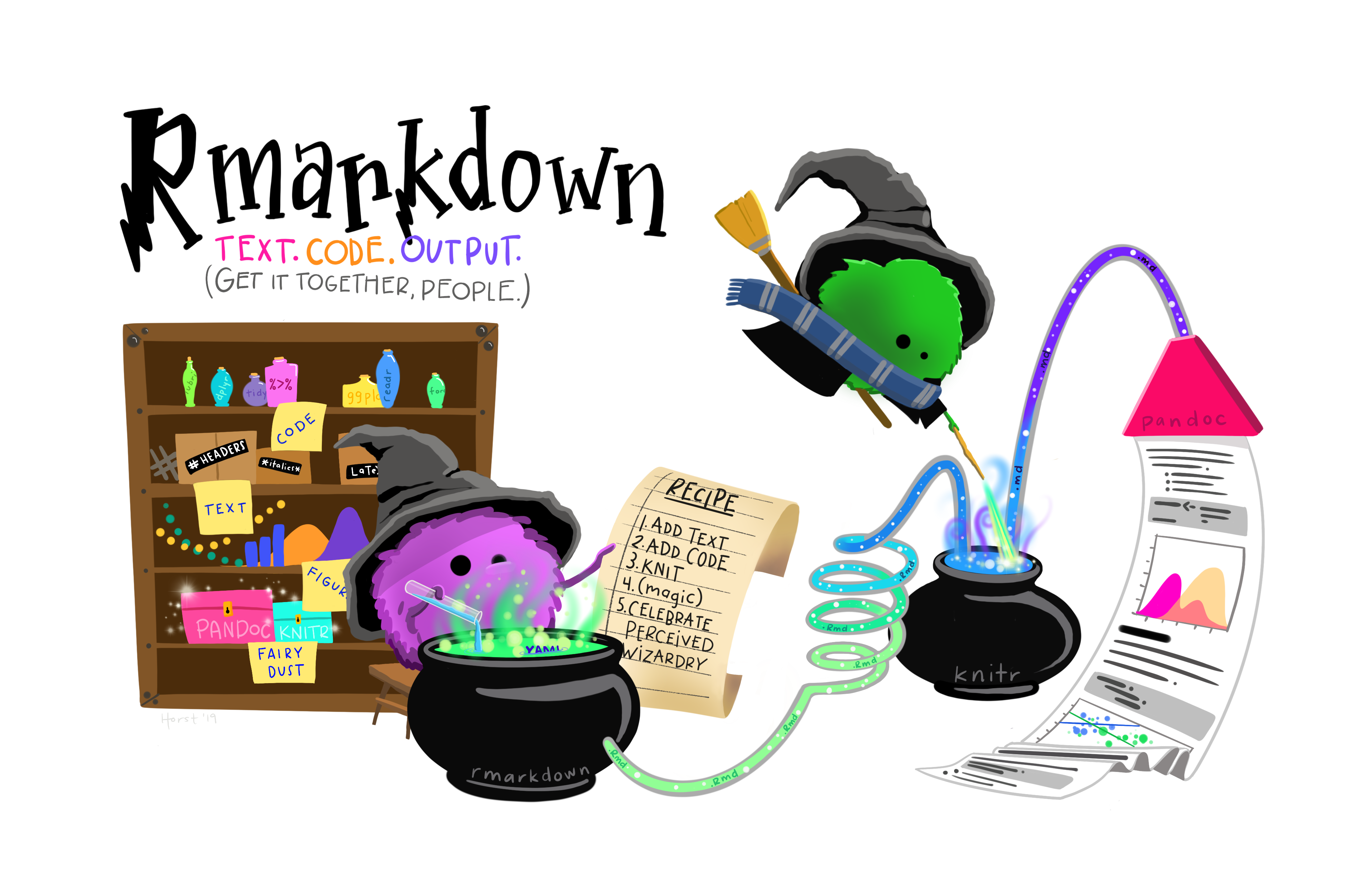
Creating an R Markdown File
To create a new R Markdown document in RStudio, click File -> New File -> R Markdown:
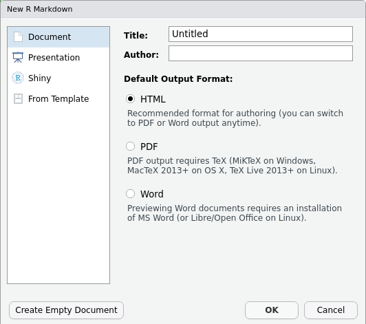
Then, click on ‘Create Empty Document’ to generate your R Markdown file.
In practice, you can enter the title of your document, your name (Author), and select the type of output. However, in this lesson, we will be learning how to start from a blank document.
Basic Components of R Markdown
To control the output, a YAML header is needed. YAML (which stands for YAML Ain’t Markup Language) is a human-readable serialization language that helps with the configuration of files!
An example of a YAML header can be seen below:
---
title: "My Awesome Report"
author: "Emmet Brickowski"
date: ""
output: html_document
---In R Markdown, the header is defined by the three hyphens at the
beginning (---) and the three hyphens at the end
(---).
Within this header, the only required field is the
output, which specifies the type of output you want. This
can be an html_document, a pdf_document, or a
word_document. We will start with an HTML document and
discuss the other options later.
Since the other fields are not required, you can delete them if they are unneeded!
To begin the body of your document, start typing after the end of the
YAML header (i.e. after the second ---).
Markdown Syntax
Markdown is a popular markup language that allows you to add
formatting elements to text, such as bold,
italics, and code. However, the formatting will
not be immediately visible in your markdown (.md) document, like you
would see in a Word document. Rather, Markdown syntax applied to text
within your file is converted into formatted elements upon
output. Markdown is useful because it is lightweight, flexible, and
platform independent.
Some platforms provide a real time preview of the formatting, like RStudio’s visual markdown editor (available from version 1.4).
First, let’s create a heading! A # in front of text
indicates to Markdown that this text is a heading. Adding more
#s make the heading smaller, i.e. one # is a
first level heading, two ##s is a second level heading,
etc. This can be repeated up until the 6th level heading.
# Title
## Section
### Sub-section
#### Sub-sub section
##### Sub-sub-sub section
###### Sub-sub-sub-sub sectionPlease note that you should only use a level if the one above it is
also in use! For example, you should not create a header using
#### unless headers at ### and all
higher levels are present earlier in the document.
Since we have already defined our title in the YAML header, we will use a section heading to create an Introduction section.
## IntroductionYou can make things bold by surrounding the word
with double asterisks, **bold**, or double underscores,
__bold__. Italics can be applied using single
asterisks, *italics*, or single underscores,
_italics_.
You can also combine bold and italics to
write something really important with
triple-asterisks, ***really***, or underscores,
___really___. If you’re feeling bold (pun intended), you
can also use a combination of asterisks and underscores,
**_really_**, *__really__*.
To create code-type font, surround the word with
back-ticks, `code-type`.
Now, let’s apply everything we’ve learned about markdown syntax thus far:
## Introduction
This report uses the **tidyverse** package along with the *Check-In* Dataset,
which has columns that include:Then we can create a list for the variables using -,
+, or * keys.
## Introduction
This report uses the **tidyverse** package along with the *Check-In* Dataset,
which has columns that include:
- checkin\_id
- checkin\_length
- checkin\_time
- location
- precinct
- device You can also create an ordered list using numbers:
1. checkin\_id
2 checkin\_length
3. checkin\_time
4. location
5. precinct
6. deviceAnd nested items by tab-indenting:
- checkin\_id
+ Unique key/ID for each ballot instance
- checkin\_length
+ Number of seconds it took for the person submitting the ballot to check-in
- checkin\_time
+ Arrival time of the person submitting the ballot
- location
+ Anonymized ID for the location of the ballot box
- precinct
+ Anonymized ID for the precinct that the ballot box belongs to
- device
+ Anonymized ID for each ballot boxFor more Markdown syntax see the following reference guide.
To render your document into HTML, click the Knit button at the top of the Source panel (top left), or use the keyboard shortcut Ctrl+Shift+K for Windows and Linux or Cmd+Shift+K for Mac. If you haven’t saved the document yet, you will be prompted to do so when you Knit for the first time.
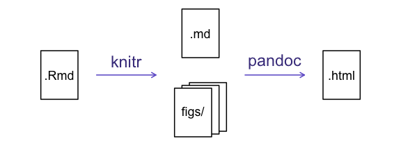
Writing an R Markdown Report
Next, we will add some R code from our previous data wrangling and visualization, which means we need to make sure tidyverse is loaded. However, it is no longer enough to just load tidyverse from the console – when working with R Markdown, you must ensure any necessary packages are loaded within the document itself. The same applies to our data. To do so, we will need to create a ‘code chunk’ at the top of our document (below the YAML header).
A code chunk can be inserted by clicking Code -> Insert Chunk, or by using the keyboard shortcuts Ctrl+Alt+I for Windows and Linux or Cmd+Option+I for Mac.
The syntax of a code chunk is:
An R Markdown document knows that this text is not part of the report
from the ``` that begins and ends the chunk. It also knows
that the code inside of the chunk is written in R from the
r inside of the curly braces ({}). After the
r, you can add a name for the code chunk. Naming a chunk is
optional, but recommended for organizational purposes. When naming
chunks, each chunk name must be unique, and only contain alphanumeric
characters and -.
To load tidyverse and our
checkin_data.csv file, we will insert a chunk and call it
‘setup’. Since we don’t want this code or the output to show in our
knitted HTML document, we add an include = FALSE option
after the code chunk name ({r setup, include = FALSE}).
MARKDOWN
```{r setup, include = FALSE}
#loads in the tidyverse and here packages
library(tidyverse)
library(here)
#reads in data and assigns it to the 'data' variable using 'here'
data <- read_csv(here("data", "checkin_data.csv"))
```Important Note!
The file paths you give in a .Rmd document, e.g. to load a .csv file, are relative to the .Rmd document, not the project root.
As suggested in the Starting with Data episode, we highly recommend
the use of the here() function to keep the file paths
consistent within your project.
Insert Table
Next, we will re-create a table from the Data Wrangling episode which
shows the total number of check-ins grouped by precinct. We
can do this by creating a new code chunk and calling it ‘anon-tbl’.
Alternatively, you can come up with something more creative (just
remember to stick to the naming rules).
When writing code chunks, unlike text, it isn’t necessary to Knit your document every time you want to see the output. Instead you can run the code chunk with the green triangle in the top right corner of the the chunk, or by using the keyboard shortcuts Ctrl+Alt+C for Windows and Linux or Cmd+Option+C for Mac.
To make sure the table is formatted nicely in our output document, we
will need to use the kable() function from the
knitr package. The kable() function takes
the output of your R code and knits it into a nice looking HTML table.
You can also specify different aspects of the table (i.e., the column
names or the caption).
Run the code chunk below to ensure you get the desired output:
R
data %>%
group_by(precinct) %>%
summarize(total_checkins = n()) %>%
arrange(desc(total_checkins)) %>%
knitr::kable(caption = "We can also add a caption.",
col.names = c("Precinct",
"Total Check-Ins"))
| Precinct | Total Check-Ins |
|---|---|
| PRECINCT_219 | 1968 |
| PRECINCT_016 | 1807 |
| PRECINCT_271 | 1798 |
| PRECINCT_317 | 1731 |
| PRECINCT_358 | 1717 |
| PRECINCT_239 | 1705 |
| PRECINCT_199 | 1700 |
| PRECINCT_323 | 1695 |
| PRECINCT_106 | 1680 |
| PRECINCT_045 | 1671 |
| PRECINCT_008 | 1652 |
| PRECINCT_051 | 1652 |
| PRECINCT_046 | 1640 |
| PRECINCT_133 | 1640 |
| PRECINCT_408 | 1636 |
| PRECINCT_119 | 1633 |
| PRECINCT_254 | 1630 |
| PRECINCT_242 | 1628 |
| PRECINCT_047 | 1621 |
| PRECINCT_386 | 1617 |
| PRECINCT_315 | 1611 |
| PRECINCT_367 | 1607 |
| PRECINCT_307 | 1600 |
| PRECINCT_215 | 1598 |
| PRECINCT_134 | 1592 |
| PRECINCT_294 | 1585 |
| PRECINCT_136 | 1584 |
| PRECINCT_340 | 1584 |
| PRECINCT_376 | 1583 |
| PRECINCT_387 | 1580 |
| PRECINCT_309 | 1568 |
| PRECINCT_246 | 1565 |
| PRECINCT_319 | 1564 |
| PRECINCT_105 | 1561 |
| PRECINCT_395 | 1554 |
| PRECINCT_306 | 1550 |
| PRECINCT_027 | 1539 |
| PRECINCT_251 | 1527 |
| PRECINCT_210 | 1519 |
| PRECINCT_211 | 1507 |
| PRECINCT_308 | 1507 |
| PRECINCT_146 | 1500 |
| PRECINCT_039 | 1489 |
| PRECINCT_161 | 1483 |
| PRECINCT_266 | 1479 |
| PRECINCT_262 | 1478 |
| PRECINCT_258 | 1475 |
| PRECINCT_297 | 1470 |
| PRECINCT_324 | 1466 |
| PRECINCT_263 | 1464 |
| PRECINCT_179 | 1459 |
| PRECINCT_200 | 1459 |
| PRECINCT_035 | 1448 |
| PRECINCT_022 | 1436 |
| PRECINCT_235 | 1432 |
| PRECINCT_335 | 1427 |
| PRECINCT_256 | 1417 |
| PRECINCT_177 | 1415 |
| PRECINCT_121 | 1402 |
| PRECINCT_398 | 1402 |
| PRECINCT_217 | 1392 |
| PRECINCT_018 | 1380 |
| PRECINCT_193 | 1380 |
| PRECINCT_084 | 1370 |
| PRECINCT_158 | 1360 |
| PRECINCT_196 | 1358 |
| PRECINCT_204 | 1352 |
| PRECINCT_007 | 1347 |
| PRECINCT_225 | 1344 |
| PRECINCT_150 | 1336 |
| PRECINCT_066 | 1334 |
| PRECINCT_044 | 1332 |
| PRECINCT_128 | 1328 |
| PRECINCT_070 | 1317 |
| PRECINCT_320 | 1317 |
| PRECINCT_282 | 1314 |
| PRECINCT_303 | 1314 |
| PRECINCT_237 | 1313 |
| PRECINCT_336 | 1306 |
| PRECINCT_399 | 1306 |
| PRECINCT_036 | 1291 |
| PRECINCT_117 | 1278 |
| PRECINCT_178 | 1278 |
| PRECINCT_236 | 1268 |
| PRECINCT_412 | 1268 |
| PRECINCT_331 | 1265 |
| PRECINCT_050 | 1262 |
| PRECINCT_124 | 1251 |
| PRECINCT_096 | 1246 |
| PRECINCT_109 | 1246 |
| PRECINCT_037 | 1241 |
| PRECINCT_280 | 1236 |
| PRECINCT_157 | 1232 |
| PRECINCT_371 | 1232 |
| PRECINCT_290 | 1225 |
| PRECINCT_375 | 1220 |
| PRECINCT_404 | 1219 |
| PRECINCT_216 | 1212 |
| PRECINCT_054 | 1211 |
| PRECINCT_356 | 1203 |
| PRECINCT_041 | 1201 |
| PRECINCT_126 | 1199 |
| PRECINCT_328 | 1198 |
| PRECINCT_332 | 1198 |
| PRECINCT_351 | 1188 |
| PRECINCT_065 | 1187 |
| PRECINCT_195 | 1187 |
| PRECINCT_125 | 1185 |
| PRECINCT_406 | 1183 |
| PRECINCT_055 | 1179 |
| PRECINCT_098 | 1179 |
| PRECINCT_048 | 1174 |
| PRECINCT_339 | 1173 |
| PRECINCT_038 | 1171 |
| PRECINCT_139 | 1170 |
| PRECINCT_191 | 1168 |
| PRECINCT_011 | 1167 |
| PRECINCT_014 | 1161 |
| PRECINCT_270 | 1154 |
| PRECINCT_110 | 1149 |
| PRECINCT_118 | 1130 |
| PRECINCT_153 | 1127 |
| PRECINCT_015 | 1125 |
| PRECINCT_097 | 1122 |
| PRECINCT_341 | 1122 |
| PRECINCT_257 | 1119 |
| PRECINCT_281 | 1114 |
| PRECINCT_052 | 1109 |
| PRECINCT_318 | 1109 |
| PRECINCT_255 | 1105 |
| PRECINCT_159 | 1102 |
| PRECINCT_396 | 1101 |
| PRECINCT_333 | 1096 |
| PRECINCT_174 | 1092 |
| PRECINCT_312 | 1091 |
| PRECINCT_079 | 1090 |
| PRECINCT_353 | 1089 |
| PRECINCT_269 | 1082 |
| PRECINCT_220 | 1079 |
| PRECINCT_067 | 1074 |
| PRECINCT_230 | 1063 |
| PRECINCT_137 | 1062 |
| PRECINCT_160 | 1056 |
| PRECINCT_033 | 1054 |
| PRECINCT_313 | 1050 |
| PRECINCT_260 | 1047 |
| PRECINCT_187 | 1042 |
| PRECINCT_206 | 1040 |
| PRECINCT_129 | 1036 |
| PRECINCT_203 | 1028 |
| PRECINCT_296 | 1028 |
| PRECINCT_029 | 1026 |
| PRECINCT_377 | 1023 |
| PRECINCT_081 | 1022 |
| PRECINCT_080 | 1021 |
| PRECINCT_221 | 1006 |
| PRECINCT_154 | 1002 |
| PRECINCT_415 | 998 |
| PRECINCT_394 | 995 |
| PRECINCT_325 | 992 |
| PRECINCT_115 | 991 |
| PRECINCT_321 | 988 |
| PRECINCT_085 | 987 |
| PRECINCT_184 | 986 |
| PRECINCT_064 | 982 |
| PRECINCT_370 | 981 |
| PRECINCT_202 | 979 |
| PRECINCT_299 | 977 |
| PRECINCT_310 | 976 |
| PRECINCT_201 | 974 |
| PRECINCT_420 | 963 |
| PRECINCT_021 | 956 |
| PRECINCT_114 | 954 |
| PRECINCT_241 | 954 |
| PRECINCT_194 | 944 |
| PRECINCT_316 | 943 |
| PRECINCT_397 | 943 |
| PRECINCT_059 | 942 |
| PRECINCT_053 | 941 |
| PRECINCT_049 | 939 |
| PRECINCT_143 | 934 |
| PRECINCT_075 | 932 |
| PRECINCT_168 | 926 |
| PRECINCT_298 | 925 |
| PRECINCT_349 | 915 |
| PRECINCT_381 | 910 |
| PRECINCT_197 | 908 |
| PRECINCT_166 | 904 |
| PRECINCT_372 | 904 |
| PRECINCT_123 | 890 |
| PRECINCT_083 | 889 |
| PRECINCT_288 | 885 |
| PRECINCT_010 | 882 |
| PRECINCT_068 | 882 |
| PRECINCT_017 | 875 |
| PRECINCT_207 | 873 |
| PRECINCT_127 | 872 |
| PRECINCT_337 | 868 |
| PRECINCT_283 | 866 |
| PRECINCT_327 | 861 |
| PRECINCT_393 | 858 |
| PRECINCT_107 | 856 |
| PRECINCT_140 | 854 |
| PRECINCT_116 | 853 |
| PRECINCT_390 | 853 |
| PRECINCT_131 | 851 |
| PRECINCT_348 | 849 |
| PRECINCT_132 | 845 |
| PRECINCT_354 | 845 |
| PRECINCT_164 | 844 |
| PRECINCT_095 | 843 |
| PRECINCT_209 | 838 |
| PRECINCT_359 | 831 |
| PRECINCT_248 | 820 |
| PRECINCT_169 | 819 |
| PRECINCT_058 | 816 |
| PRECINCT_076 | 816 |
| PRECINCT_198 | 815 |
| PRECINCT_181 | 810 |
| PRECINCT_378 | 810 |
| PRECINCT_003 | 806 |
| PRECINCT_023 | 797 |
| PRECINCT_025 | 796 |
| PRECINCT_069 | 796 |
| PRECINCT_234 | 795 |
| PRECINCT_267 | 791 |
| PRECINCT_144 | 785 |
| PRECINCT_322 | 783 |
| PRECINCT_130 | 776 |
| PRECINCT_224 | 766 |
| PRECINCT_416 | 766 |
| PRECINCT_329 | 764 |
| PRECINCT_005 | 762 |
| PRECINCT_352 | 762 |
| PRECINCT_142 | 761 |
| PRECINCT_012 | 759 |
| PRECINCT_120 | 757 |
| PRECINCT_314 | 748 |
| PRECINCT_102 | 743 |
| PRECINCT_009 | 742 |
| PRECINCT_250 | 738 |
| PRECINCT_013 | 737 |
| PRECINCT_024 | 734 |
| PRECINCT_108 | 734 |
| PRECINCT_057 | 733 |
| PRECINCT_113 | 732 |
| PRECINCT_228 | 731 |
| PRECINCT_149 | 728 |
| PRECINCT_391 | 727 |
| PRECINCT_073 | 724 |
| PRECINCT_071 | 708 |
| PRECINCT_231 | 701 |
| PRECINCT_185 | 691 |
| PRECINCT_034 | 682 |
| PRECINCT_138 | 682 |
| PRECINCT_145 | 682 |
| PRECINCT_304 | 680 |
| PRECINCT_006 | 676 |
| PRECINCT_369 | 669 |
| PRECINCT_172 | 663 |
| PRECINCT_030 | 662 |
| PRECINCT_183 | 660 |
| PRECINCT_155 | 652 |
| PRECINCT_001 | 648 |
| PRECINCT_233 | 648 |
| PRECINCT_243 | 643 |
| PRECINCT_188 | 639 |
| PRECINCT_364 | 638 |
| PRECINCT_028 | 633 |
| PRECINCT_111 | 621 |
| PRECINCT_212 | 621 |
| PRECINCT_213 | 614 |
| PRECINCT_026 | 604 |
| PRECINCT_060 | 601 |
| PRECINCT_094 | 592 |
| PRECINCT_170 | 585 |
| PRECINCT_208 | 581 |
| PRECINCT_223 | 581 |
| PRECINCT_344 | 580 |
| PRECINCT_141 | 578 |
| PRECINCT_350 | 573 |
| PRECINCT_063 | 571 |
| PRECINCT_182 | 571 |
| PRECINCT_122 | 570 |
| PRECINCT_086 | 565 |
| PRECINCT_273 | 562 |
| PRECINCT_252 | 560 |
| PRECINCT_388 | 556 |
| PRECINCT_278 | 555 |
| PRECINCT_151 | 553 |
| PRECINCT_368 | 552 |
| PRECINCT_384 | 547 |
| PRECINCT_343 | 546 |
| PRECINCT_186 | 543 |
| PRECINCT_409 | 540 |
| PRECINCT_087 | 536 |
| PRECINCT_259 | 530 |
| PRECINCT_249 | 528 |
| PRECINCT_240 | 527 |
| PRECINCT_289 | 520 |
| PRECINCT_287 | 513 |
| PRECINCT_347 | 511 |
| PRECINCT_311 | 504 |
| PRECINCT_072 | 498 |
| PRECINCT_407 | 493 |
| PRECINCT_192 | 490 |
| PRECINCT_104 | 489 |
| PRECINCT_295 | 482 |
| PRECINCT_214 | 479 |
| PRECINCT_245 | 478 |
| PRECINCT_305 | 477 |
| PRECINCT_247 | 473 |
| PRECINCT_103 | 469 |
| PRECINCT_004 | 466 |
| PRECINCT_366 | 463 |
| PRECINCT_226 | 462 |
| PRECINCT_147 | 459 |
| PRECINCT_402 | 459 |
| PRECINCT_162 | 457 |
| PRECINCT_284 | 454 |
| PRECINCT_019 | 444 |
| PRECINCT_293 | 443 |
| PRECINCT_156 | 441 |
| PRECINCT_152 | 439 |
| PRECINCT_077 | 429 |
| PRECINCT_100 | 415 |
| PRECINCT_279 | 412 |
| PRECINCT_135 | 406 |
| PRECINCT_165 | 404 |
| PRECINCT_099 | 403 |
| PRECINCT_090 | 397 |
| PRECINCT_264 | 397 |
| PRECINCT_218 | 396 |
| PRECINCT_276 | 393 |
| PRECINCT_413 | 386 |
| PRECINCT_383 | 385 |
| PRECINCT_338 | 373 |
| PRECINCT_361 | 371 |
| PRECINCT_362 | 367 |
| PRECINCT_405 | 363 |
| PRECINCT_190 | 362 |
| PRECINCT_418 | 362 |
| PRECINCT_373 | 359 |
| PRECINCT_040 | 356 |
| PRECINCT_093 | 348 |
| PRECINCT_392 | 342 |
| PRECINCT_400 | 339 |
| PRECINCT_173 | 333 |
| PRECINCT_379 | 324 |
| PRECINCT_082 | 321 |
| PRECINCT_163 | 320 |
| PRECINCT_285 | 320 |
| PRECINCT_232 | 313 |
| PRECINCT_286 | 296 |
| PRECINCT_277 | 295 |
| PRECINCT_222 | 288 |
| PRECINCT_301 | 284 |
| PRECINCT_275 | 280 |
| PRECINCT_291 | 279 |
| PRECINCT_238 | 274 |
| PRECINCT_385 | 265 |
| PRECINCT_389 | 259 |
| PRECINCT_002 | 257 |
| PRECINCT_357 | 248 |
| PRECINCT_148 | 244 |
| PRECINCT_380 | 243 |
| PRECINCT_302 | 241 |
| PRECINCT_342 | 234 |
| PRECINCT_330 | 232 |
| PRECINCT_417 | 232 |
| PRECINCT_032 | 227 |
| PRECINCT_268 | 224 |
| PRECINCT_374 | 220 |
| PRECINCT_363 | 218 |
| PRECINCT_346 | 213 |
| PRECINCT_300 | 212 |
| PRECINCT_265 | 207 |
| PRECINCT_334 | 206 |
| PRECINCT_074 | 190 |
| PRECINCT_043 | 189 |
| PRECINCT_167 | 187 |
| PRECINCT_205 | 184 |
| PRECINCT_410 | 184 |
| PRECINCT_401 | 180 |
| PRECINCT_229 | 179 |
| PRECINCT_089 | 178 |
| PRECINCT_112 | 171 |
| PRECINCT_365 | 171 |
| PRECINCT_274 | 169 |
| PRECINCT_326 | 167 |
| PRECINCT_078 | 150 |
| PRECINCT_244 | 148 |
| PRECINCT_056 | 143 |
| PRECINCT_061 | 142 |
| PRECINCT_088 | 140 |
| PRECINCT_171 | 124 |
| PRECINCT_176 | 124 |
| PRECINCT_292 | 111 |
| PRECINCT_020 | 109 |
| PRECINCT_091 | 102 |
| PRECINCT_180 | 101 |
| PRECINCT_261 | 101 |
| PRECINCT_382 | 101 |
| PRECINCT_272 | 98 |
| PRECINCT_419 | 89 |
| PRECINCT_042 | 78 |
| PRECINCT_062 | 75 |
| PRECINCT_189 | 70 |
| PRECINCT_227 | 70 |
| PRECINCT_403 | 68 |
| PRECINCT_414 | 68 |
| PRECINCT_031 | 66 |
| PRECINCT_175 | 64 |
| PRECINCT_355 | 60 |
| PRECINCT_253 | 58 |
| PRECINCT_101 | 43 |
| PRECINCT_345 | 42 |
| PRECINCT_411 | 37 |
| PRECINCT_360 | 11 |
| PRECINCT_092 | 2 |
Many different R packages can be used to generate tables. Some of the more commonly used options are listed in the table below:
| Name | Creator(s) | Description |
|---|---|---|
| condformat | Oller Moreno (2022) | Allows for the application and visualization of conditional formatting to data frames using defined criteria. |
| DT | Xie et al. (2023) | By using the JavaScript library ‘DataTables’ (included within the library), data objects can be rendered as HTML tables via R Markdown or Shiny. |
| formattable | Ren and Russell (2021) | Provides functions that create “formattable” vectors and data frames. Formattable vectors are displayed with text formatting, while formattable data frames use HTML to enhance the readability when rendered on web pages. |
| flextable | Gohel and Skintzos (2023) | Assists in the creation and customization of tables for reporting and publication purposes. The following formats are supported: ‘HTML’, ‘PDF’, ‘RTF’, ‘Microsoft Word’, ‘Microsoft PowerPoint’ and R ‘Grid Graphics’. ‘R Markdown’, ‘Quarto’, and the package ‘officer’ can be used to produce files with results. |
| gt | Iannone et al. (2022) | Builds display tables from tabular data. Within this package, tables are constructed using a set of cohesive table parts. Table values can be formatted using any of the included formatting functions. |
| huxtable | Hugh-Jones (2022) | Creates styled tables for data presentation. These tables can be exported to HTML, LaTeX, RTF, ‘Word’, ‘Excel’, and ‘PowerPoint’. Using this package, you can manipulate borders, size, position, captions, colors, text styles and number formatting. |
| pander | Daróczi and Tsegelskyi (2022) | Includes functions that catch all messages, ‘stdout’ and other useful information while evaluating R code. It also provides helpers to return user-specified text elements (e.g., header, paragraph, table, image, lists, etc.), or several types of R objects similarly automatically transformed to markdown format, in ‘pandoc’ markdown. |
| pixiedust | Nutter and Kretch (2021) | Provides tidy data frames with a programming interface intended to be similar to ’ggplot2’s system of layers, allowing fine-tuned control over each cell of the table. |
| reactable | Lin et al. (2023) | Creates interactive data tables for R based on the ‘React Table’ JavaScript library. Provides an HTML widget that can be used in ‘R Markdown’ or ‘Quarto’ documents, ‘Shiny’ applications, or viewed from an R console. |
| rhandsontable | Owen et al. (2021) | Provides an R interface to the ‘Handsontable’ JavaScript library (a minimalist Excel-like data grid editor). |
| stargazer | Hlavac (2022) | Generates LaTeX code, HTML/CSS code and ASCII text for well-formatted tables that display regression analysis results from multiple models side-by-side, along with summary statistics. |
| tables | Murdoch (2022) | Computes and displays complex tables of summary statistics. Output can be in LaTeX, HTML, plain text, or an R matrix for further processing. |
| tangram | Garbett et al. (2023) | Provides a flexible formula system to create production quality tables quickly and easily. The processing steps include a formula parser, statistical content generation from data defined by a formula, and table rendering. |
| xtable | Dahl et al. (2019) | Coerces data to LaTeX and HTML tables. |
| ztable | Moon (2021) | Makes zebra-striped tables (tables with alternating row colors) in LaTeX and HTML formats using data.frame, matrix, lm, aov, anova, glm, coxph, nls, fitdistr, mytable and cbind.mytable objects. |
Customizing Chunk Output
Earlier, we mentioned using include = FALSE in a code
chunk to prevent the code and output from printing in the knitted
document. There are additional options available to customize how the
code-chunks are presented in the output document. The options are
entered in the code chunk after chunk-name and separated by
commas, e.g. {r chunk-name, eval = FALSE, echo = TRUE}.
| Option | Options | Output |
|---|---|---|
eval |
TRUE or FALSE
|
Whether or not the code within the code chunk should be run. |
echo |
TRUE or FALSE
|
Choose if you want to show your code chunk in the output document.
echo = TRUE will show the code chunk. |
include |
TRUE or FALSE
|
Choose if the output of a code chunk should be included in the
document. FALSE means that your code will run, but will not
show up in the document. |
warning |
TRUE or FALSE
|
Whether or not you want your output document to display potential warning messages produced by your code. |
message |
TRUE or FALSE
|
Whether or not you want your output document to display potential messages produced by your code. |
fig.align |
default, left, right,
center
|
Where the figure from your R code chunk should be output on the page |
Tip
- The default settings for the above chunk options are all
TRUE. - The default settings can be modified per chunk, or with
knitr::opts_chunk$set()(i.e., enteringknitr::opts_chunk$set(echo = FALSE)will change the default of value ofechotoFALSEfor every code chunk in the document).
Exercise
Play around with the different options in the chunk with the code for the table, and re-Knit to see what each option does to the output.
What happens if you use eval = FALSE and
echo = FALSE? What is the difference between this and
include = FALSE?
Chunk 1:
MARKDOWN
```{r eval = FALSE, echo = FALSE}
data %>%
group_by(precinct) %>%
summarize(total_checkins = n()) %>%
arrange(desc(total_checkins)) %>%
knitr::kable(caption = "We can also add a caption.",
col.names = c("Precinct",
"Total Check-Ins"))
```Chunk 2:
MARKDOWN
```{r include = FALSE}
data %>%
group_by(precinct) %>%
summarize(total_checkins = n()) %>%
arrange(desc(total_checkins)) %>%
knitr::kable(caption = "We can also add a caption.",
col.names = c("Precinct",
"Total Check-Ins"))
```-
eval = FALSEandecho = FALSEwill neither run the code in the chunk, nor show the code in the knitted document. The code chunk essentially doesn’t exist in the knitted document! -
include = FALSEwill not display the code nor the output, but it will be ran, with the output stored for later use!
In-Line R Code
Now we will use some in-line R code to present some descriptive
statistics. To use in-line R-code, we use the same back-ticks that we
used in the Markdown section, with an r to specify that we
are generating R-code. The difference between in-line code and a code
chunk is the number of back-ticks. In-line R code uses one back-tick
(`r`), whereas code chunks use three back-ticks
(```r```).
For example, today’s date is `r Sys.Date()`, will be
rendered as: today’s date is 2026-06-30. The code will display today’s
date in the output document (or, technically, the date the document was
last knitted).
The best way to use in-line R code is by preparing the output in code chunks, minimizing the code needed to produce the output. For example, let’s say we’re interested in presenting the total check-ins for a specific precinct.
We can run the below code to create the total_2866 object, making future in-line R code much easier to write:
R
#create a summary tibble with the total check-ins per precinct
df <- data %>%
group_by(precinct) %>%
summarize(total_checkins = n())
#select the precinct we want to use
total_2866 <- df %>%
filter(precinct == "2866")
Now we can make an informative statement on the counts of each precinct, and include the total values as in-line R-code. For example:
The total check-ins at precinct 2866 is
`r total_2866$total_checkins`
becomes…
The total check-ins at precinct 2866 is .
Because we are using in-line R code instead of the actual values, we have created a dynamic document that will automatically update if we make changes to the data set and/or code chunks.
Plots
Finally, our last addition to our document will be a plot from the Data Visualization lesson!
Exercise
Create a new code chunk for the plot, and copy the code from any of the plots we created in the previous episode to produce a plot in the chunk.
If you are feeling adventurous, you can also create a new plot using
the data tibble.
R
#retrieve top devices
top_devices <- data %>%
count(device) %>%
top_n(10, n) %>%
pull(device)
#create plot
data %>%
filter(device %in% top_devices) %>%
mutate(device = str_remove(device, "DEVICE_")) %>%
ggplot(aes(x = device, fill = device)) +
geom_bar() +
labs(title = "Top 10 Devices by Number of Check-ins",
x = "Device",
y = "Count")+
theme_classic() +
theme(legend.position = "none")

We can also create a caption with the chunk option
fig.cap.
MARKDOWN
```{r chunk-name, fig.cap = "I made this plot while attending an
awesome workshop where I learned a ton of cool stuff!"}
"Insert the code for the plot here"
```…or, ideally, something more informative.
R
#retrieve top devices
top_devices <- data %>%
count(device) %>%
top_n(10, n) %>%
pull(device)
#create plot
data %>%
filter(device %in% top_devices) %>%
mutate(device = str_remove(device, "DEVICE_")) %>%
ggplot(aes(x = device, fill = device)) +
geom_bar() +
labs(title = "Top 10 Devices by Number of Check-ins",
x = "Device",
y = "Count")+
theme_classic() +
theme(legend.position = "none")
Other Output Options
To convert an R Markdown file to a PDF or Word Document, you can
either click the little triangle next to the Knit
button to get a drop-down menu or put pdf_document or
word_document in the initial header of the file.
For example, to output to a word_document:
---
title: "My Awesome Report"
author: "Emmet Brickowski"
date: ""
output: word_document
---Note: Creating PDF Documents
Creating .pdf documents may require installation of some extra
software. The R package tinytex provides some tools to help
make this process easier for R users. With tinytex
installed, run tinytex::install_tinytex() to install the
required software (you’ll only need to do this once) and then when you
Knit to pdf tinytex will automatically
detect and install any additional LaTeX packages that are needed to
produce the pdf document. For more information, visit the tinytex website.
Note: Inserting Citations into an R Markdown File
It is possible to insert citations into an R Markdown file using the editor toolbar. The editor toolbar includes commonly seen formatting buttons generally seen in text editors (e.g., bold and italic buttons) and is accessible by using the settings drop-down menu (next to the ‘Knit’ drop-down menu) to select ‘Use Visual Editor’. You can also use the keyboard shortcuts Ctrl+Shift+F4 for Windows and Linux or Cmd+Shift+F4 for Mac. From here, clicking ‘Insert’ allows ‘Citation’ to be selected.
Using this menu, you can search various sources for citations and
insert the appropriate citation necessary. For example, searching
‘10.1007/978-3-319-24277-4’ in ‘From DOI’ and inserting will provide the
citation for ggplot2 [@wickham2016]. This will also save the
citation(s) in ‘references.bib’ in the current working directory. Visit
the R
Studio website for more information.
Additionally, you can obtain citation information from relevant
packages by using citation("package").
Resources
- Knitr in a knutshell tutorial
- Dynamic Documents with R and knitr (book)
- R Markdown documentation
- R Markdown cheat sheet
- Getting started with R Markdown
- Markdown tutorial
- R Markdown: The Definitive Guide (book by Rstudio team)
- Reproducible Reporting
- Introducing Bookdown
- R Markdown is a useful language for creating reproducible documents combining text and executable R-code.
- You can specify chunk options to control formatting of the output document.